We're All Going To Be Navigating The Apple Watch With Our Eyes In The Future
Last week, Apple held its "Wonderlust" event. While the iPhone 15 and iPhone 15 Pro certainly get the most fanfare at the company's September events, Tim Cook and team also unveiled the Apple Watch Series 9 and Apple Watch Ultra 2 (and those USB-C AirPods Pro 2). With the new Apple Watch models and especially the watchOS 10 update, customers are getting a lot of great new features including a big redesign to how watchOS functions.
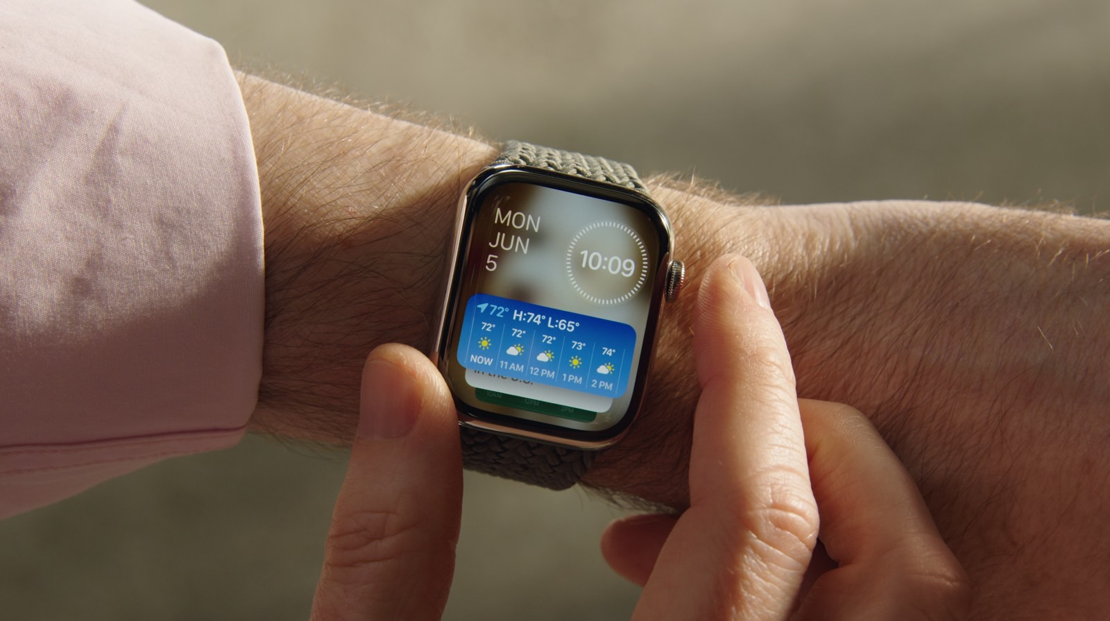
With watchOS 10, Apple implemented a big redesign that changed the way we interact with our Apple Watch. The big change came on the watch face itself. With the new Smart Stack, you can simply turn the Digital Crown and see what Apple is shooting to be "time information" from apps that support the new feature.
A new Smart Stack contains widgets that display timely information that adapts to the user's context and can be revealed with a simple turn of the Digital Crown from any watch face. For example, at the beginning of the day, Weather will show the forecast, or, when traveling, the Smart Stack will show boarding passes from Wallet. Calendar and Reminders will reshuffle to the top to display upcoming meetings or tasks, and apps that are running, such as Podcasts, will also move up so they are readily available. Smart Stack also enables users to enjoy a beautiful watch face, like Portraits, while still offering a way to quickly access information they care about.

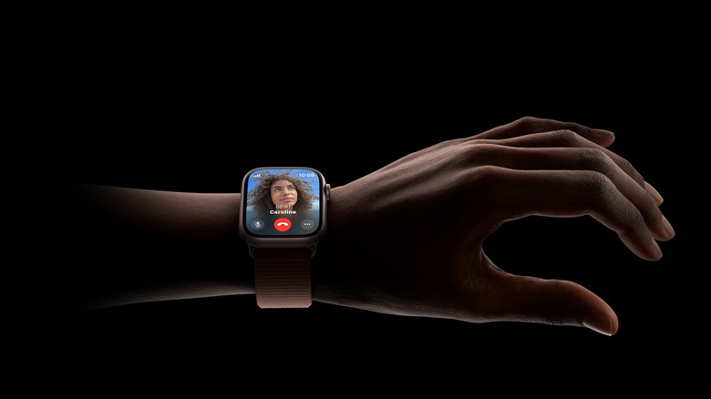
With the Apple Watch Series 9 and the Apple Watch Ultra 2, the company revealed its new S9 chip which, in addition to a CPU boost, new Neural Engine, and on-device Siri, also enables the company's new interactive feature, Double Tap. The feature allows users to control the watch without having to touch the display.
Innovations such as the Digital Crown and Taptic Engine — along with gestures like tap, swipe, wrist raise, and cover to mute — make Apple Watch simple and intuitive to use. With a new double tap gesture, users can easily control Apple Watch Series 9 using just one hand and without touching the display. Users can tap the index finger and thumb of their watch hand together twice to quickly and conveniently perform many of the most common actions on Apple Watch Series 9.
After having the last week to think about the redesign to watchOS 10 and the Double Tap feature enabled by the new Apple Watches, I think Apple is laying the groundwork for an entirely new way to interact with our smartwatch — and the Apple Vision Pro is the biggest clue.
I think eye tracking is coming to the Apple Watch
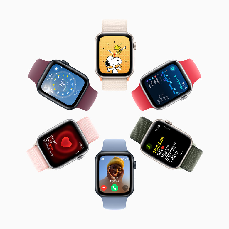
Okay, here's where I put the tin hat on quite a bit and connect some things that are incredibly loose. When I saw the redesign to watchOS 10, I noticed that a lot of the apps have a lot more buttons on them. Apple says that the move was made to "utilize more of the Apple Watch display for more glanceable information."
Apple Watch apps, including Weather, Stocks, Home, Maps, Messages, World Clock, and others, now utilize more of the Apple Watch display for more glanceable information. The Activity app on Apple Watch and the Fitness app on iPhone make tracking daily movement even easier with more details, improvements to sharing, a redesigned trophy case, and Apple Fitness+ trainer tips.
However, if you look closely, you can see that a lot of apps — when compared to watchOS 9 — also add more buttons to tap and that most buttons within apps have now been moved to the four corners of the display. If Apple was trying to prepare its software to work better with eye-tracking, moving these to the corners of the display would give its eye-tracking more space to ensure a user is honing in on the button they intend to tap...well, Double Tap.
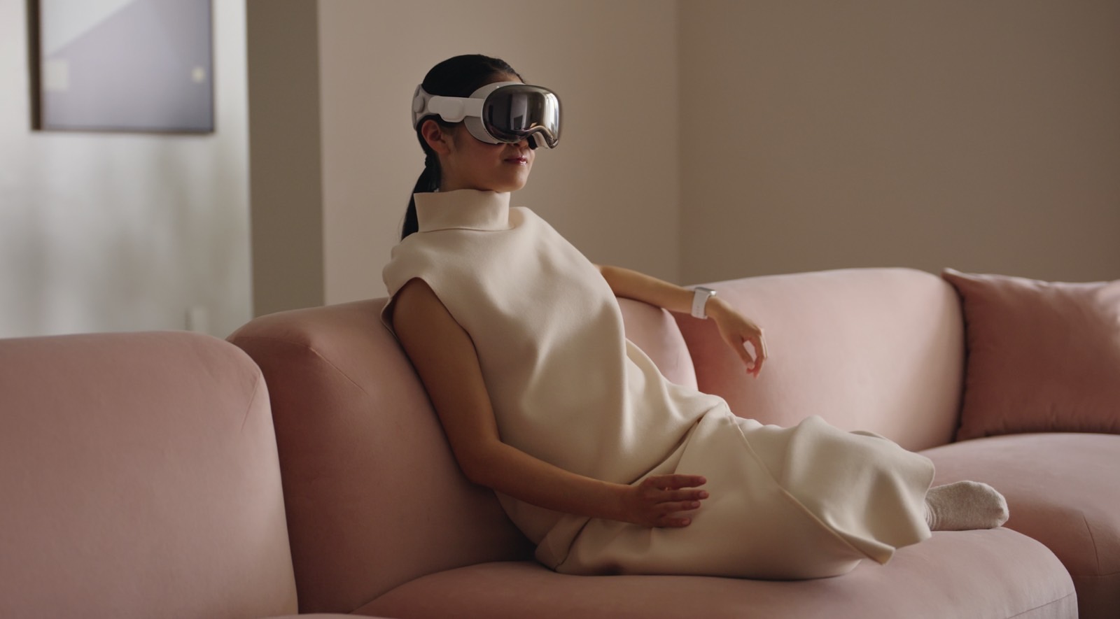
Double Tap (also known in some circles as Pinchy, Pinch) is inherently part of the key to this experience, and the Vision Pro plays a part here too. When Apple unveiled the Vision Pro, it showed that users would interact with the user interface by pinching their fingers together to make a selection. Now, with Double Tap, the company is bringing that same interaction to Apple Watch owners.
While this has existed in some form on the Apple Watch for a while with AssistiveTouch, Double Tap is now baked across the system to choose the default button on compatible apps. For example, bringing up the Timer app will pause and resume an in-progress timer. If Apple can get us used to pinching our fingers together for one button, it certainly can get us prepared to use the gesture for any selection available on the display.

This is where the Vision Pro comes into play. I remember watching Marques Brownlee's (MKBHD) first impressions of the upcoming headset and him specifically pointing out just how precise the eye tracking was on the device. This is obviously the key technology that Apple would likely need to figure out how to shrink even more in order to build it into the Apple Watch, but if it can pull it off, it has the software redesign and the gesture support to bring the entire experience together.
I can see that future now. You raise your wrist, stare at your watch, and Double Tap. That's it. That's how you navigate your Apple Watch in the future. And Apple isn't far away from bringing the technology together to make that future a reality.

