This App Transforms Your MacBook Notch Into A Useful Dynamic Island
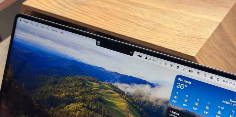
In 2021, Apple revamped the MacBook Pro with a new industrial design. Alongside the hardware changes, Apple added a 1080p camera, an improved keyboard, more ports, and a microLED display with a notch. But what exactly was the point of the notch?
At the time, the company explained that it was a "smart way" to give users more space for their content, as they'd have a 16:10 display by making the screen taller in the 14-inch and 16-inch models. Then, in 2022, the company expanded this visual change to the MacBook Air lineup.

While most of us got used to Apple's new design language, wouldn't it be nice to make this lost space more useful? At least, this is what lo.cafe developers envisioned when they created NotchNook, a new app that turns that wasted space into a useful Dynamic Island.
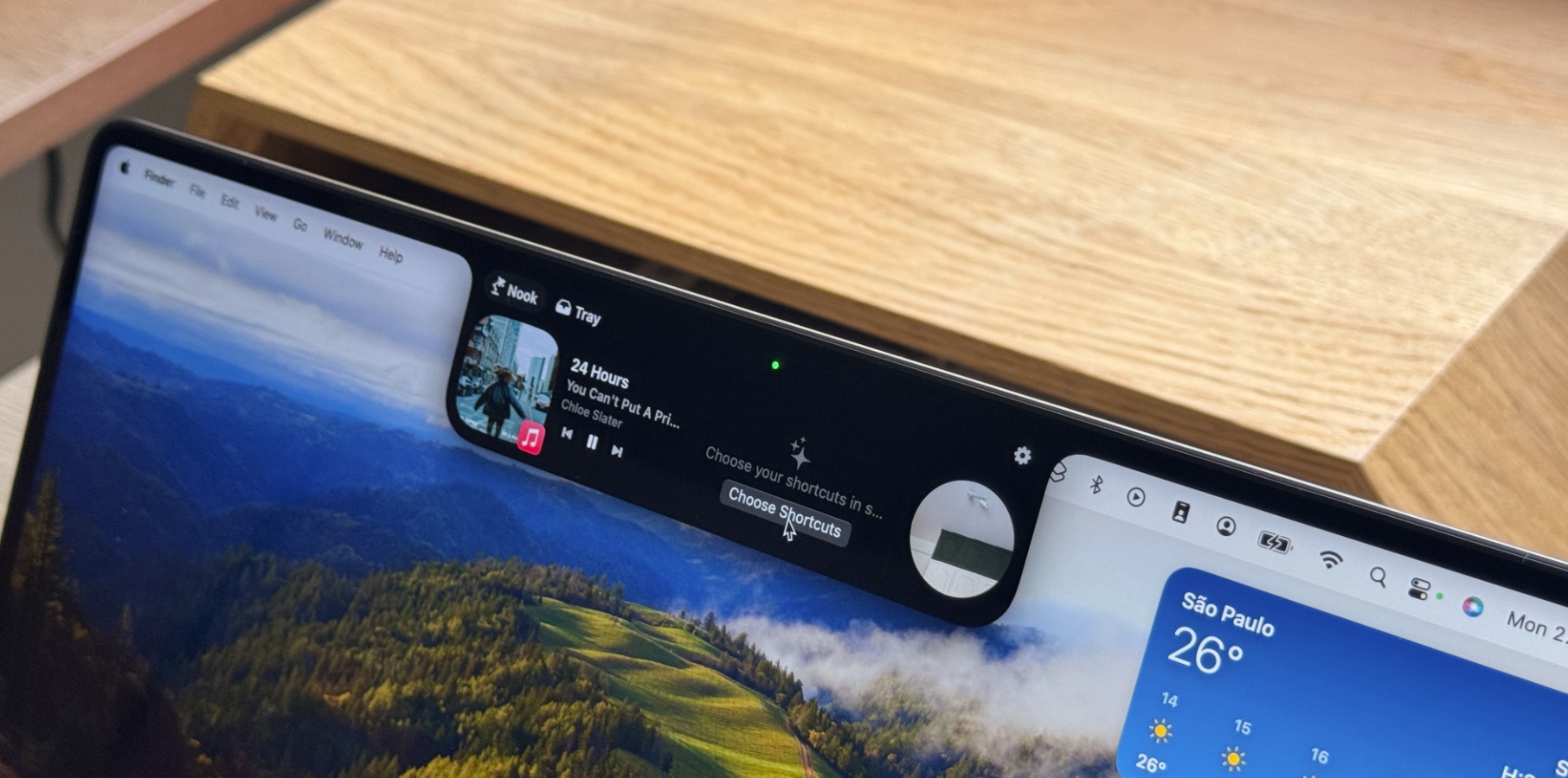
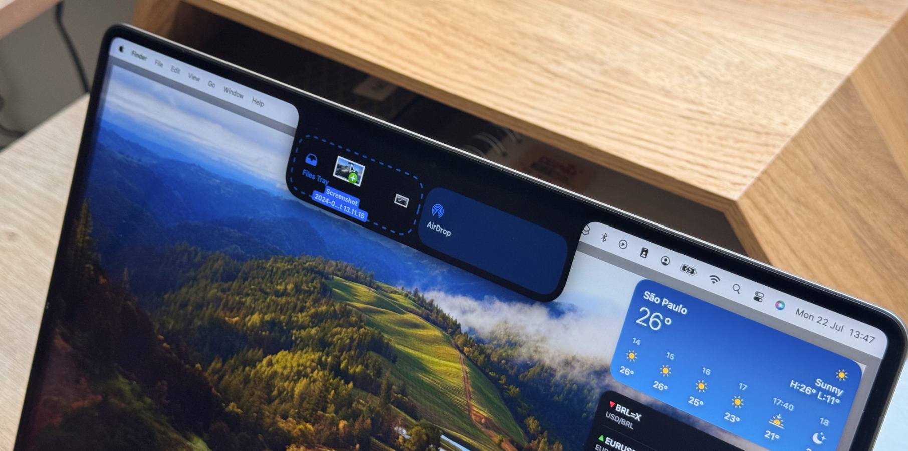
For those with an iPhone 14 Pro or newer, you'll see that NotchNook works similarly to iPhone's Dynamic Island. When you click the notch, it reveals a "Nook" with a Live Activities-like feature. For example, you can preview the song playing on Apple Music, add a shortcut, drop files or apps into a Tray tab, or even use your FaceTime HD camera as a little mirror.

You can tweak several settings, such as enabling Live Activities, activating different gestures, and even changing how you want the app to behave. What's genius enough about NotchNook is that even Macs without a notch can take advantage of it, such as my Mac Studio with Studio Display.
The developers say the app works with multiple monitors. If the customer chooses the $3 monthly subscription, a license allows activation on two devices. Those making a one-time $25 payment get five licenses.
NotchNook works with any Mac running macOS Sonoma or newer. You can find more details about it here.
