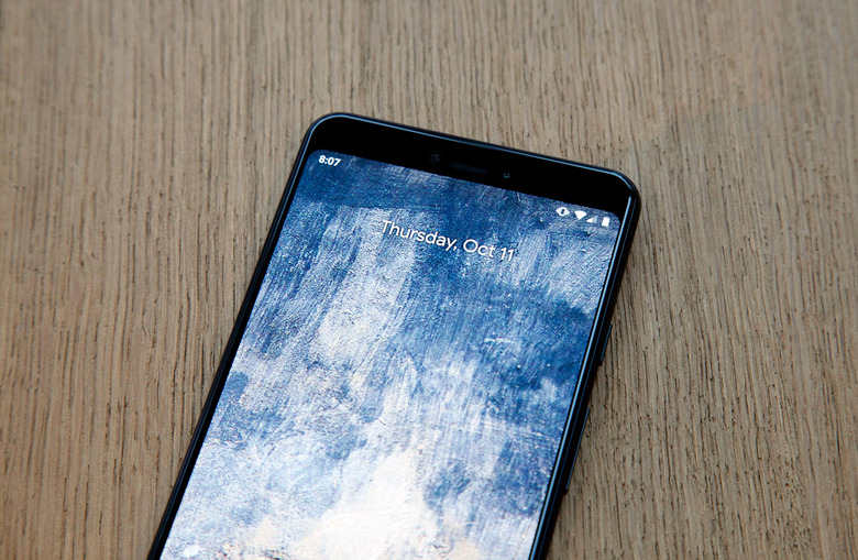
The Only Thing Worse Than Google's Giant Pixel 3 XL Notch Is Hiding It
Months of Pixel 3 and Pixel 3 XL leaks reached a boiling point in September when a shipment of prototypes was allegedly stolen, sold on the black market, and then reviewed by Eastern European bloggers. As a result, there were almost no surprises left earlier this week when Google finally unveiled its third-generation Pixel phones during a media event in New York City. We knew what the Pixel 3 and Pixel 3 XL looked like, we knew how impressive their new camera would be, and we knew just about all of their new features. We also knew that the larger Pixel 3 XL would feature a big notch at the top of the display, but we don't think anyone fully appreciated how massive the notch is on Google's new Pixel phablet until we got our hands on the phone this past Tuesday.
I shared some initial thoughts and hands-pn Pixel 3 and Pixel 3 XL impressions earlier this week after spending some time with both new phones. They're terrific new handsets that showcase the best of what Android has to offer in 2018 and 2019, and they'll undoubtedly be very popular with hardcore Android fans who want access to a "pure" Android experience and timely software updates. That said, there's one thing that many hardcore Android fans will dislike about both new Pixel phones: Their displays.
The screens on both new Pixel 3 devices are bright and vivid, but their designs are off-putting — each for a different reason. On the smaller Pixel 3 phone, the thick unsightly bezels above and below the display make the phone look like a relic of the past. The larger Pixel 3 XL has a slightly more modern "all-screen" style design, but it also has the most massive notch I have ever seen on a smartphone. Android fanboys who inherently hate anything involving Apple are definitely not going to like it. After all, it was Apple that popularized this type of display notch with last year's iPhone X and this year's iPhone XS.
![]()
I'll spend plenty of time in my in-depth Pixel 3 XL review discussing that massive notch at the top of the screen, but there's one reason I wanted to bring it up in the meantime. Following the Pixel 3 XL's unveiling earlier this week, people are rediscovering the fact that there's a way to disable the display notch on the Pixel 3 XL so that the entire top portion of the screen is kept black. With this option enabled in the phone's developer settings, the phone's screen looks like it does in the featured image at the top of this post instead of stretching to the top left and right corners.
Is hiding the Pixel 3 XL's notch a good idea for people who hate Google's amplification of Apple's iPhone X design? No, it isn't. In fact, the only thing that makes the face of the Pixel 3 XL look worse than it does with that huge notch is hiding it.
Many Android vendors that copy Apple's iPhone X design — and there are dozens of them — acknowledge the fact that not all smartphone users want a screen with a notch. To accommodate those users, many vendors offer an option like Google to hide the notch by making the screen black on either side of the cutout. But instead of completely wasting all that screen real estate and catapulting their phone designs back to 2015, they use the space on the sides of the notch to display things like reception, battery, a clock, and notification icons. When you hide the notch on the Pixel 3 XL, however, all that space is burned and the phone looks like a design straight out of 2015. It looks like... well... the Pixel 3.
Google's display notch on the Pixel 3 XL is large and unsightly indeed, but you should prepare yourself to just deal with it if you plan to buy this phone. As bad as it looks, the alternative is so much worse.
