Developer Dreams Up A Stunning macOS-Style Menu Bar For iOS
The 2018 iPad Pros are the best tablets money can buy right now. They are more powerful than most computers, including some MacBooks and iMacs, according to benchmark tests, and have fantastic potential. The new iOS tablets can easily replace computers for most needs, but they're still not true laptop or desktop alternatives.
I would love an iPad Pro experience that was more like what macOS has to offer, although that's not where Apple's iOS is heading. Apple has always maintained that it's not making touchscreen laptops and that it doesn't intend to merge iOS and macOS. But a developer just proved that it's not that hard to bring one of the best things of macOS — the iconic menu bar — to iOS apps.
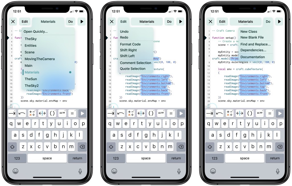
Two Lives Left, which built the Codea coding app for iPad, came up with the following Mac-style menus on iOS while looking to adapt the user interface of the application for iPhone:
While creating the universal version of the app, the coders encountered a major UI problem. The smaller screen real estate of the iPhone doesn't offer enough space for the different menu items necessary for coding:
For simple apps, menus aren't necessary, and that's great.
But Codea isn't a simple app, and there's nothing I can do about that.
What it can be is discoverable. Compared to all the options I considered, menus are exactly that, discoverable. You pull down a list of named features complete with shortcut keys (if a keyboard is attached). Then you activate that feature by tapping on it, or by dragging your finger and releasing.
So they coded a macOS-style menu bar for iOS. The result is a beautiful menu bar on an iPhone app that looks like this:

Yes, it looks like overkill for iPhone, but Two Lives Left created this particular menu for the iPhone version of the app, which requires plenty of menu items. But the same menus could very well work inside any iOS app, regardless of screen size. The iOS menu bar also looks amazing and proves that you could easily replicate the macOS menu bar to deliver an iPad Pro user interface that would actually allow many people to ditch computers in favor of iPads.
Conversely, the same kind of design would allow Apple to create MacBooks with touchscreen displays if it ever wanted to go down that route.
Apple is working on ARM-based MacBooks, reports say, but they'll still run versions of macOS. On the other hand, existing and future Macs will run iOS apps, no matter what chips they have inside. Apple already confirmed the feature back at WWDC 2018, and the first such apps are already available inside Mojave — the new Home and Apple News apps are two such examples.
iOS 13, which is already in testing at Apple, is expected to bring over several improvements to the iPad user interface, although it's way too early to speculate on what will make it into the final iOS 13 release.
