Jony Ive Explains The Origins Of The MacBook Pro's Touch Bar In New Interview
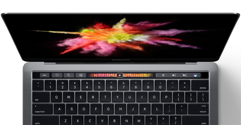
Apple last week rolled out a completely redesigned MacBook Pro with an intriguing new input option called the Touch Bar. Nestled atop of the keyboard, where the function row previously resided, the Touch Bar is an OLED display that presents users with specialized controls depending on which app is being used. While a number of developers and creative professionals have expressed disappointment with Apple's revamped MacBook Pro, the Touch Bar may very well prove to be a game-changing feature for everyday users.
DON'T MISS: 'Battlefield 1' review: Make war matter again
While ostensibly a straight forward design, Apple's new Touch Bar was in active development for approximately two years before seeing the light of day. In an enlightening interview with CNET, Apple design guru Jony Ive spoke at length about how the concept of the Touch Bar came about, the challenges involved in developing working prototypes, and why Apple has never been keen on releasing a touch-enabled Mac.
As to the Touch Bar's design and the challenges involved in evaluating its utility, Ive explains:
As has always been the way, we develop designs as quickly as we possibly can. This is a particularly difficult prototype because it required a fairly mature software environment, and a fairly mature and sophisticated hardware prototype, to really be able to figure out whether these ideas were valuable or not. One of the things that remains quite a big challenge for us is that you have to prototype to a sufficiently sophisticated level to really figure out whether you're considering the idea, or whether what you're really doing is evaluating how effective a prototype is.
Make sure to check out Ive's full interview via the source link below. While Ive has a tendency to pepper some of his answers with generic buzzwords, the interview nonetheless provides an interesting behind-the-scenes look at what went into bringing the Touch Bar to life.
