Asus' Blatant iPhone X Ripoff Convinced Me That Apple Made The Right Choice With The Notch
I've been using the iPhone X for almost four months now and not a day goes by that I don't notice the notch. Just because I got used to it, it doesn't mean that it's gotten any prettier since I last complained about it. At the same time, not a day goes by that I don't appreciate the notches usefulness. Face ID is something that I already take for granted, and I don't miss Touch ID at all, but that's a story for a different rainy day.
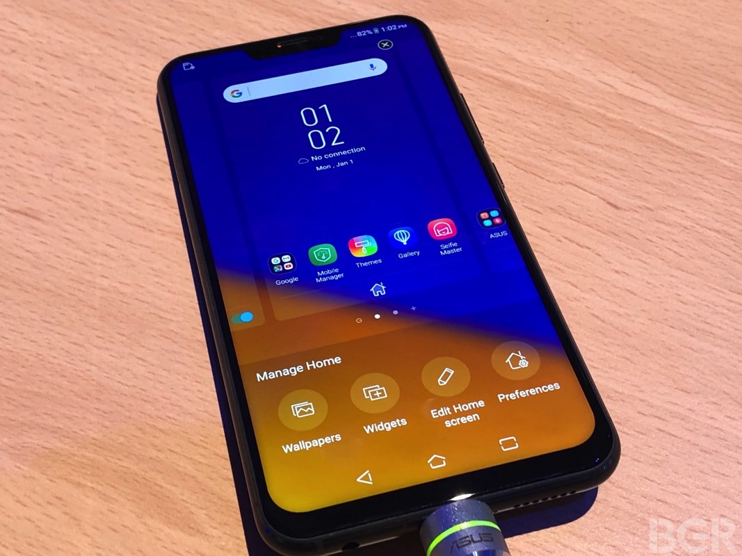
Asus the other day came out with the most blatant iPhone X ripoff to date. There's nothing with anyone copying Apple, it's how things work in the business. But Asus was incredibly aggressive about replicating the "Fruit Phone X" to the point where it claimed that it fixed the notch. My hands-on experience with the Zenfone 5 after the show convinced me that Apple's way of doing it is the right way. For the time being, there's no fixing it.
Let's take a look at the Zenfone 5's notch — by the way, that red dot indicator shows the phone is charging.
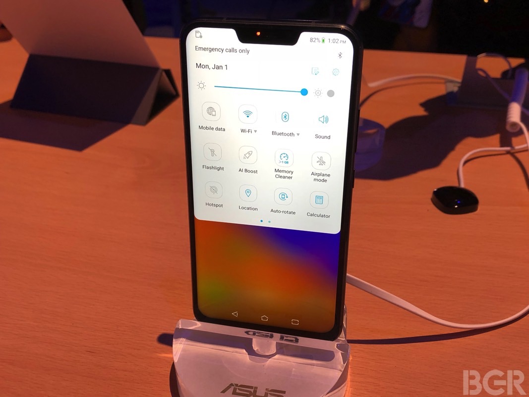
Asus did say that it's smaller than Apple's notch. I mean Fruit company. Here's how Asus "fixes" the notch:
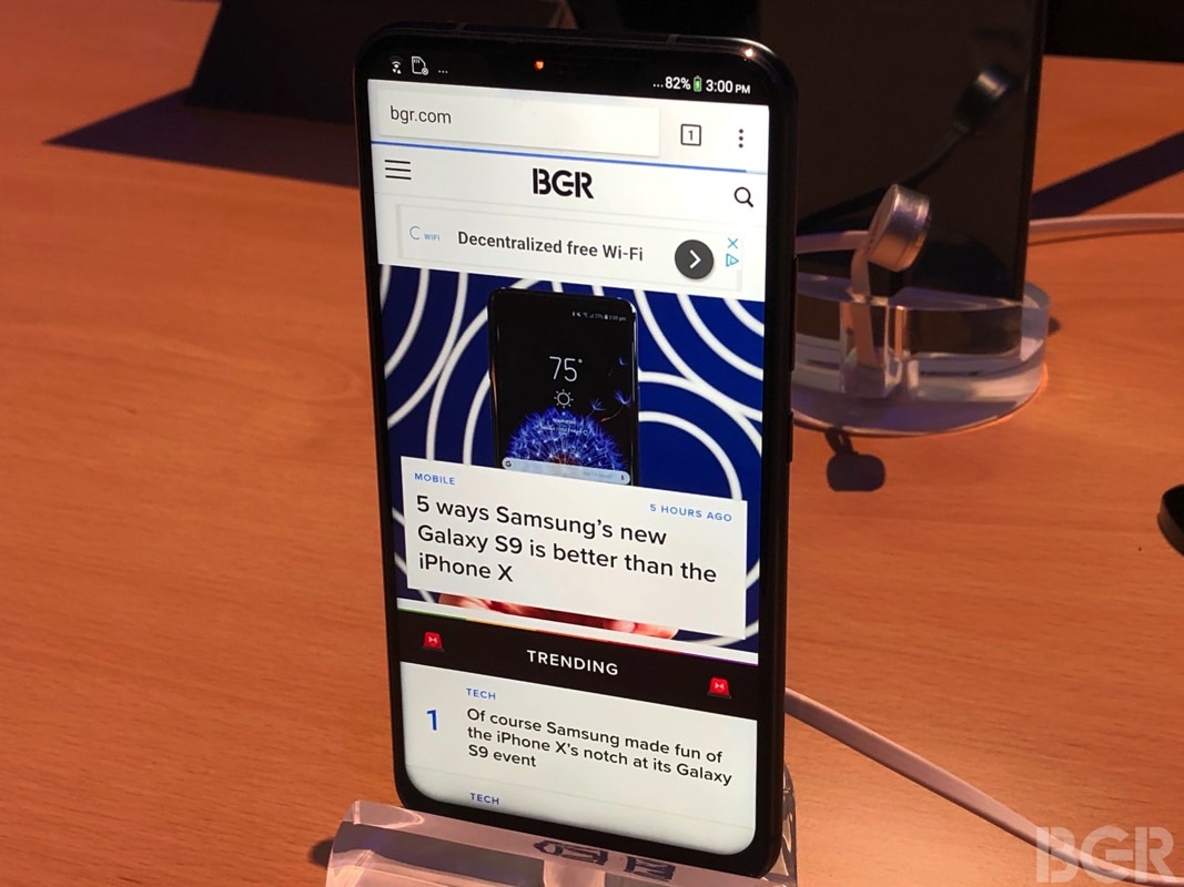
It practically turns the display's ears into black areas that only show certain elements, including wireless indicators, notifications, battery level, and the time. It's how I thought Apple would deal with its own notch. But look again at it, but this time focus on the bottom side of the screen. It's more obvious in the following image shows a video being played on the phone.
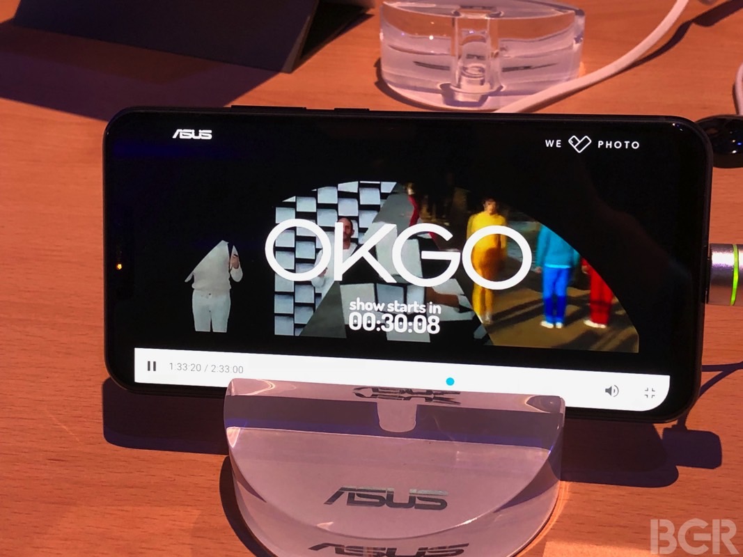
Notice how incredibly ugly the asymmetry is? We have square corners near the top of the phone, and rounded corners on the bottom. These are things you see right away. And it's all hideous. This is how I recommend reacting to it, but Zenimoji do not work on the Zenfone.

Let's get back to the same video playing but without the menu at the bottom. It looks better, but the black bands are still there — same as Apple does it.

On the other hand, when it comes to photo experiences, Asus seems to embrace the notch too, just like Apple does.
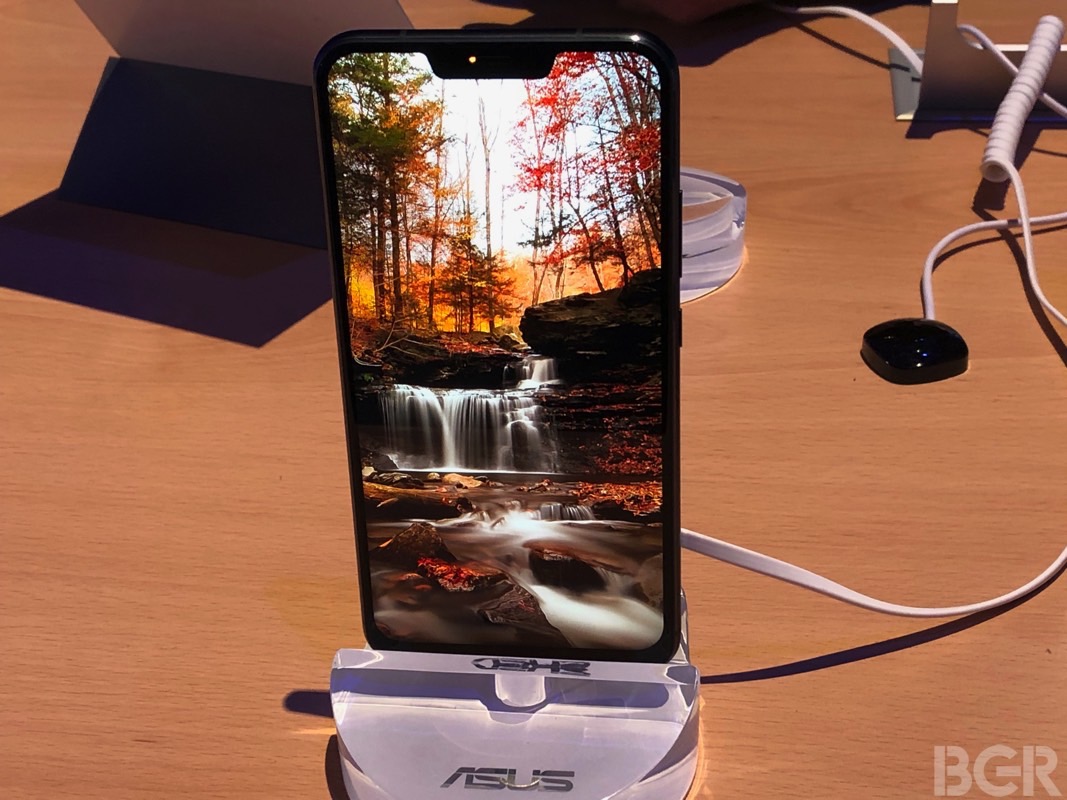
Unless we're taking pics, in which case the notch goes away.
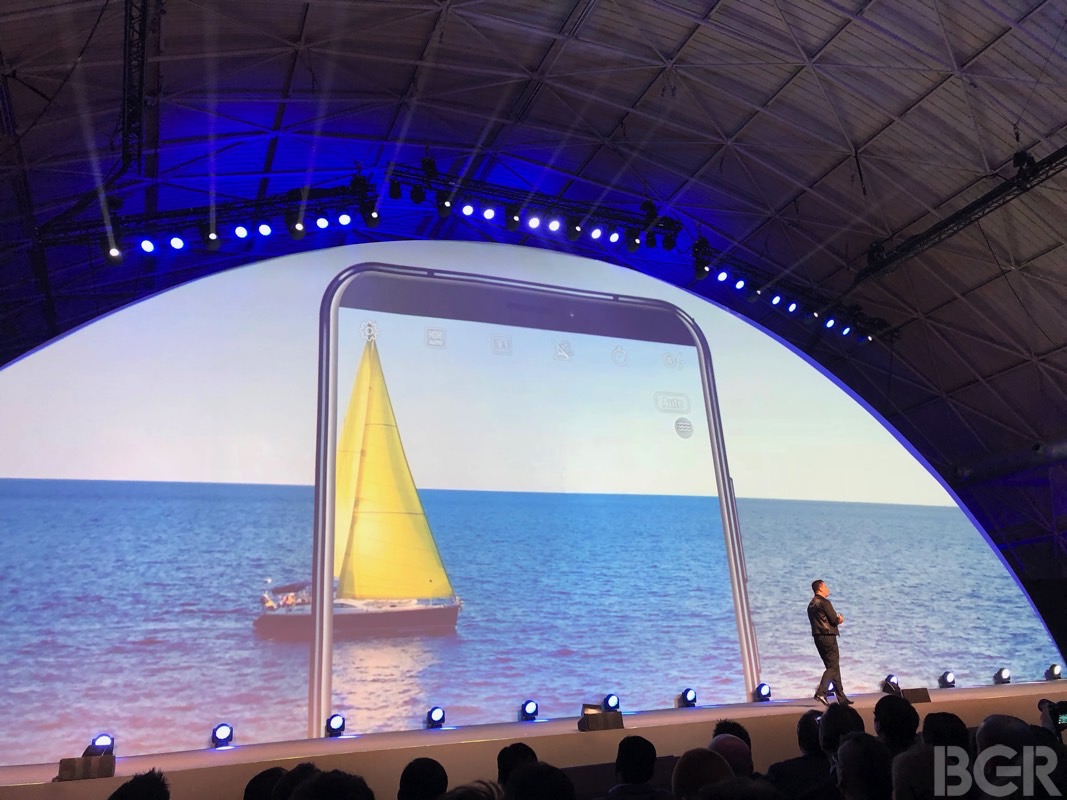
So which is it, Asus, do we hide the notch, or do we love it?
Apple's way of dealing with the notch in software is a lot better. Apple is well aware this is a design compromise, and it's embracing the notch in the system and in apps while maintaining a harmonious edge-to-edge design. Asus attempts to hide it, and the result is a mess.
Finally, Asus wasn't even able to properly copy the all-screen-with-a-notch experience the iPhone X has to offer. The phone has a bottom chin, and that's either because the phone has an LCD display instead of an OLED panel, and LCD displays usually aren't flexible. Or because the phone has a 3.5mm headphone jack on the bottom. Or both.
The iPhone X, meanwhile, has the same bezel all around the phone, something no other company has achieved to date.
