Imagining The iPhone 8 Wasn't Enough, So A Designer Dove Into iOS 12
Apple is likely about a month away from finally releasing the iPhone 8, a handset destined to become Apple's most expensive iPhone to date. Despite the sky-high price point we're all expecting, however, the iPhone 8 is likely to also become Apple's fastest selling iPhone ever — that is, if Apple isn't plagued by the supply shortages that have accompanied all of its big launches of late. Seriously, how crazy is it that it still takes four weeks to get a pair of AirPods? It's been eight months since AirPods were released! But we digress...
The iPhone 8 will be Apple's first completely redesigned iPhone in three years, and Apple fans are practically losing their minds from the anticipation. We all know what to expect for the most part thanks to all the leaks, and we've all seen iOS 11 since it's been available as a beta since June. But what happens next year when iOS 12 rolls around and Apple cooks up a range of hot new features aimed specifically at the iPhone 8? One designer used his imagination to dream up new features and big changes in iOS 12, and the results are absolutely stunning.
Just yesterday we saw a graphic designer whip up iPhone 8 images that show what the phone will likely look like in real life. Adding the fit and finish of an actual Apple product to the iPhone 8 design we've seen time and time again resulted in a gorgeous device that we can't wait to have in our hands. Now, another designer has taken things a step further to imagine what iOS 12 might be like next year.
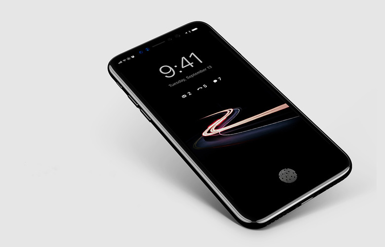
A graphic designer who goes by the name Prince Studio on Behance recently published a series of iPhone 8 mockups. The phone itself looks fantastic, but in this case we're more interested in what's on the phone.
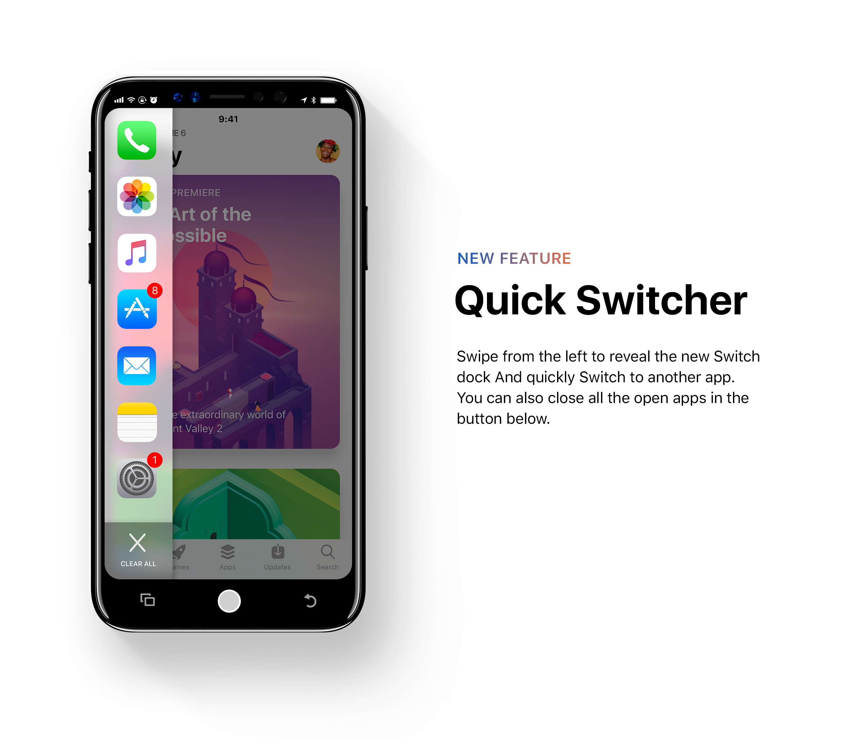
Prince Studio dreamt up an entirely new feature set that Apple might introduce with iOS 12. In the designer's vision, the software gets a big visual overhaul to make use of the iPhone 8's bezel-free design, and to accommodate an iPhone with no home button.

A virtual home button replaces the physical home button of old, and it's flanked by context-aware shortcuts that give the user quick access to things like the camera, alarms, the app switcher, or even a back button. The notification system has been overhauled as well.

There's also a new "quick switcher" concept proposed in the mockups, but we're not sure Apple would ever do something like this.

The new Dark Mode, on the other hand, looks like something Apple definitely would do. And after seeing these concept images, we really hope it finally becomes a reality.


Below, you'll find a quick video that shows the Dark Mode in action, and you can check out plenty more on Prince Studio's Behance page.
