iPhone 16 Camera Control Might Be Apple's Worst New Feature In Years
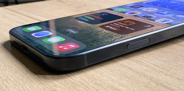
Camera Control is one of the marquee features of the new iPhone 16 lineup. Apple claims it is a "result of thoughtful hardware and software integration, which elevates the camera experience on the iPhone 16 lineup" thanks to a "tactile switch that powers the click experience, a high-precision force sensor that enables the light press gesture, and a capacitive sensor that allows for touch interactions."
The company constantly advertises that the iPhone 16's Camera Control is perfect for never missing a shot. However, after more than a month of trying this new button with both the iPhone 16 and the iPhone 16 Pro Max, I don't think I'm sold.
I upgraded to the iPhone 16 Pro Max mainly because I wanted a larger display and better battery, and I'm fine with it. The Camera Control should be a bonus, but I have a few problems with it:
- Fast-opening the Camera app with it is always laggy for me — sometimes, it actually causes my phone to reboot
- Taking photos with it is uncomfortable because of where the button is positioned, and I think it's hard to use it in both Portrait and Landscape modes
- Selecting camera settings with it is slower than just tapping the screen

While my colleague Chris Smith had a slightly different feeling about his iPhone 16 Plus, he also disliked the new Camera Control functionality. It's important to make clear the fact we are certainly not alone:
On Reddit, tons of posts say how bad the iPhone 16 Camera Control is while very few people seem to be praising it. One of the oldest threads on the topic still has some people complaining about it to this day. One user's comment summed up what most people felt about it.
When I saw this concept, I was very excited despite knowing that I am not gonna buy the phone. Having a dedicated button to open the camera or access visual AI is a great idea, not having to touch the screen would also be great. But seeing how this is so poorly implemented, according to most people on the internet, I am pleased to continue using my iPhone 13 until it is discontinued.
On another thread, a Redditor, who considers themselves a "professional photographer," calls the Camera Control surprisingly "frustrating and inconvenient," mentioning some of the issues I wrote above. On the other hand, another thread praises the Camera Control. Still, most people under the comments say this feature could be better implemented.
A top change would be the position of the Camera Control button. If it were slightly closer to the Side Button, people would think it would be easier to reach and take photos with it. Unfortunately, as it is, the Camera Control seems to be one of Apple's poorest choices for its latest iPhone devices.
