iOS 18 Might Get UI Changes That Look Like visionOS On The Vision Pro
iOS 18 will be the biggest iPhone update ever released. That's what Apple sources who are reportedly familiar with iOS 18 told Mark Gurman a few days ago. I speculated that there's only one thing that could elevate iOS to such status: the inclusion of so-called Apple GPT AI features in iOS. Without AI, iOS 18 can't be the giant leap forward that we're all waiting for.
Operating systems have become boring, and that's perfectly fine. It's not like Apple or Google can deliver major redesigns or revolutionary new features every year.
However, there's one other aspect I didn't consider when assessing Gurman's take: a potential iOS 18 UI redesign. A more recent report says that's very much in the cards. iOS 18 will supposedly look more like visionOS, which powers the Vision Pro spatial computer.
That might sound strange, and it'll certainly cause a fuss among iPhone users if it's true. Change is difficult, after all. But I'm here to tell you that it all makes sense. Not only that, but iOS has to eventually look more like visionOS, even if it doesn't happen this year.
The rumor comes from Israeli blog The Verifier. They learned Apple wants to bring design elements and UI changes to the iPhone that will mimic the Vision Pro software experience.
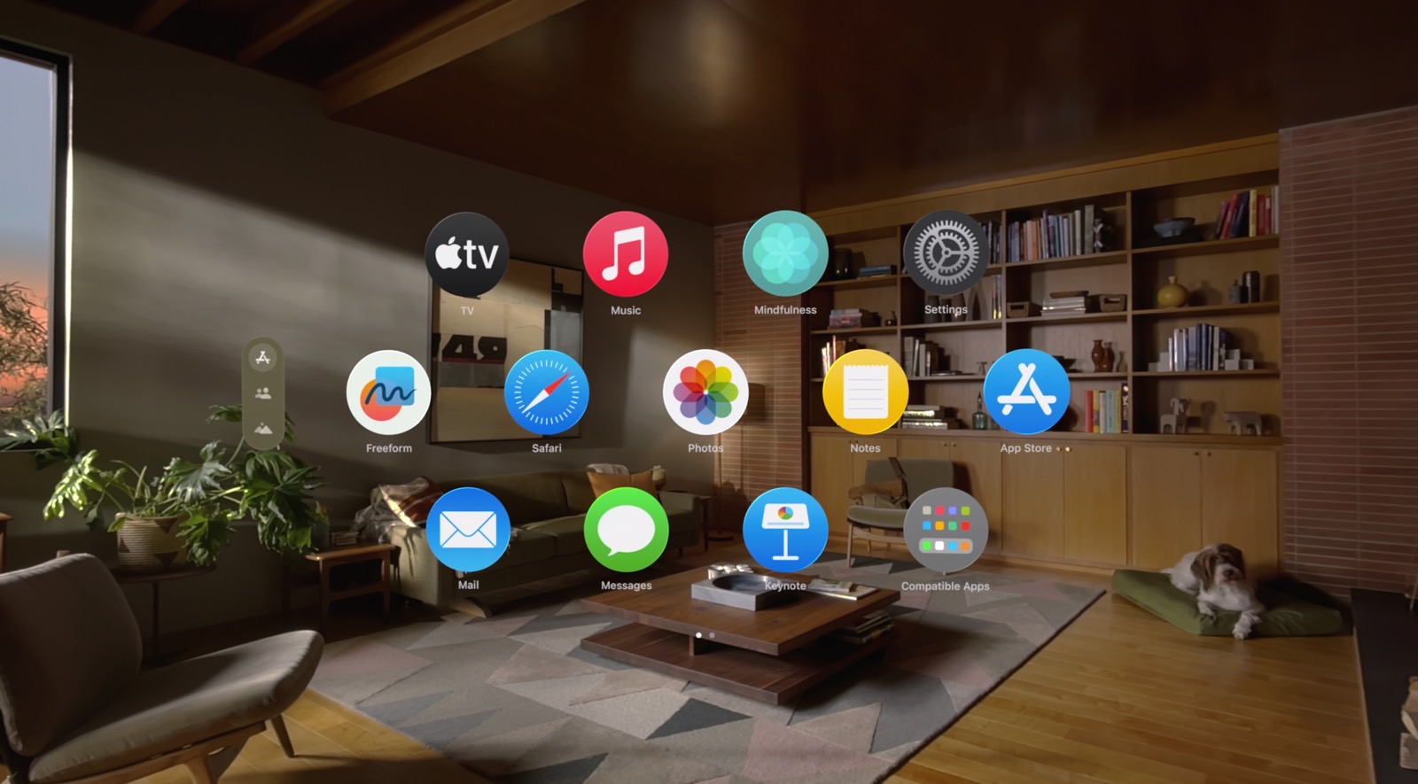
The report points to a few clues that Apple might adopt elements of visionOS UI into iOS 18. First of all, the tvOS 17.2 update brought a floating, translucent sidebar that's similar to what you'd see in visionOS.

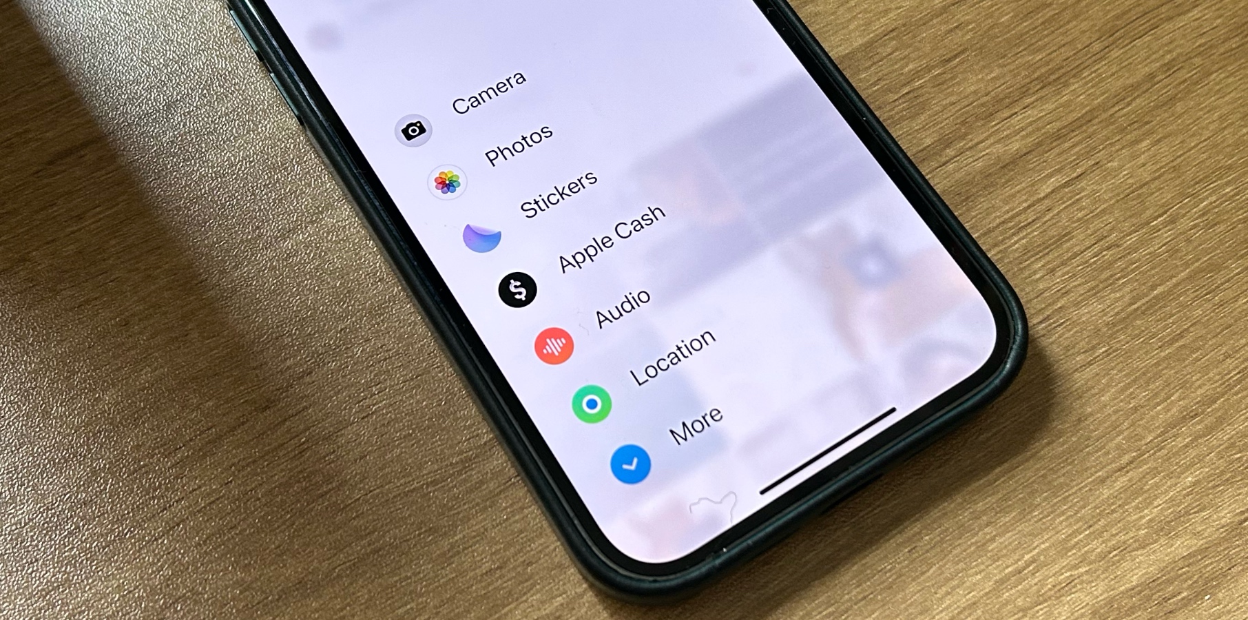
The Verifier also points out the iMessage design makeover in iOS 17. The app comes with a new floating menu that includes all the apps and elements you'd see at the bottom of the app before iOS 17. It's a much cleaner look, for sure, one that I appreciate. The blog notes the design of that floating meu, complete with round app icons, looks nothing like the rest of the iOS experience.
The rounded app icons are more in line with what you'd find in visionOS. Then again, the Vision Pro software experience is based on iOS and iPadOS, though it has its unique particularities. After all, we're looking at spatial computing here, so the user interface can't be a copy of the iPhone or iPad.
The Verifier provides no evidence to prove the iOS 18 redesign is real. Furthermore, MacRumors says the report is sketchy as the Israeli blog has a mixed track record with Apple rumors.
But I'll say that the take makes sense. Even if iOS 18 will not see the big UI changes the report mentions, I expect Apple to do it down the road. The Vision Pro is the precursor of Apple AR glasses that will work with the iPhone in the future. Eventually, the glasses could replace the iPhone completely. That is, we might not use the screen of the device as much as the glasses' spatial computing UI.

In such a future, iOS has to look almost identical to visionOS, especially once the first-gen AR glasses arrive, so we can seamlessly transition between the two experiences.
