Google Maps Is Due For Another Big Design Update, But You're Not Getting Your Colors Back
Google deployed a massive Google Maps redesign a few months ago that angered some longtime users. Google replaced its traditional colors, making Google Maps resemble Apple Maps. This triggered criticism from a former Google Maps UI designer, who explained what was wrong with the user experience beyond the colors.
As a Google Maps fan, I can't say I was bothered too much by the color change. Sure, I'm still surprised to see gray roads instead of yellow, though real-life roads are never yellow. But I do agree with the former Maps designer's take that the app's UI is too cluttered.
The upcoming Google Maps redesign that Google is testing won't deal with all the clutter. But the UI is in for a few interesting changes, which may improve the overall experience.
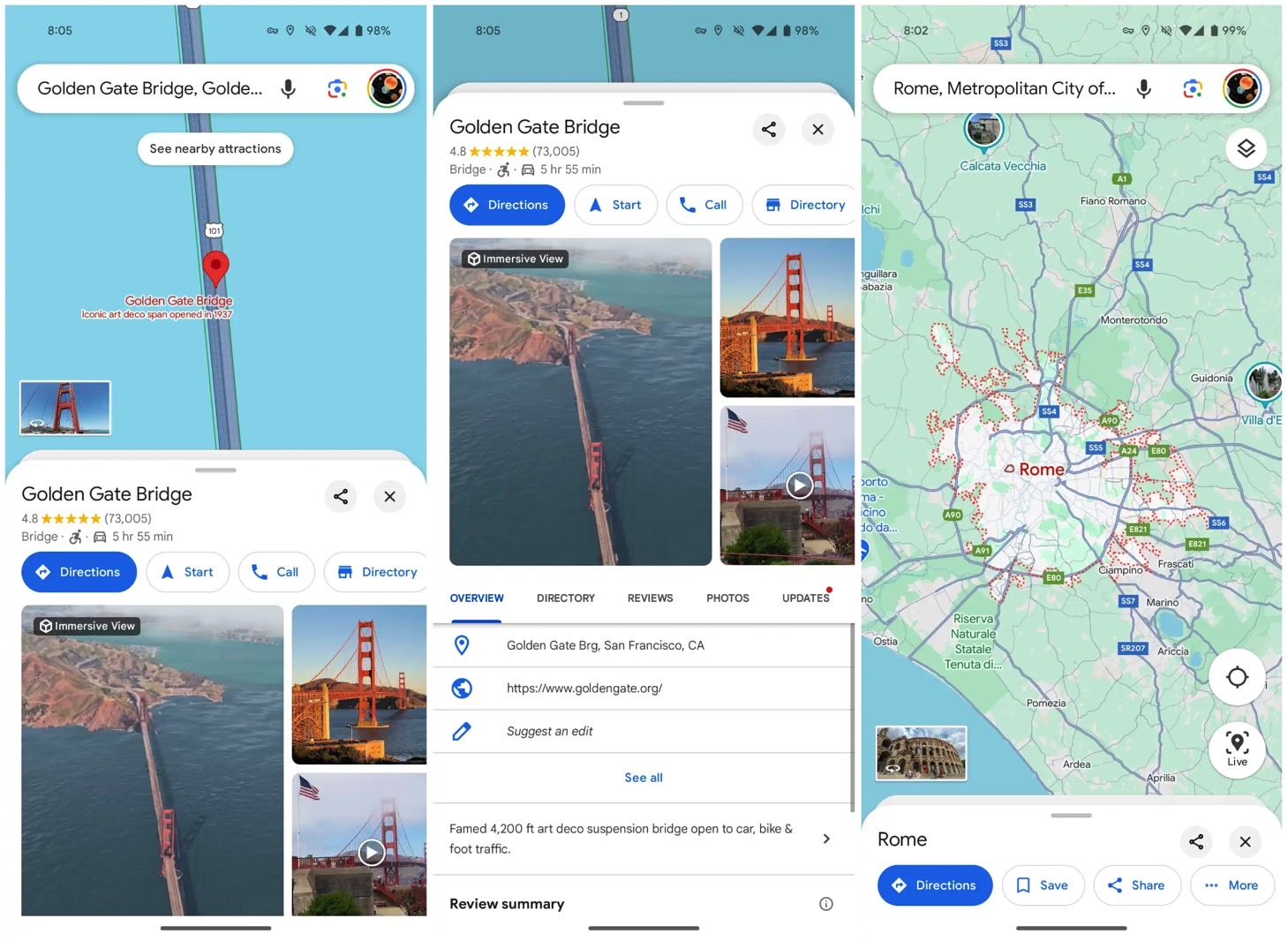
It's unclear when the new Google Maps design will roll out, but 9to5Google has already discovered it in testing. As you'll see in the following screenshots, Google is going for a cleaner design that focuses on improved usability. The UI changes will also make the actual maps shine.
The new Google Maps design will change how a location's sheet appears on the screen. The information sheet of a point of interest gets rounded corners that make room for the map in the background. That way, you'll be reminded of where you are in the app.

You'll find the share and close buttons atop the sheet in the right corner. This is a cleaner look that lets you get back to inspecting the map more intuitively than before.
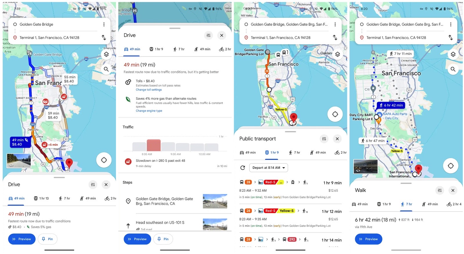
I think that the changes to Google Maps's UI for directions and navigation are even more interesting. For example, the carousel that lets you choose between different transportation methods is now at the bottom. As someone who prefers Safari's bottom URL bar on iPhone, this is a welcome addition. It'll be even easier to interact with the bar with one hand.

The images above show that redesign in action. Again, the focus of the UI seems to be on the actual maps of the region you're exploring. I think the changes Google is testing are actually better than the current navigation experience.
That said, it's unclear when the Google Maps redesign will roll out. The screenshots 9to5Google shared come from an Android device running version 11.113.x of Google Maps. When the upgrade is ready, Google will likely give it a proper announcement and launch it on iPhone.
