Yosemite Vs. Mavericks: Here Are Apple's Subtle And Not-So-Subtle Design Changes
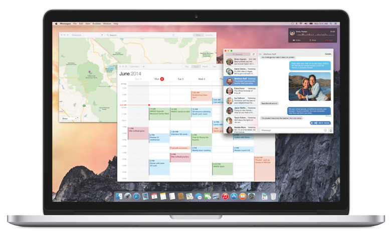
Just as expected, Apple's OS X Yosemite operating system has a brand new design that's more like to iOS than its predecessor. Apple has employed various subtle and not-so-subtle design tricks to make the transition, while trying to preserve the same functionality Mac users have grown accustomed to when it comes to basic OS X features. Pixelapse has taken an in-depth look at Yosemite's design, comparing it with similar elements from Mavericks, and highlighting the good, the "okay" and the bad design features of the new OS.
For starters, Yosemite has a new login screen that's "much cleaner and sleeker" than Mavericks, while the most obvious design change appears to be the translucency effect of the "materials" used to build Yosemite, as Apple's Craig Federighi put it, a feature the executive praised over and over during the WWDC 2014 keynote.
Apple also completely overhauled the dock, removing the shelf-like appearance and redesigning the app icons to better match iOS 7 design lines. Of the redesigned icons, older Mac users will immediately notice the new Finder icon, which appears to be a lot happier than before, but also the new Trash design, which Apple said it put a lot of effort in.
The Menu Bar is "cleaner and sharper," with each icon being "a hairline thinner" than in Mavericks. Flatter user interface elements are also present throughout Yosemite menus, in line with the overall design language for the OS.
The "traffic lights" in the top left side of app windows have been tweaked as well, sporting a flatter design and offering a new functionality. The green button now moves the app into full screen rather than to an user-generated size, a change from Mavericks and previous other OS X versions.
Another big change for Apple is the default font. In Yosemite, Apple moved from Lucida Grande to Helevetica Neue, which is much tighter.
The publication found some design inconsistencies when it comes to the whole layout of the Safari browser, but also when it comes to back/forward button placements throughout the OS. One other potentially annoying Safari feature is the absence of the full URL of a webpage, which makes Safari look better in Yosemite, but isn't necessarily useful for some Mac owners.
The Search bar inside Safari and Finder is also a potential annoyance in Yosemite, as it apparently resembles more a button rather than a text-friendly field.
A few screenshots showing Yosemite vs Mavericks comparisons follow below, but you can follow the source link at the end of this post for a more detailed design comparison between these two OS X versions, complete with more images.
