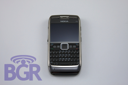
Nokia E71 Review
So there's this phone called the Nokia E71. It magically showed up on our doorstep yesterday (shout out to FedEx Sameday!) and was begging for us to review it. Well, we're not going to disappoint you. In fact, there will be no disappointment at all as you'll see in our review. The Nokia E71 has officially entered the ring, and it's coming out fighting. Spoiler Alert: we love this phone. Full review is after the break!
Design:
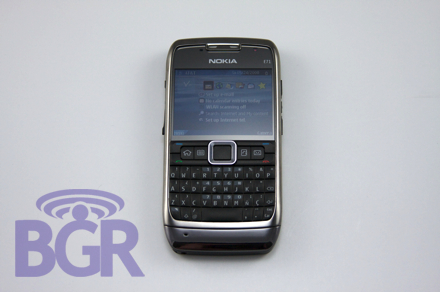
Obviously this is subjective, but this could really be one of the sexiest damn phones we've seen in a very long time. We could do without the tacky pattern on the back battery cover, but we'll let it slide this time. The entire phone is chrome and while it's definitely a fingerprint magnet (just have your assistant wipe it down for you) it looks really sharp in person. Everything is proportionate and sort of just works well together. The middle select key actually serves as the notification light, too. So when you have a missed event, the border around the middle key will glow white until you cleared the event, or until the expiration time you set for the notification light expires. It's a nice touch and a creative way to get rid of the annoying older-fashioned status light. Oh yeah...did we mention this thing is thin? Seriously, we don't know how they did it. Especially with everything that's packed in here...man, that BlackBerry Bold is just huge compared to this. Everyone is going to have to step it up after this because as of now, we can't find one single thing Nokia sacrificed to make the device this thin and compact.
Screen:
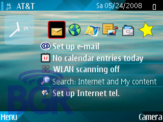
There's a 320x240 screen on the E71 and it looks very sharp. It's not as bright as the N95, but it's very clear and easy on the eyes. Screen real estate isn't a problem at all as we find it more pleasurable to use than an N95. Pictures and video look very detailed and clean. There's a decent amount of contrast when looking at media, and you'll especially appreciate the screen during some heavy web browsing.
Connectivity:
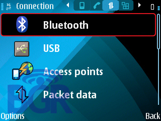
The world must be changing. Remember when Nokia would hold every single feature above your head and never give you the perfect phone? Well, we're finally getting past that. We're not positive if there's support for the 2100MHz band here, so for now, we'll assume it doesn't have it and there will be a US NAM model, and European model. In terms of the hard connectivity specs, you've got a quad-band GSM/GPRS/EDGE phone with 850MHz/1900MHz UMTS/HSDPA support, Wi-Fi 802.11 a,b,g, Bluetooth 2.0, and GPS. Like most recent Nokia's, the GPS is assisted by the network, but fret not because there still is a physical GPS chip in here.
Sound:
Like the E61 and E61i before it, the E71 houses a single speaker in the upper left of the phone. It seems louder than the E61 and it's pretty clear for ringtones and alert sounds. Music sounds fine on it, but it's not perfect. Bass is seriously lacking and you do get a "tinny" sort of sound. It is very, very loud, though, so you can be sure that alarm is going to get your ass out of bed in the morning.
Email:
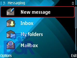
What good would an E-Series device be without email? Besides the normal POP3/IMAP supported protocols, Nokia's Mail For Exchange comes with the device out of the box and is incredibly easy to setup. The handset supports BlackBerry Connect (though we didn't actually try it) and we'd imagine Goodlink as well. The messaging application had a little bit of a visual makeover, and it's for the better. Text is extremely readable and emails look great. We'd have loved to see support for HTML email, but oh well.
Keyboard:
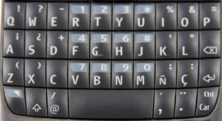
If there had to be one negative to the E71 (relax, it's not the end of the world) it's going to be the keyboard. Again, not a huge deal, but if we had to pick one thing to single out it's the keyboard and it quite possibly won't bother you. It did annoy us, though. Think of the physical keys on the E71 the same as the E61, just a lot smaller. They're also not as squishy which is nice, and they're pretty easy to press once you get it down. Our issue is, again, Nokia has not learned the basic keyboard layout and we personally can't stand it. On a normal QWERTY keyboard the letter "z" is not directly under the letter "a". It's either under the letter "s" or somewhere in between the two. This makes typing a royal bitch if you're not looking directly at the keyboard and is totally unnecessary. All they had to do is stick the damn period key in front of the "z" key and all would be well. Again, this might not be a big deal to you if you're coming from a QWERTY E-Series already, but for us hardcore freaks who bang away constantly on the keyboard, we'd like the normal layout that's used on basically every other QWERTY phone on the planet. Fix it please, Nokia. The keys have a nice white backlighting which makes them very easy to read. Just like the other models, the actual keys don't light up, just the letters and symbols which makes for a very clean and sexy look.
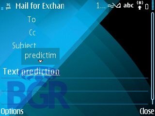
Something also interesting is the inclusion of predictive text on here. You might be thinking why you'd ever need predictive text when you've got a QWERTY keyboard, but it actually helps more than it gets in the way. It sort of works like how the iPhone does. If you're typing fast and accidentally misspell a word but keep typing and hit the space bar, it will auto correct and suggest that word for you. It can also save you a good amount of typing time as it will suggest words for you when you are halfway through them and a simple press of the space bar selects the suggested word and keeps you moving.
Expandability:
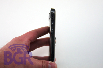
There's a microSD card slot right above the microUSB port on the handset, so you should be able to expand the memory of the phone to the largest microSD card you can find. We haven't checked data transfer speeds to the memory card over USB yet, but we're assuming it's on par with the rest of the Nokias.
Call quality:
Nokia and call quality go together like ham and burger. Kool-Aid and sugar. The E71 doesn't disappoint. We've had such a pleasurable experience with it that we've been calling people randomly just to talk on the phone. In all seriousness, it meets or exceeds what we've come to expect and love from Nokia. A phone that excels as a phone, as it should. It actually went toe-to-toe with our BlackBerry Curve in terms of holding onto a signal in low coverage areas. And all you BlackBerry lovers out there know that RIM makes one hell of a cell radio in those things.
Battery:
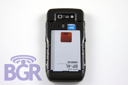
There's a 1500mAh battery in the E71, and with a full day of heavy use like constant email, phone calls, web browsing, and all around messing with the phone, we've still got around 2 bars left. There should be no concern with the battery life here.
Conclusion:
We're at the end of the review, but by now, you've seen how impressed we are with the phone. It takes a lot to get us excited but the E71 has done it. This thing, in our opinion, is the best phone Nokia has made to date. That's a very bold statement, we know. But this really is going to be the phone to beat by a lot of manufacturers. From the design, to the specs, to the size, the feel — it has the entire package. It's not for everyone, though. Some people prefer a straight up phone like a flip phone, but in terms of a smartphone with a QWERTY keyboard, this takes the cake. It is just striking compared to the shit device the E61 was. It's ok, we still love y'all that carry the E61, but this puts it to shame. One thing I personally can't get over is the awesome dimensions of the device. It's so perfectly thin, yet incredibly comfortable to hold and use. We just hope Nokia doesn't wait too long to bring this to market as they need to strike now. Like right now. This second. After seeing all of the detailed shots and our impressions, how do you guys feel about the phone? Are you foaming at the mouth waiting for it or ice-grillin' us?
