Motorola DROID 3 Review
Motorola has been on a roll. With the introduction of the original DROID handset, a phone that we exclusively showed the world, Motorola has been set on a path of success with Android. The first Motorola DROID was innovative and brought forth a brand new version of Android, Android 2.0. The device featured a high resolution display with full QWERTY slide-out keyboard, and ran on Verizon Wireless' solid voice and data network. Motorola and Verizon followed it up with an evolutionary upgrade in the DROID 2, but the Motorola DROID 3 is supposed to be the next big step in both hardware and software. I have been using a Motorola DROID 3 for over a week now, and my full review is after the break.
Hardware / Design
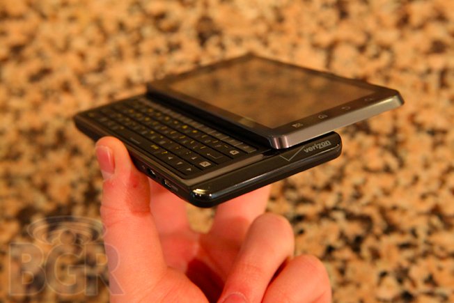
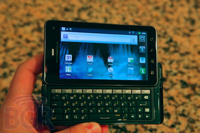
The Motorola DROID 3 is taller and wider than the original Motorola DROID from over two years ago, though it's also a hair thinner. This is due in part to the 4-inch display that replaces the 3.7-inch LCD found on the first DROID and DROID 2. Still, the bezel surrounding the qHD screen seems abnormally large and makes the entire handset footprint very big.
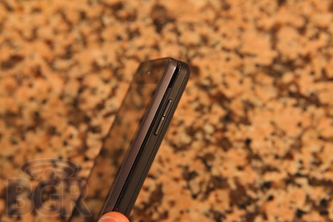
The DROID 3's build materials are top notch though, complete with a metal bezel around the screen, a soft-touch rubberized finish and high-quality glossy plastic on the back. On top of the device you'll find a power on/off/lock button in the center along with a 3.5mm headset jack towards the right. The power button itself is recessed and unusually difficult to press, I should add. On the right side there's a volume up/down rocker, and on the left side there is a mini-HDMI port and a microUSB port. Around back there is an 8-megapixel camera with a dual-LED flash, and it's capable of 1080p HD video capture.
The device itself feels reasonably solid, though it really is heavy. Combined with such a large footprint, the Motorola DROID 3 doesn't feel like a phone that should be replacing the original DROID, even if the internals say otherwise. It's really big, and seemingly without reason. Phones should be getting thinner and slimmer, not thicker and wider, especially when they're replacing such an innovating handset like the original Motorola DROID. In my opinion, Motorola's inclusion of a 4-inch display forced the company to take a step back hardware-wise, instead of leaping forward. This was a trade off that wasn't worth making.
The display on the Motorola DROID 3 is a PenTile display, used in the company's other dual-core handsets like the Motorola ATRIX 4G. This display, while using less power over superior qHD displays, looks incredibly pixelated, and cheap. Text is blurry at times, especially combined with Motorola's custom UI when scrolling between app panes, for instance.
Keyboard

The full QWERTY keyboard has been a staple with all Motorola DROID devices, and the DROID 3's doesn't disappoint. It's easily the best keyboard of the pack, and the best overall on any Verizon Android handset I've used. Keys have definition and the keyboard is spacious, complete with a dedicated number row at the top. The buttons also have a perfect tactile feel when pressed, and the backlighting looks very good in low-light conditions. The layout of the keys is even a major win, as most manufacturers constantly muck up key layouts; the keys are placed properly here.
Motorola also included directional arrow keys, which are great to have on the physical keyboard. Oddly enough though, the accent symbols on the keyboard include very rarely used symbols (for most of the U.S. population) like a yen symbol, { } symbols, and comically, even an elipsis.
Software
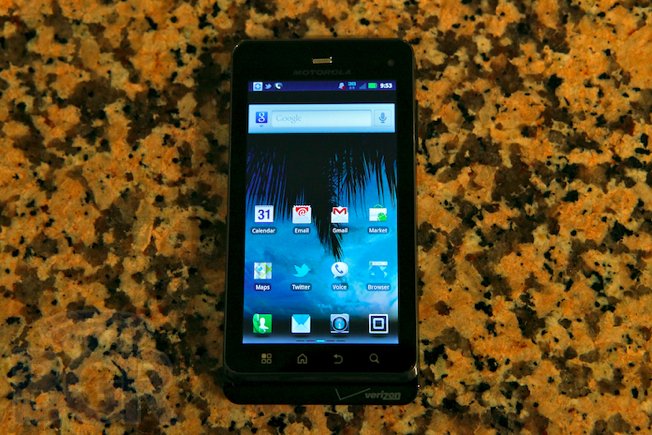
The DROID 3 runs Android 2.3 Gingerbread, but with Motorola's customizations you'd pretty much never know it. Google's fastest Android OS stutters on the DROID 3, and it also faces random slowdowns. Motorola's UI clearly appears to be the cause. Cheesy animations and effects like 3D scrolling, darkening and lightening of widgets and screen sliding make the device actually feel slower than it is and it's pretty mind boggling to think that Motorola thinks cheap effects were worth the sacrificed performance in order to try and differentiate their device. The DROID 3 packs a dual-core 1GHz processor, but you definitely wouldn't know it.
Little things software-wise annoy me. For starters, the ability to touch and hold an app and have the phone let you immediately drop it on the home screen was a nice shortcut in Android. Motorola has replaced that with the following functionality: touch and hold an app, and be prompted to add the icon to the home screen, or add it to a group. It's not a huge deal, but it's an unnecessary addition to something that worked very well to start. Similarly, most of Motorola's customizations aren't enhancing Android, they're making it worse. And for an OS that already doesn't offer the ease of use and fluidity of a platform like iOS or webOS, Motorola shouldn't be making UI changes just for the sake of making UI changes. Instead, the company should be trying to make the platform better and lighter, but it is adding rather than subtracting.
Running Qualcomm Labs' Vellamo benchmarking tool, the Motorola DROID 3 performed reasonably well as far as raw tests are concerned, though coming in below the HTC Sensation and HTC EVO 3D, and even other older devices like the HTC myTouch 4G and HTC Desire S. This obviously shows the large role that both hardware and software configurations play with a device's speed, but it's interesting that Motorola's flagship handset is slower than HTC's non-flagship handsets, even with the heavy UI customization that HTC uses with Sense.
Phone / Battery

Talking on the Motorola DROID 3 is one of the worst voice experiences I have had in recent memory. In fact, I can't actually believe that a network with as high standards as Verizon Wireless would release a device this bad as far as the phone function is concerned. Calls are often choppy and distorted, they cut in and out, and callers on the other end sound incredibly tinny. Volume isn't that great either, and I've had to keep the volume all the way up at all times during testing.
The speakerphone suffers from most of the same issues, with choppy audio, thin sound quality and poor projection.
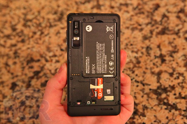
As far as the battery is concerned, battery life on the DROID 3 is reasonably good. With moderate use, the battery lasts through a day with ease, and you could even probably squeeze out two days if needed. This included some basic web browsing, music playback, and light app usage. As soon as I started playing video, or recording video, or even taking photos, battery life became noticeably diminished. Again, with moderate usage, you should be able to power through a day even with push Gmail and an Exchange server set up, though nightly recharges will be mandatory.
Conclusion
The Motorola DROID 3 was rushed and I'm betting pushed to the side in favor of the upcoming Motorola DROID Bionic. There is no other explanation. The fact that Motorola and Verizon could release the third major iteration of the original Motorola DROID and have most of the handset's usability features not live up to the first is disappointing, especially because the phone is more than competitive in terms of raw specs.
Motorola pretty much missed the boat with the DROID 3. While it adds necessary features like a dual-core CPU, global roaming, and a qHD display, the sum of these parts surely doesn't equal an enjoyable product in every day usage, even if they do on paper. Phone calling is borderline atrocious. The device is just too big and heavy, doesn't feature a solid UI, and isn't unique enough to offer a compelling reason to buy one over another Android handset on Verizon, especially not with the Motorola DROID Bionic on the way. Unfortunately, this likely isn't the DROID you're looking for.
