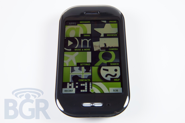
Microsoft KIN Two Preview
We've only been using the Microsoft KIN Two for about half a day. Even though that isn't enough time to put a comprehensive review together, we can still comment on our initial reactions about the device.
The Microsoft KIN One and KIN Two are aimed at a non-professional crowd, mostly the young Justin Bieber generation. For phones in this category, they definitely do pack a punch. For starters, there is Microsoft Exchange support (no calendar support), an 8 megapixel camera with 720p video capture, Wi-Fi, Bluetooth, a slide-out QWERTY keyboard and all the social networking integration you could want. Microsoft actually is not very spec-heavy when pushing this device as they realize the specifications are almost irrelevant to the target buyer — and that's smart.
The real issue is that we cannot remember a phone in recent memory that has felt so cheap and so clunky to use. Seriously. For some reason — and I am really not exaggerating here — I do not remember ever being so frustrated with a phone. It is slow and far from intuitive. There are feature phones that I would rather carry around with me. The one saving grace we thought the KIN had was that the data plans would be more economical than the traditional $30/month unlimited data packages. Well, we were wrong. The KIN Two goes for $99.99 on a two year contract after $100 MIR, but you still need that $30 data plan on top of your texting plan, on top of your voice plan (or family plan). I'm sorry, but I don't see the advantage of a device this limited in this day and age, not with $100 Android devices, $100 iPhones, and $100 BlackBerry handsets (that all use the same $30/month data package). The concept is fine, but the execution is more a mashup of glitter, key lime pie, and a crappy stained glass window artist all thrown together under Sharp's assembly lines.

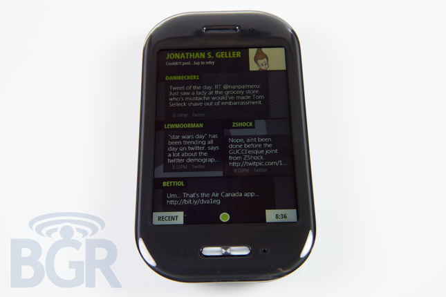
Yes, the added value stuff is cool — KIN Studio lets you see a historical archive of your entire phone, complete with text messages, photos and videos, and KIN Loop on the homepage is great in theory — but again, the execution here is the issue, and it reminds me of Motorola's MOTOBLUR mess of a homescreen.
Going one step further, this device kind of spoiled my excitement for Windows Phone 7 — it is definitely not the same (though they do have the same base kernel), but it seems to be a little peak into that window, and from where I am standing, I don't like the view. We have some photos ready to go in the gallery, plus the HTC Incredible makes a cameo for some size comparisons.
