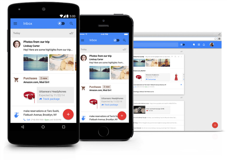
Inbox Vs. Gmail 5.0: The Most In-Depth Comparison Yet
Google may think of Inbox as the future of email but that doesn't mean it's hanging its Gmail app out to dry. In fact, the recently released Gmail 5.0 update is the most dramatic overhaul of Gmail we've seen in a very long time, as it marks the first time that Google has brought Material Design to its hugely popular email app.
RELATED: Google is trying to 'fix' email with a new Gmail alternative
IDG website GreenBot has taken a look at both Inbox and the newest version of Gmail and has written a great in-depth comparison that discusses the strengths and weaknesses of both apps to help you decide which one you should use to manage the large piles of email you get every day.
Inbox obviously gives you a lot more customization options for your email and, among other things, it lets you "snooze" some messages that you need to respond to but that you don't feel like responding to right at the moment you receive them. This means that they will pop up at a later time so they don't get lost in your inbox shuffle by a flood of newer mail. Other customization features include integration with Google Now to make your inbox more like a to-do list and email bundles that put similar types of emails together in one package.
You don't get quite as many bells and whistles with Gmail 5.0, but it still does give you things that Inbox can't offer right now. For instance, you can get support for Microsoft Exchange, Yahoo, Outlook.com, IMAP, or POP mail. What's more, Gmail also makes it easier to delete emails and to make individual labels for some types of messages.
The full comparison is worth reading and can be found at the source link below.
