HTC Hero Review
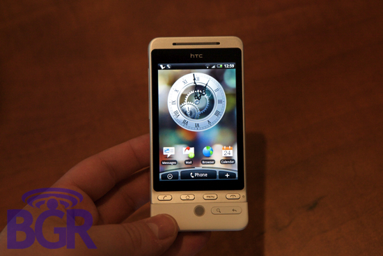
When I fondled the HTC Hero for the first time a month or two ago, I was instantly floored. I mean, Android looked this bad ass? It was actually functional? The T-Mobile G1 was a non-starter for me, the HTC Magic (HTC variant) was a cool mess around device I had (a custom white one with U.S. HSDPA might I add) but it wasn't until I saw the Hero where I actually thought, "Wow. This could actually be a device I'd want to use." Multi-touch capacitive screen, Flash support in the browser, full Microsoft Exchange support? Oh man...
But it's not all roses, ponies, and rainbows. Since my time with the device pre-announcement was limited, I was quickly shown the best that the Hero had to offer. In terms of the inner workings however, not so much. All that changed since the Teflon Don found its way to BGR HQ and I've had plenty of time to size it up from top to bottom. So what's the verdict? Hit the jump for the full review.
Hardware
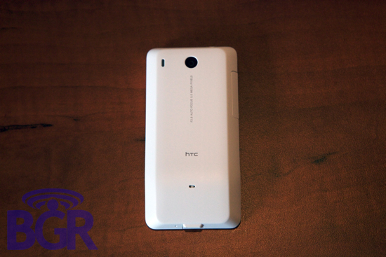
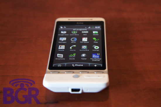
HTC went from this little nothing company to literally a manufacturing champion practically overnight. Their hardware is top notch and with each product cycle, it constantly improves and is refined. The HTC Hero's exterior is nothing short of amazing. The metal bezel around the entire screen with the white Teflon-coated plastic shell both reek of elegance and sophistication. The four main navigational buttons on the front (send, home, menu, end) are all made of aluminum just like the bezel so they blend in perfectly in terms of looks and feel. Additionally, the handset in general is very comfortable to hold and fits nicely in your hand. The trackball is placed nicely in the now rigidly-sculpted signature Android "chin" but there's two buttons that we can't (we can, there's no damn room) understand why they are placed where they are: the search button and the back key. Here's the issue... since the phone has this chin thing that everyone either hates to love or loves to hate, you have to hold the handset higher up in your palm in order for it to be useful as a touchscreen-based handset. What happens then, is you're forced to stretch your thumb all the way down below the screen itself — below the row of four navigational buttons, in order to hit the back key which is used incredibly frequently since there is no touchscreen equivalent.
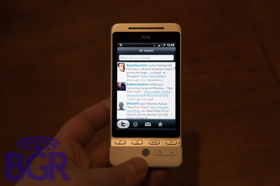
It's not so bad if you're not really getting jiggy with the handset, but if you're entrenched in some serious Google Voice action, or in your inbox, it's an annoying pain to switch positions with the phone in your hand just to move down and hit the back button. Our choice? Move the Menu button to the left side of the trackball and put the back button where the menu button was on the strip of four. Have a nice day.
Software
Thank the lord for HTC as far as Android is concerned. For anyone that does anything of importance with their lives (doesn't live on Gmail and actually requires corporate functionality — half kidding, kind of not), the standard Google builds are effectively useless to us. Luckily HTC has saved our cold, robotic hearts from Mountain View's default experience. There's literally too much to list, but HTC overhauled everything as we'll explore a little later, and this includes home screens, widgets, contact lists, messaging, email, information syncing, the camera interface, keyboard, web browser, music player, GPS, calendar, photo albums, and much, much more. It makes the phone feel like an almost brand new OS and for something as new as it is, it's pretty incredible. To be fair, this in itself is the beauty of Android — it doesn't hold OEMs back, it encourages them to smack it around and mold it into something entirely their own.
Keyboard
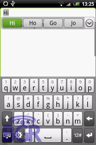
Since there's no physical keyboard on the HTC Hero, there's a built-in virtual keyboard to handle all your data entry needs. How well does it work? It's decent if not mildly frustrating at times. One of the reason the iPhone keyboard works so incredibly well is because their correction system is second to none. HTC's is decent, but it's still not in the same class as Apple's integration. The keys are decently sized and do provide a nice little enlarged key popup when you press one (though they can be a little slow to show and if you're a normal human, the enlarged key popup will be of little use as you've already moved on to the next key).
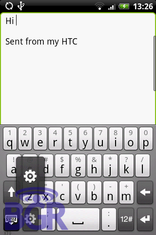
A couple annoying things with the keyboard: Maybe it's just habit, but the "12#" symbol entry button should be on the other side as there's no use for a damn settings key IN THE ACTUAL KEYBOARD. That's what the settings section is for. Another annoying trait is the fact you have to manually hide the keyboard when you're done typing. Say what? Wait, how about this... you have to manually tap the text field to bring up the keyboard. Uh... why? This isn't HTC's fault, but the fact Android doesn't auto-launch the keyboard in 98% of everything we've come across is ridiculous. So, the keyboard is kind of clunky and slow, the auto-correction isn't that great, you have to manually bring up the keyboard when you want to use it, you have to manually hide it when you're done typing, and there's a settings key in place of where the symbol key should be. Rock on, fellas.
Screen
The 3.2-inch 480x320 capacitive multi-touch display used on the Hero (we believe it's the exact same panel as used on the Magic as well) is fantastic. The touch input is second to only Apple's capacitive touch screens and as far as the display itself goes, it's wonderfully bright, vivid, clear, and crisp. One of the reasons I had an issue with the original G1 was the lack of multi-touch. Android's default browser (to me personally) is a joke. Navigation is more than clunky, it's the opposite of intuitive, and I'd rather use my BlackBerry browser. Word, son. Thankfully multi-touch is incorporated into other areas of the OS besides just the browser, and this extends the fluidity of HTC's improvements but as you'll soon see here, it's a two-faced coin because as much as it adds, it subtracts.
Speaker / Music
The speaker is fine. It's not great, it's pretty loud as far as the top end is concerned but what's really nice is that since the shape of the Hero is a tad bit curved, when rested on a flat surface like a desk, the speaker placement doesn't get muffled and makes it a pretty useful speakerphone.
We really liked the music player on the Hero. It's not a full-fledged MP3-playing companion like an iPod but it's simple to use, you can scrub through music, flicking through tracks was enjoyable, playlists and organization followed HTC's Sense slider theme and works really well here. Very nice.
HTC Sense
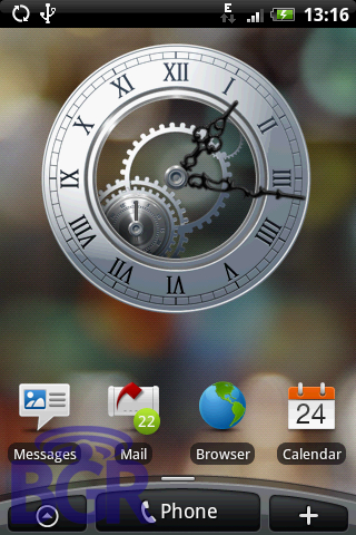
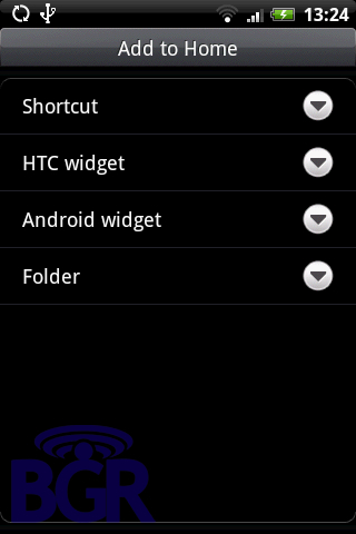
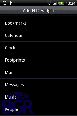
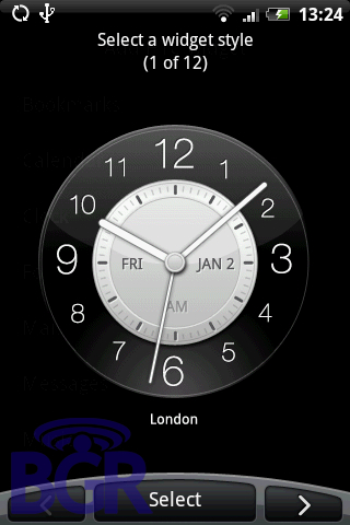
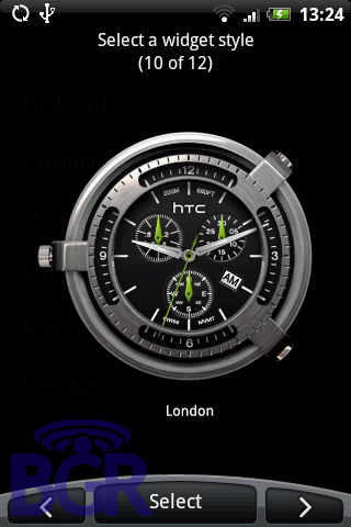
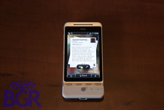
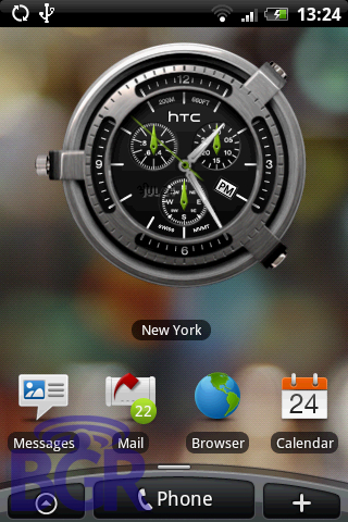
Man... HTC has done it again. While TouchFLO on the original Touch Diamond was a huge gamble for them, they've kept pushing forward and practically made Windows Mobile almost lovable likable. Well, HTC Sense is basically a Palm Pre killer and it's just a freakin' skin! Literally. The Pre is cool but borderline useless. What HTC's Sense does is add a beautiful layer to Android that lets the user interact with their phone in fun, entertaining, and most of all, productive ways. Their clock widgets are gorgeous, their Twitter widget (and Twitter client) are great, their messaging and weather widgets don't disappoint. You can customize the crap out of your Hero and make it exactly custom tailored to you and your tastes.
HTC's beauty isn't just skin deep, it extends beyond the surface and integrates more heavily with the actual OS. A true testament to Android's open and customizable nature. You can, in addition to linking Twitter, link up your Facebook and Flickr accounts and let all of them co-exist naturally in a seamless playground of contacts, photos, and notifications. Facebook profile pictures and birthdays can sync up with your contacts, your Google contacts can live with your Exchange contacts in harmony, and Flickr photo uploading is only a couple (probably 25) seconds away.
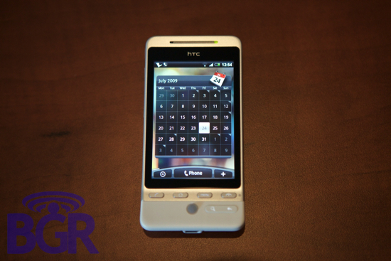
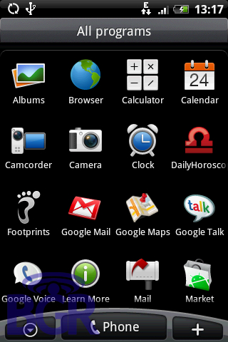
Typical HTC doesn't do the bare minimum, though, and you'll find practically every damn .png or graphic on the Hero customized from the original Android base build. From the custom HTC dialer to call logs, to the notification drawer to the mail application; they've brought Android even further in the future than where Google probably thought it could go, and we're only around a year in.
Battery:
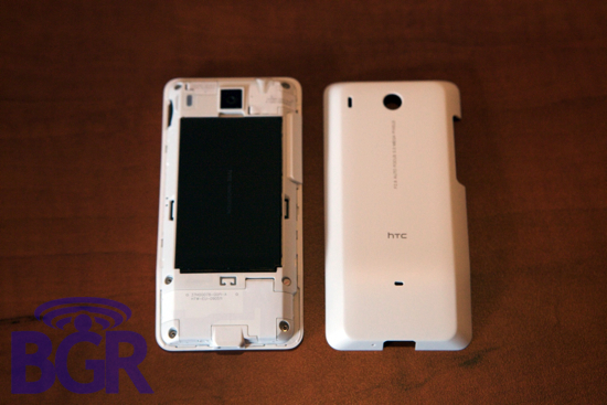
The Hero ships with a thin 1350mAh battery and since the unit we got our hands on doesn't have any U.S. 3G bands, all we were able to test daily was EDGE and Wi-Fi. Running around NYC using the phone, Exchange email, some light web browsing, and some Google Voice SMS checking and sending, we were able to get around a day of usage. Add in 3G and some real heavy use and we don't think you'll be too pleased with the battery staying power. Seeing as how the iPhone 3GS lasts around 2-3 times longer on 3G than the Hero does EDGE, HTC might be better suited researching their own battery technology.
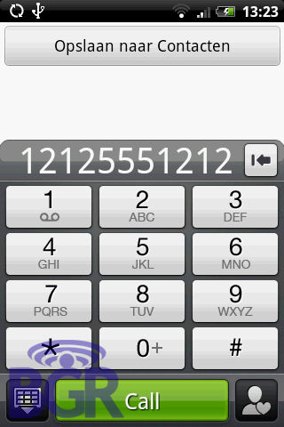
Phone calling: No. We have no idea why the text at the top is in Dutch...
Making phone calls was pleasant enough except for a couple annoyances. When dialing a number, the Hero cross-checks this with your contact list. While nice in theory, it makes for a pretty slow dialing session as the underpowered handset tries to visibly (literally, under the dialpad) match up what you're entering with your address entries.
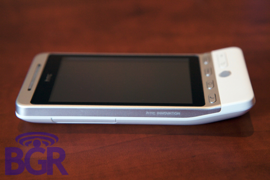
What's really nice is when talking on the phone itself, using the ear speaker, the Hero is really comfortable to hold against your ear. It just feels natural and it's one of the best phone phones we've used a pretty long time, even on AT&T's network.
Performance
This is going to be tough. For everything I loved about the Hero, there was always something pulling me back that had to do with performance. Let me explain... One more original reason why I didn't like the G1 was because it required more effort to do less. Why would I want to spend 25 seconds just getting to a compose email screen when I could press "C" on my BlackBerry and receive a reply to my original email I just sent faster than I could get that original email out on an Android phone? There are trade offs, sure, but speed isn't a trade off. The HTC Magic is my favorite Android device because coupled with a sexy form factor and Cupcake 1.5, it fixes a lot of the less-intuitive and time-consuming issues that the original Google device launched with. So where in the hell am I going? It's that we took 10 leaps forward with the Hero but took 12 back. With every brilliant addition HTC made, the device suffered a little bit in terms of performance. Imagine what the typical home screen background on the Hero is actually running when you're not even doing anything:
- One or possibly two clocks (which also grab your location so it will invoke GPS requests from time to time)
- One or possibly two weather widgets (which update in the background as well as grab your location so that it will invoke GPS requests from time to time)
- A Twitter widget which pulls your Twitter timeline at intervals
- A Messaging widget which updates in the background displaying your latest SMS and MMS messages all in a funky and cool yet CPU intensive animated widget
- An email widget which just the Messaging widget displays your emails, also CPU intensive
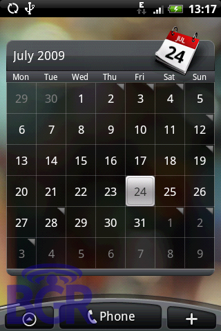
- A calendar widget which pulls in your entries from the Calendar app
- A people widget which displays favorites and their associated photo thumbnail
- A bookmarks widget showing your top four website bookmarks
Now, even if half of these do nothing but display data, it's still memory that's being used up in addition to CPU, and then consider the ones that actually update in the background. What makes Android so much more usable here, hurts it because of the hardware it runs on. This doesn't speak too highly of Android as an OS to us because Apple's iPhone 3G was about 50% faster with a 400MHz CPU compared to the Hero's 528MHz processor. The Palm Pre, a little faster than the iPhone 3G, is pretty speedy and doesn't bog down like the Hero does. And the iPhone 3GS? For. Get. It. Once you've tasted Big Momma's fried chicken, you're not going to eat at Popeye's (don't think about that line too much because you won't get anywhere) and that's really the issue here with the performance aspect of the Hero. All of HTC's advancements get undermined with a should-be-fast-enough CPU and make the entire user experience suffer. I don't want to wait, I want to move quickly when I'm doing something and this is one huge area where the HTC Hero disappoints to the point of almost not wanting to use it.
Conclusion:
So what's the wrap-up with everything that's been said? It's a really tough one. This for me personally was harder than just reviewing another Android handset to cross the desk because I really, really wanted this damn thing. Would I take it over the Palm Pre? One hundred percent yes. The HTC Hero effectively crushed any hopes Palm had at keeping any sort of momentum (at least in my view). Though what I've found, sadly, is I get more enjoyment out of using my HTC Magic or the T-Mobile myTouch 3G than I do with the Hero. Like I said, HTC's achievements and innovations aren't anything to dismiss, they are what to me makes Android usable, but with the current hardware powering the HTC Hero, things become murky and frustrating.
I'd like a multi-touch web browser and full Exchange integration in a sexier thinner package with a Teflon-coated shell, but I'd rather save myself 5 seconds here, and 7 seconds there than deal with bogdowns and sluggishness on something that should be as fast as lightning. HTC isn't stupid and we're sure they know that once they couple this setup with a faster CPU and chipset (Tegra?) it's going to be a sure-shot winner that will be able to rival the best. As it is now, it sort of fits in with Android's whole theme — you can do what you want, but you might have to take a couple more roads to get there.
