How Apple Stole Notifications From Android And Beat Them With iOS 5
If you haven't seen the pattern before, well, you just haven't been looking — Apple might not be the first with a feature all of the time, but the company almost always has the last laugh. Remember what happened with copy and paste? It's almost unimaginable to think that the iPhone didn't have this feature until almost three years into its existence, but when Apple introduced it, it worked like nothing before it — and by that, I mean it worked, and worked effortlessly. Notifications were arguably the biggest pain point for most iOS users, and Apple, as you know, has addressed them in a big way with Notification Center. How do you access Notification Center? You simply swipe down from the top of the device and a drawer-like panel slides down and displays your notifications. It sounds familiar, yes, but it's really so much more than what we've seen in Android so far. Hit the jump to read on.
How does this differ from Android? Well, for starters, Android populates your status bar at the top of the device with the icon of the app from which you received a notification, and when you run out of screen space, it hides the rest. To see your actual notifications, you pull down the notification pane, and they are listed in there in order from newest to oldest. And you have zero control over those notifications. All you can do is clear them all, or tap them one by one, which brings you into the app that notified you, until they are all clear. You can't prioritize, choose the sort order, determine what apps you want to actually be in that drawer — nothing.
Beyond Apple's superior Notification Center UI and the great widget support, initially for weather forecasts and a real-time stock ticker, the company that usually doesn't give users such fine grain control completely delivers this time. Notification Center lets you chose not only the order in which your notifications are sorted, but also how many notifications from each app you'd like to display (either 1, 5, or 10), and whether or not they appear on the lock screen.
This alone is invaluable — while I get a tiny icon in the status bar in Android letting me know I have a new email, with iOS I can now see a preview of that message along with others. Additionally, I can swipe a particular notification and be directly taken to that individual message or alert right from the lock screen. You can also clear just a specific notification in Notification Center as well, which actually makes my workflow much easier since I rely on calendar events to run my life, and I can leave that calendar notification in the drawer even past the meeting time to remind me of something I need to follow up on.
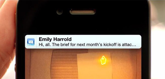
When you get a notification and are in an app, the top part of the screen will flip down like a number on an old analog alarm clock, displaying your notification. After a few seconds, it will flip back up to reveal the rest of the screen. This also is another place where Android hasn't innovated, as getting a notification on an Android phone simply displays the icon in the top status bar, but doesn't give you a preview of that message for all apps, just certain ones. Apple certainly took the drawer concept from Android, but as it has done with countless other features, the company implemented it better than anyone else. Apple didn't borrow it from Android... Apple stole it, which is why the implementation is as good as it is. If Apple borrowed it, we'd all just have a drawer stuffed full of dirty socks. And notifications.
