BlackBerry Z10 Review
BlackBerry is back! Or is it? With a brand new operating system, brand new hardware, and a restructured company with some new people, Research In Motion (RIMM) has done everything possible to make the company's brand new flagship smartphone a success. It combines the tried and true hardware we all know and love with a new take on the BlackBerry software experience. But is it enough to fight through the sea of iPhones, Android phones, and even Windows Phones?
Without getting into specifics, it's very easy to recap what happened with RIM. This company is one that changed the game multiple times. First with an email-only messaging device and then with an email-focused smartphone.
BlackBerry exploded onto the market first with investment bankers and executives, and then to lower-level company workers, and finally to consumers. But as Research In Motion was getting peaking, Apple (AAPL) unleashed the iPhone onto the world.
This didn't only affect Research In Motion obviously, it affected the entire smartphone industry forever, but it hit BlackBerry hard for a number of reasons. One of them is that the BlackBerry hadn't actually changed all that much since it was first released. It really was the same phone, just with different things bolted onto it, like a web browser, phone calling, text messaging and so on.
So now, Research In Motion has broken away from the company's legacy BlackBerry operating system in favor of what it calls BlackBerry 10, which is software developed in-house based on QNX. This is the future of BlackBerry, one that RIM says can power tablets, cars, and practically anything else — it's a 10-year bet. But will it pay off?
Let's start with the hardware first since that's a bit more straight forward.
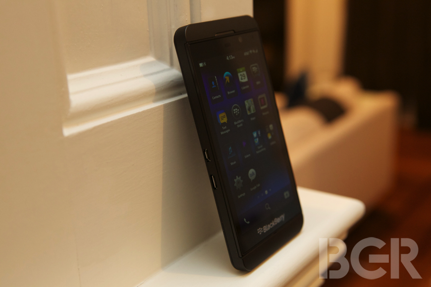
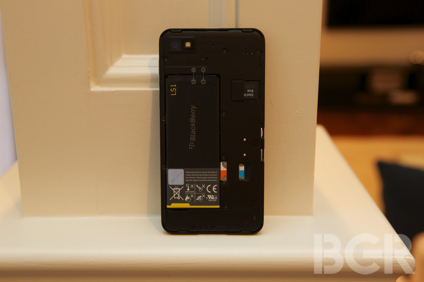
The BlackBerry Z10 is a plastic and metal device with a rubberized back that fits well in your hand. It's very similar in design to the BlackBerry PlayBook and features an all-glass panel fitted into a metal frame. On the right side you'll find a volume up and down key and mute key all in a sand-blasted metal form. On top is an on/off/power button and 3.5-millimeter headphone jack. On the left is a microUSB port and a miniHDMI port.
As far the display, it's a 4.2-inch screen with a resolution of 1280 x 768 pixels. It looks good, but not great compared to other high-end smartphones that are packing a boatload more pixels than the Z10. Color reproduction, and white and black levels also aren't the best, and when viewing anything else besides RIM's colorful user interface, things just appear a little bit muted.
Research In Motion told me that the screen has an "anti-fingerprint and grease coating" when I asked if it was oleophobic, but it really doesn't work well. After using the phone for just a couple of hours, the display had grease all over it that couldn't be rubbed off and it started to interfere with touch sensing for different tasks. No, I'm not that greasy.
There's just an instantly noticeable different feel compared to the iPhone 5, Nexus 4 and other phones when you're using the display. Your finger glides over the aforementioned smartphone screens, whereas it's sometimes bizarrely difficult to flick or scroll on the Z10. The best way to describe it is that there is literally friction against your finger when you try to swipe. As far as durability, the BlackBerry Z10 doesn't feature a Gorilla Glass panel but RIM told me it has some of the same durability features.
But what good is hardware without software? And being one of the few vertically integrated phone companies in the world, Research In Motion has a unique advantage here.
BlackBerry 10 is a completely rethought BlackBerry experience. Very few things are the same, and for the most part, that's good. In some cases though, it feels like RIM needed to differentiate just for the sake of differentiation, leading to a slightly worse experience for the end user.
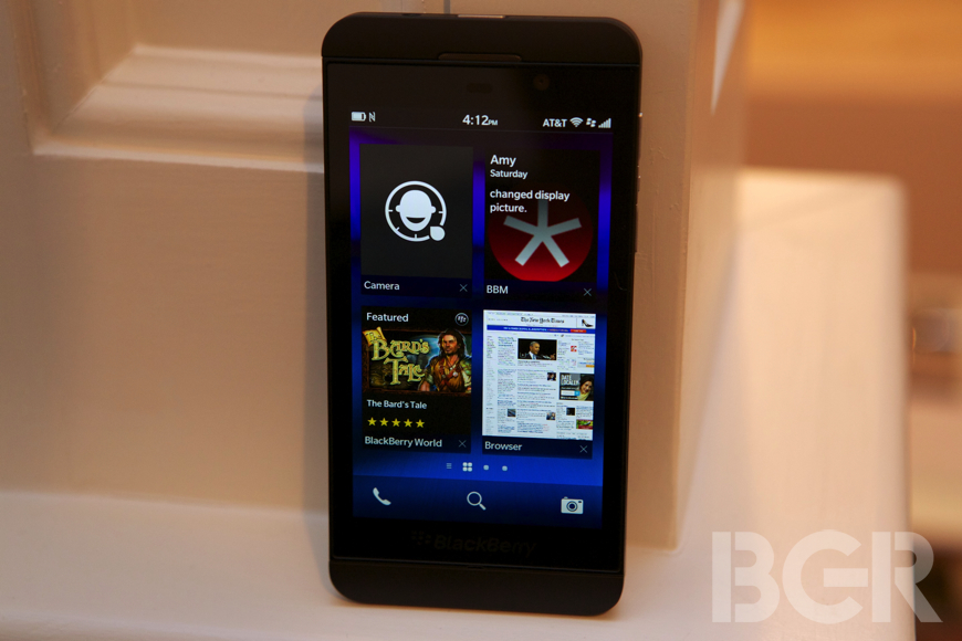
BlackBerry 10 is controlled by a couple of standard gestures. You flick up from the bottom of the phone to either exit an app or peek at any notifications you might have, you flick left and right to page through your home screens, you and you flick left, right, and up to get in and out of the BlackBerry Hub. Including the sliding panels going left and right for almost every app and sliding panels to reveal more information and other settings that come down for the top, there's a lot going on with BlackBerry 10.
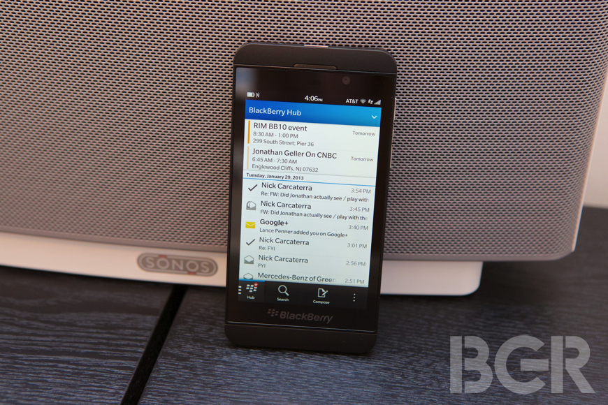
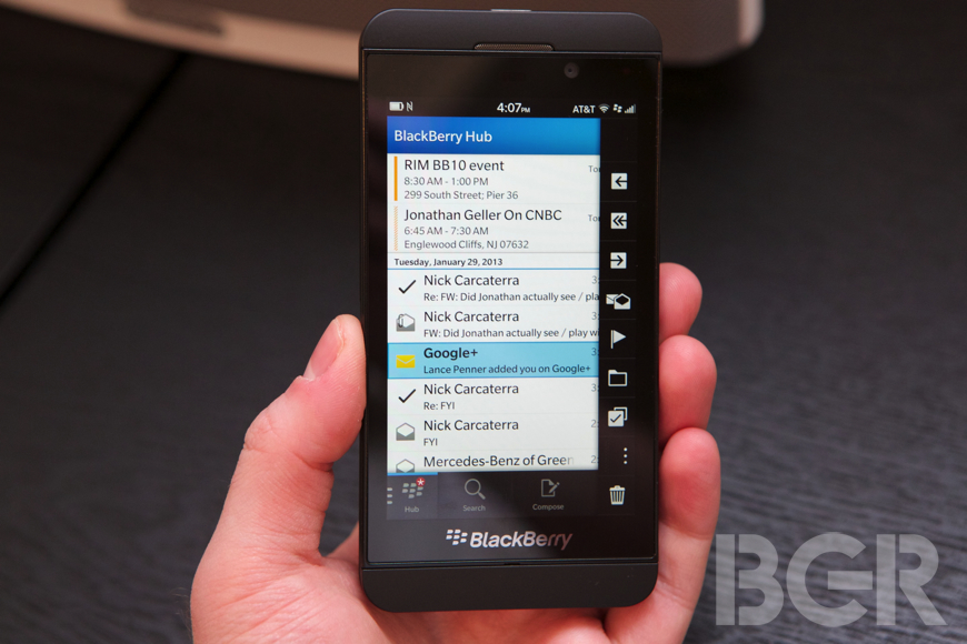
The BlackBerry Hub is where all of your messages are aggregated, much like how the Messages app works in previous BlackBerry models, though it's better. You have more control over your messages, more control over sorting and in general I liked using it to keep track of all of my conversations across BlackBerry Messenger, email, Twitter, and Facebook. You can also get a quick look at your upcoming meetings by pulling down the top of the BlackBerry Hub — a nice touch.
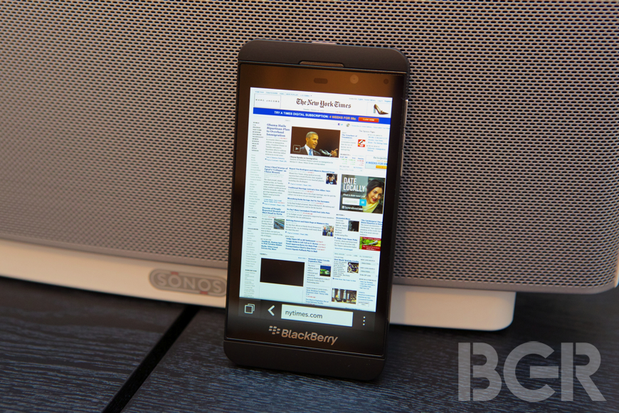
The new BlackBerry Browser will be a welcome upgrade to any existing BlackBerry owner in particular, but although the browser performs well, it still doesn't render nearly as fast or as well as my iPhone or Nexus 4. And that's with Adobe Flash support turned off.
Also, zooming seems to be something that just does not work quite well — double tapping rarely zooms in to highlight the content you want to read, and the rendering of a page is jarring. It's like the screen clears what's rendering so you see white space and then it tries to fill it in as quickly as possible. There were also weird errors when the BlackBerry browser couldn't load a page like The New York Times' full website, where another phone next to me could pull it up instantly over the same Wi-Fi network. Rendering in general on the browser doesn't seem to be on par with other high-end smartphones, to be honest.
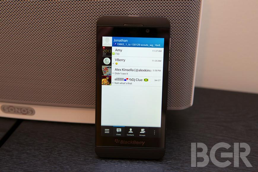
Let's talk about BlackBerry Messenger. It's completely new and there are some great features like the ability to finally do video calls, even over cellular. But perhaps the best feature to me is the ability to screen-share your device with a friend on BlackBerry Messenger. Voice calling also works very well on Wi-Fi and 3G/4G — it sounds way better than traditional voice calling.
Besides those new additions, BlackBerry Messenger is basically the same BlackBerry Messenger you're used to. You have your sections for open conversations, contacts, groups, and of course, your friends' updates. In addition to adding a friend by email, PIN or bar code, you can now utilize NFC to tap to add a contact.
Switching to BlackBerry World... there's a lot to say and at the same time, not much at all.
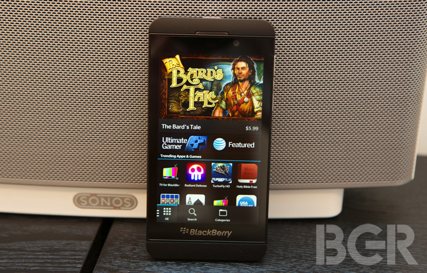
RIM is touting the fact that BlackBerry World has more than 70,000 apps, a great starting number. However, diving deeper, the company let me know that only around 1,000 of them are native BlackBerry 10 apps. The rest are ported from Android, or made in another programming language, or worse, even web apps.
By practically bribing developers to make apps for BlackBerry and by having such a low standard of quality for the store in general, BlackBerry World not only has the least amount of apps of any mobile platform, but it has the worst quality. I've literally found apps that have been made for the BlackBerry PlayBook, a 7-inch tablet, and are unmodified on the BlackBerry Z10 so the buttons you have to tap are comically small. RIM let me know that the company has to go through these one by one when problems are found, but it seems like the company wanted to get the 25,000 apps made for the PlayBook in the BlackBerry 10 store as fast as possible, and I think it has lowered the quality of the overall app store experience.
Then there's the app selection.
There's no Fandango, no Chase, no Mint, no Nest, no Gmail, no Google Maps, no 1Password, no Instagram, no Sonos, no RunKeeper, no Temple Run, no Optimum, no Netflix... I actually spent a lot of time looking through as many apps that I could look at on BlackBerry World while I was using the BlackBerry Z10 every day, and I couldn't really find anything that piqued my interest. I finally downloaded an app called Splashtop, one I have used on my other phones and tablets, and it was one of the apps that was not modified from the PlayBook, so I couldn't even use it. I was told that there would be major title apps like WhatsApp, Angry Birds, NY Times, Bloomberg, The Weather Channel and more, though these were not available when I was using the phone before launch. I'm also told new apps will continue to be added as the device is launched around the world with Research In Motion's carrier partners.
While it's nice to tout a number like 70,000, my thoughts are that it would have been 10 times better to have even a few hundred top-quality, name-brand apps than 70,000 apps from all over the sea — some native, some HTML5, some Android ports.
Apps are only one part of BlackBerry World though, and there seems to be a good selection of music, movies and TV shows right out of the gate. Carrier billing is another great feature of BlackBerry World that lets you pay for the apps you download on your wireless carrier bill instead of using a credit card, and the experience here was quite good.
BlackBerry 10, as far as the software is concerned, is a bit tough to grasp however. On one hand, RIM has really tried to create a new way of interacting with apps and your communications. It's something mostly new and fresh, and it shows. Unfortunately though, the experience feels messy at times and it seems like some things are different for the sake of being different.
RIM's gesture-based interface can be confusing and even maddening at times. While the home screen is dressed up just as any other smartphone platform at this point, with app icons and pages, the way you interact with the phone is just... unconventional. You can swipe up from the bottom of the phone to unlock it, and once you're in an app you can swipe up to close the app and go back to the home screen. Once you swipe to the right and enter the BlackBerry Hub, you can view all of your messages with just a tap. But the layers can quickly become heavy when you go deep into a conversation or browse to event attendees — these cards or layers pile up and you have to keep flicking them away to get back to the main BlackBerry Hub.
Expanding on the gesture interface, there is a gesture where you slide down from the top of an app to reveal even more settings that the developer couldn't fit on the bottom row or tabs, but the thing is, you don't ever know if there are more settings. You have to swipe down to check, and most of the time using the BlackBerry Z10, I kept forgetting to do this and wasn't able to customize some apps when I wanted to.
There are a couple huge problems with BlackBerry 10 that I just do not understand. The first is notifications. This should be something RIM can nail, but notifications in BlackBerry 10 are a straight up mess.
First off, when you're in an app or even on the home screen and you get a message, an email, a text — whatever — there is no visible notification on the screen. You get an audible notification if you set one, you get a vibrate notification, but you do not see anything on the screen. There is nothing that scrolls by, or flips down, or pops up, that gives you an idea of what kind of notification you got or a preview of it.
To make things worse, you have to slide your finger up and to the right in an awkward gesture to see what kind of message it was. Even then, all you're getting is an app icon, not a preview of the message, so you have to slide over again to the right to get to the message. I've also found that after reading and exiting the message view, it's still marked as unread, making organization confusing.
The second major issue has to do with email, and it's just ridiculous.
There is no push email, contacts, or calendar on the BlackBerry Z10 except for Microsoft Exchange accounts. No push Gmail, no push Yahoo — email is checked every 15 minutes by default, and you can make this interval longer but not shorter.
Because of the fact that Research In Motion couldn't get QNX (BlackBerry 10) to function over the company's existing network, the PlayBook and now BlackBerry 10 devices have to use a local mail client on the device itself as opposed to having the network handle the accounts, the push features, syncing, and so on. There is no more Blackberry Internet Service, it's just data now. That's not to say the BlackBerry network isn't used at all, but it sure is used less often. Research In Motion alluded to using the network for BlackBerry Messenger of course, and other things like helping to facilitate a BlackBerry voice or video call, and for providing a secure tunnel for RIM's BlackBerry Enterprise Server customers.
Other bits about BlackBerry 10 that bother me: there is no over-the-air device switching, back up or restore. Moving from a previous BlackBerry smartphone requires using the software to sync on a computer, and even moving from one BlackBerry 10 smartphone to another still doesn't copy your information wirelessly. Copy and paste is a terrible experience; there is a phone icon permanently in the interface on the bottom, yet there is also a phone app; and the camera will lock photos in portrait orientation if the orientation of the phone is locked, among others.
Another problem — and this one really gets me: you do not see a status bar in any app. Whether you're in BlackBerry Messenger, Facebook, your calendar, or any other app, there is no status bar. No battery level, no time, no signal, nothing. This is just odd and pointless.
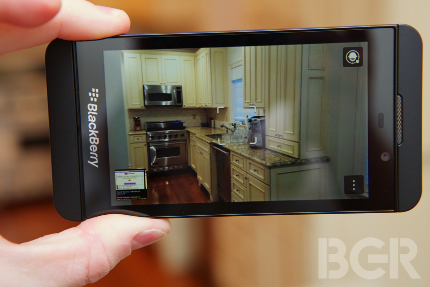
The camera on a BlackBerry has never been good, but the photos taken on the Z10 are completely acceptable. The camera interface, however, is confusing.
It took me a while to understand how to even focus the camera and how to take pictures. There is a super cool feature that allows you to take photos of people and literally go back in time on individual faces to pick the best expression in case someone blinked or didn't smile at the right time. You can use a jog wheel to go forward or back and pick the right shot for the photo, and this works with multiple people in one frame. It's insanely cool, though it doesn't work all of the time, especially if the subjects aren't perfectly still.
Video recording at full 1080p resolution was extremely sharp and looked great when I reviewed it on a computer. There is also a front-facing video camera for the first time ever on a BlackBerry.
This isn't the first all-touch BlackBerry, but let's be honest, it really is.
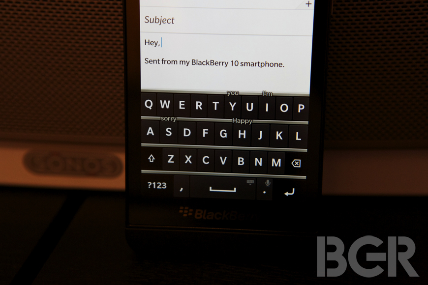
With a brand new virtual keyboard, the BlackBerry Z10 is the first smartphone from Research In Motion to offer up a compelling physical keyboard alternative. The keyboard visually is very similar to the patented BlackBerry QWERTY keyboard, even including the metal-looking frets in between the rows of keys. It works, very, very well. It's probably my favorite thing about BlackBerry 10 and could even take the crown for best virtual keyboard. Windows Phone's keyboard is quite good, but this is borderline great. You need to get used to it, and like all virtual keyboards you need to trust it, but when you go, you can type amazingly fast and accurately.
Research In Motion told me that in addition to the keyboard performing great out of the box, the software will start to recognize your typing patterns and get even better over time.
There's also one other feature about the keyboard that works quite well, and it's a new take on predictive text. When you're typing, and this works especially well when you need to type with one hand, the software will start to predict what word you want to type after the word you're currently typing. It will do this by suggesting those words over letters on the keyboard.
For example, if I wanted to type "Good to meet you," I would type the word good, and then on the keyboard over the letter T would be the word "to." You can slide your finger up on the letter to accept a predicted word, so sliding up on the letter T would have entered good "to." Then on the letter M the word "meet" is positioned above it, so sliding up would accept that, and finally on the letter Y would be the word "you." Slide up again and you've typed a sentence with one hand by only really typing one word.
One more feature that's a must-have on a modern phone to round out a great virtual keyboard is voice dictation, and it's powered by Nuance and works reasonably well.
A smartphone is of course, at its core, a phone. Traditional voice calling is about average on the BlackBerry Z10. Calls sounded distorted in the ear speaker even at a low level, with all of the high-end crackling and the ear speaker itself sounding distorted. Speakerphone calls sounded better and very loud, but still sounded a little bit distorted. I'm not sure if this is a software bug or not, but it's a little frustrating and it's not what I'd expect on a high-end smartphone — or even a low-end smartphone, to be honest.
As I spent a day with the BlackBerry Z10, and then another one, and then finally over a week with it, I have questioned very much why the company thought this strategy was the correct one — launching the Z10 first, a high-end smartphone.
Why jump into battle with the beast when you can take on the monkeys? Why not launch BlackBerry 10 on a low or mid-range smartphone focused on markets outside of the United States and Canada at first? BlackBerry 10 is a great upgrade for BlackBerry users, but it's not unique or polished enough at this point to grab existing high-end smartphone users. Not in the U.S. or in several other top-tier markets.
The fundamental shift Research In Motion has had to go through brings a fish that was out of water now directly into the sun. It takes a company that did a couple of things extremely well — quick and effortless email with always on, fast access to the calendar, contacts, tasks, phone calling and more — and takes away almost all of those advantages in BlackBerry 10. There's no push email for anything but Exchange accounts, it's more complicated with a borderline confusing gesture-based interface, the app selection is the worst of any mobile platform, and overall it feels like a rush job that's unpolished.
As the software capabilities grow with a much better browser, all-touch keyboard and other features, it feels like RIM loses it's core. The company is forced to try to reinvent the smartphone and in the process just seems to end up making an iPhone, Android, and Windows Phone competitor that isn't as good as any of them. And in several ways, it isn't even as good as the BlackBerry before it.
It's very tough to build a phone from scratch, starting with the operating system, crafting the user interface, and picking the right path for app development and support. There were plenty of different paths for Research In Motion to take, and I do kind of question the one that the company ultimately chose. [bgr-post-bug]

