Watch This Exhaustive Comparison Of Android Auto And CarPlay
This year, both Apple and Google officially launched their vehicle dashboard interfaces, CarPlay and Android Auto. We've seen them action before, but 9to5Mac's Macmixing recently had a chance to check out both in the same car at the LA Auto Show. This allowed for one of the most thorough comparisons we've seen so far.
READ MORE: Google reveals plans to bring Android to your car with Android Auto
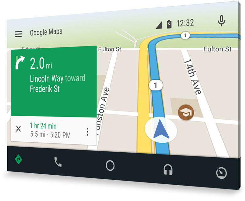
At first blush, Android Auto seems to have benefitted significantly from the Material Design of Android 5.0 Lollipop. It's sleek, functional and perfectly suited for a dashboard experience. Some of the small touches that make the latest version of Android stand out have even made their way into Android Auto.
Google's dashboard interface has nearly feature that an Android device would have, from Google Now cards to full phone functionality.
The CarPlay interface is far more simplistic, initially displaying a bland home screen filled with apps against a black background. There are a few interesting tweaks worth noting, such as the Contacts app going straight to Siri rather than showing a list of all of your contacts. CarPlay also won't show you the text within your text messages, but will allow you to respond with voice.
Overall, Android Auto certainly has CarPlay beat in the visual department, but a distracting interface is the last thing drivers need in the dashboard of their vehicles. Either way, smartphone owners will have their choice as more cars adopt the systems in the coming years.
