Xbox Copied The PS5's Home Screen, And It's A Major Upgrade
As big of a fan as I am of both the PlayStation 5 and Xbox Series X, I spend more time with the former. There are many reasons for that, but one is that I simply prefer the PS5's UI to that of the Xbox Series X. The user interface on the PS5 is far from perfect, but I spend less time navigating the home screen and more time playing when I turn on my PlayStation. Thankfully, Microsoft has solved the problem with this week's Xbox Home update.
"Starting today, a new Home experience is rolling out to all Xbox Series X [and S] and Xbox One consoles," wrote Xbox's Ivy Krislov in a blog post. "This update is designed from player feedback and makes it easier to discover new games, rediscover games you already love, connect with communities, and create a more personalized experience."
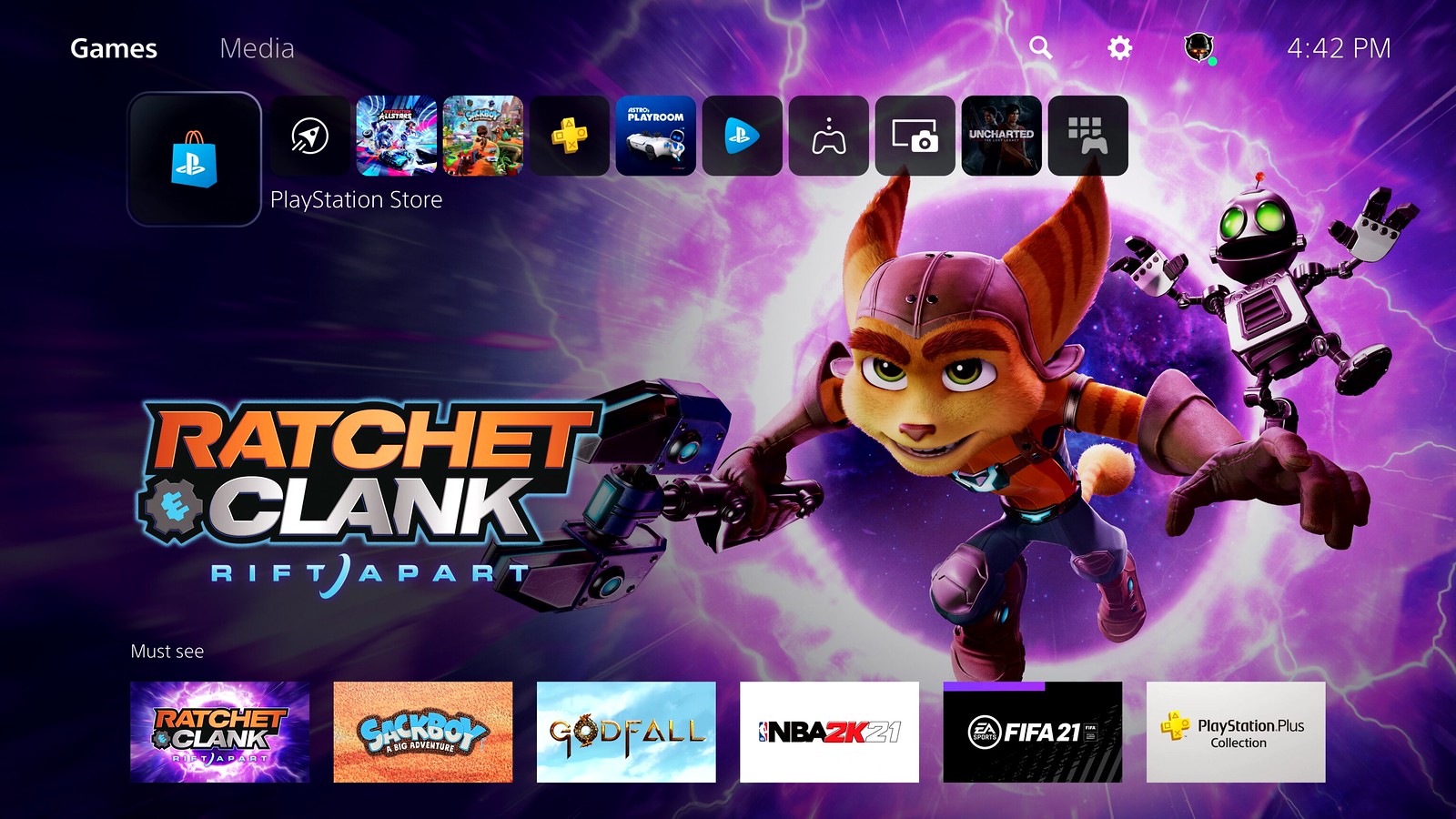
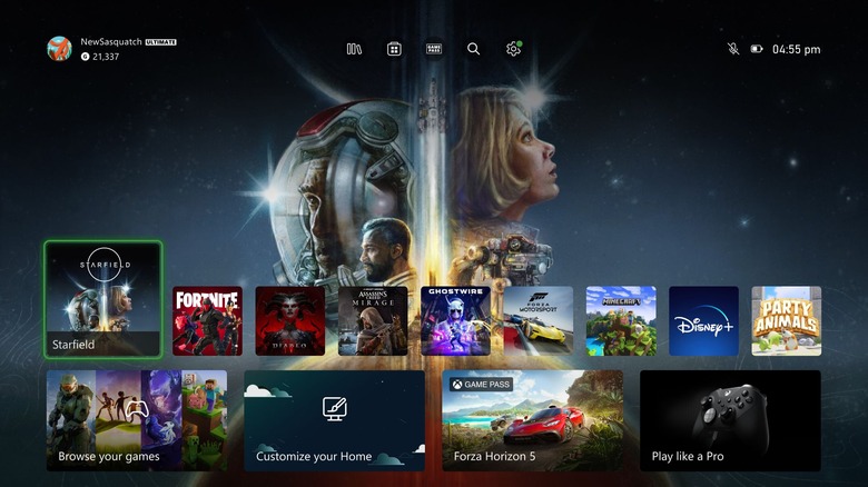
As you can see in the screenshot above, the Xbox's Home UI now features a long row of small, rounded game icons in the middle of the screen. Let's take a quick look at the PS5 home screen to see if we can spot any similarities between the two:

Moving on, one way that Microsoft has actually improved upon the PS5's UI is by putting a quick access menu at the top of the screen that can take you to your Library, the Microsoft Store, Xbox Game Pass, Search, and Settings with a single tap.
Microsoft points out that the new UI also creates more space for your personalized background to shine through, gives you the option to change your background to match the selected game, introduces lists of curated games for each user, adds an improved Friends & Community Updates row, and features a separate list for entertainment apps.
The new Xbox Home experience is currently rolling out to "a subset of all Xbox consoles," so you might not see it right away. Everyone with an Xbox Series X|S or Xbox One should move to the new Home UI within the next few weeks.
