Brilliant App Shows You Which TV Shows Are Worth Bingeing - And Which To Skip

Have you ever found yourself wishing for an IMDb ratings graph? One that could show you the best episodes of any series, or whether a series fizzles out in the later seasons? This way, you'd know what to watch on Netflix. Or what to watch on HBO Max (sign up for a free HBO Max trial!), Hulu (you can also get a free Hulu trial!), Peacock, Disney Plus, and all the other streaming services out there. Additionally, it could tell you which TV series are worth watching on traditional TV. Well, your payers are about to be answered.
Imagine never having subscribed to HBO Max before, and somehow never having heard of Game of Thrones. Then one day you escape from the rock you've been living under and everything changes. You scroll through all the movies and shows available to stream in the HBO Max app. Suddenly, you happen upon an intriguing show you're unfamiliar with. You watch the trailer and it blows your mind, obviously, so you settle in and start streaming season 1.
Needless to say, the show hooks you instantly. The plot is incredible, the writing is fantastic, the character development is outstanding, and the acting is superb. You know you have some serious binge-watching to do because you can't wait to see what happens next. You're staying inside more than usual these days because of the pandemic. As a result, you've got plenty of time on your hands to binge season after season — and that's exactly what you do. Then, after weeks of enthralling television that's like nothing you've ever seen before, you finally arrive at season 8.
And just like that... trainwreck.
IMDb ratings graph
You are absolutely gutted. Devastated. How could such a mind-blowing show get so terrible so quickly?! Had you known how bad it was going to be when it ended, you probably wouldn't have invested all that time, energy, and emotion into the show to begin with. You know, perhaps if you had seen a chart like this one:
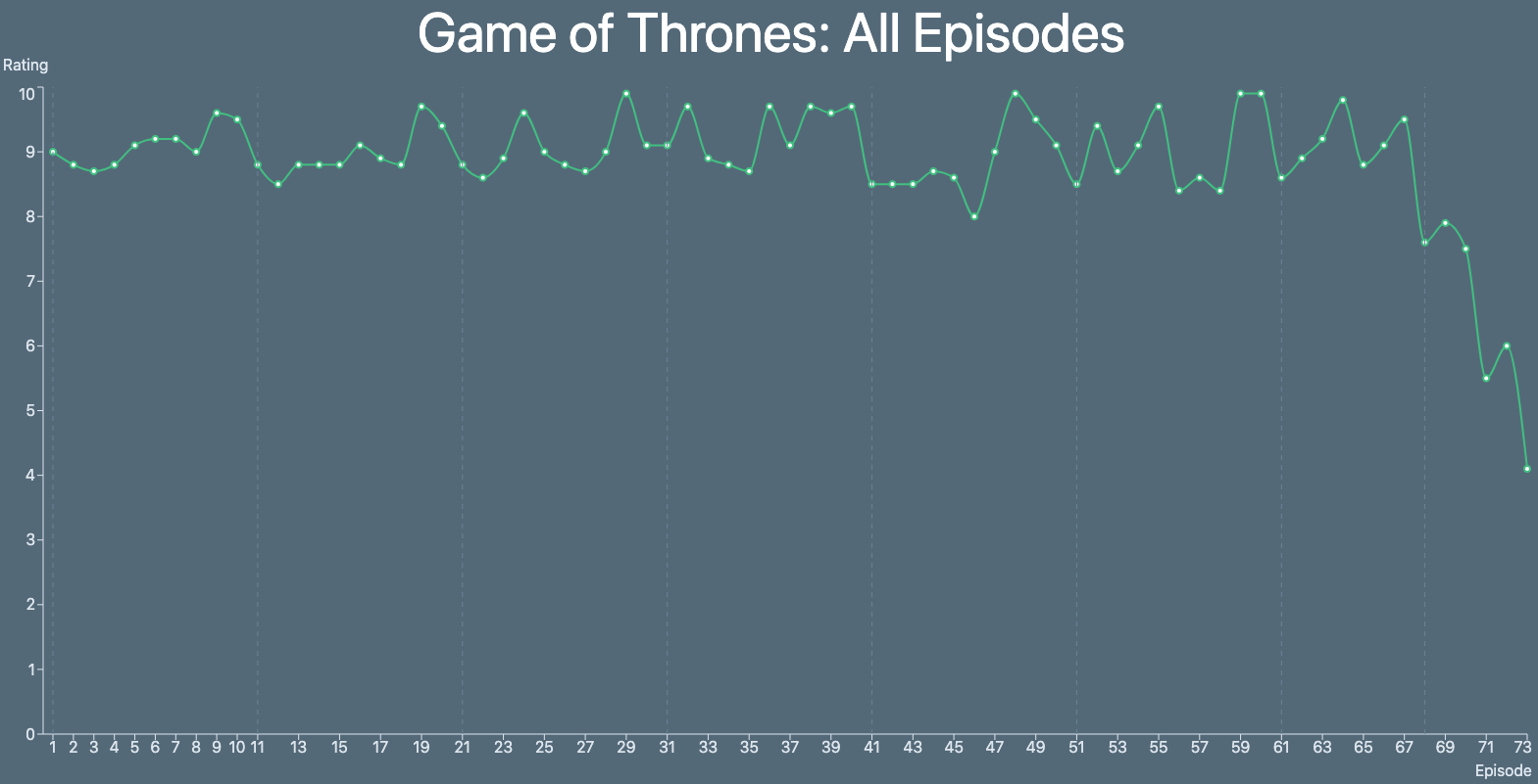
The graph above was created by a free app called TV Chart. Created by developer Benjamin Mizrahi, the web app is simple but incredibly useful. Type in the name of any series and TV Chart will, as the name suggests, create a chart. The points plotted on the chart represent the IMDb rating for each episode from start to finish. Had you known about TV Chart before you started binge-watching Game of Thrones, you would have seen that the final season is an absolute travesty and you might have saved yourself the heartache.
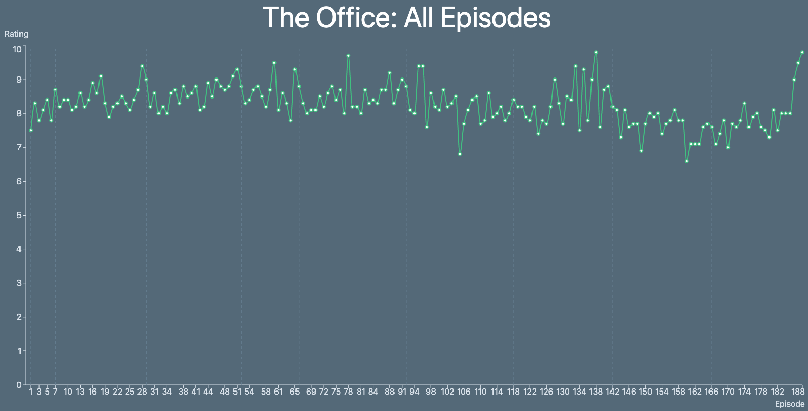
On the flip side of the coin, imagine the same thing happened with The Office. The penultimate season gets so bad that you very well might consider bailing, but a quick glance at TV Chart and you'll see that it's definitely worth sticking it out.
TV Chart is a terrific tool and it's totally free. You'd be crazy not to bookmark it right now and use it next time you consider diving into any show that's been around for a while. This is the IMDb ratings graph app we've all been waiting for. And it's completely free to use!
Originally published on Sep 4, 2020, at 9:16 AM ET.