Apple Watch Review
Oh, quite a journey we have had so far in just a few short months. Even though the Apple Watch was released on April 24th, the device was first announced practically a year earlier, and rumors had been swirling forever that Apple was entering the wearable market.
I feel like this watch had the potential to be the absolute perfect product for me. Mechanical watches have been an obsession for me as long as I can remember, and I had dreamed about owning a skeletonized Royal Oak since I was probably 14. I've collected many watches, from novelty to high-end Swiss ones, and the thought of having a modern-day watch that worked seamlessly with my iPhone had me ready to completely just go bonkers.
After spending almost three months with two versions of the Apple Watch and practically every band the company offers, and with rumors of terrible sales swirling, has Apple actually released a dud? You, my friends, need to meet me after the break to find out.
Let's start with some more overview of the concept of the Apple Watch and also how it functions in day-to-day usage. The concept is, a device for keeping time, a device for notifications and connecting, a device for workouts and fitness. Those are pretty much the three pillars that Apple has positioned the watch on.
The thing is, the watch does so much more.
Hardware

Think about how unbelievably challenging it is to design a product so personal it's worn on the wrist every day and all day by millions of people of all kinds. Young and old, women and men, from different countries and backgrounds. Apple nailed it, though. The watch is exciting without being offensive or loud. It feels modern and current but actually the design to me seems almost timeless. It's such a beautiful representation of what Apple is good at — an amazing design that can appeal to practically everyone on Earth.
The sapphire screen curves around the edges to meet the perfectly polished metal case, which then flows right into the band you're wearing. Looking at the case from the back, I get even more excited. It looks like a window into the mechanics of a traditional watch, yet so modern and crisp.
The fact that Apple is the first company to think of a digital crown doesn't surprise me, but it's still shocking that this hasn't been done before. In use, it functions just amazingly. Winding it up or down quickly breezes through lists and selections, and winding down slowly lets you select what you're looking for with precision. Press it in from the side to make a selection. You can use your finger to select on-screen elements and scroll, though your finger ends up blocking most of the display, which is exactly why Apple invented the digital crown here.
There's another dimension to Apple Watch and it's not just touch, but a firm press, something the company calls Force Touch.
You're able to use the touchscreen normally like your iPhone or iPad, but if you press firmly, the device is able to tell, and that triggers other menus and options that are applicable to the app or page you're in. For instance, if you're in the workout app and want to change your move goal, pressing firmly brings up that option. If you're in messages and need to start a new message, pressing firmly gives you that option there.
It's smart for a couple of reasons, like the fact that you really can't fit too much at a time on the display. But one reason I truly appreciate it in particular is because of the space constraints on the watch, Apple was forced to think about other ways to make the experience complete, and it brought them to this Force Touch feature in addition to the digital crown.
This technology might not have ever existed if it were not for the watch, yet we're seeing Force Touch appear on the company's new MacBooks, and Force Touch is rumored to come to iPhones and most likely iPads in the future.
Let's talk about the screen for a second as it's important. In short, the screen is beautiful, with deep and dark black levels, vibrant color, saturation and also brightness.
The resolution falls under Apple's Retina badging because when it's held up from normal distance, you're not able to discern pixels. It's a great display, and is Apple's first AMOLED display, something the company has always steered away from.
From a macro level, all that means is the panel is a different type of panel from an LCD that is traditionally used in the iPhones and iPads and also computers. On a micro level, I still prefer LCDs and how they look, but that's just being nitpicky. Outdoor viewability is also great if you're not in direct sunlight, and in direct sunlight still absolutely usable. In fact, the Apple Watch Sport, because of the Ion-X glass screen, not sapphire, actually refracts less light, improving outdoor viewability over the Watch and Edition models.
I can't move on to the next part without talking about the Taptic Engine. This is something else that is just hard to believe didn't exist in this form before Apple included in the Watch, and it literally puts a smile on my face all of the time.
It's hard to accurately describe, so I recommend going to try it out at the Apple Store if you're interested in the Watch in general, but this completely reinvents the noisy and clumsy vibrate features on our phones and devices that we're all used to. Instead, combined with the incredible speaker on the Watch, the Taptic Engine is able to tap you on your wrist, mimic the feeling of a heartbeat, or reproduce chimes and other alerts while adding a physical feeling to them.
The best way I can describe it is, it conceptually feels and sounds close to a minute repeater on a mechanical watch, both with the sound and tapping.
The first time I put the Apple Watch on in the store, it was on a demo loop, cycling through various apps and features, and all of a sudden I felt a heart beat on my wrist, and I almost jumped. It was that freaky and cool. It's such a subtle and discreet way of notifying you for new messages and alerts, and it's one of the coolest features of the watch.
The Apple Watch has a relatively tiny battery compared to an iPhone, but it is flawless. Battery life was a major thing people were concerned about, but I'm happy to say that you don't ever have to worry about it. From 6AM to 12AM, with use all day, I find I end up with 25-30% left. You need to charge it nightly, just as Apple says, but I would be shocked if you ever ran out of battery life in a single day. It's that impressive.
Software

It's hilarious to me how many people got the Apple Watch wrong as far as software goes. Pretty much every single first wave review didn't understand it at all, and called it confusing and hard to navigate.
I don't even think a child would find the Apple Watch hard to use. It's crystal clear to me. You have your watch face which tells you the time plus shows other complications like sunset and sunrise times, the weather, your next appointment, and other choices. Then on top of that you have the ability to swipe down, showing your notifications just like on iOS, and alternatively you can also swipe up to reveal glances, little bite sized pages of information from your apps that you can customize.
If you press in the digital crown from the watch face, you are taken to your apps. That's it.
Apple's software always brings the company's hardware to life, and the Watch is no exception. All of the built-in apps are great, blending in with the hardware so it looks like they are physically on screen instead of just running on a display.
Here are some of my favorite first- and third-party apps:
- Messages. I love being able to see, and if necessary, reply to all my incoming messages instantly. With a quick pre-populated reply, a quick voice dictation, or even an emoji.
- Activity. I tried to wear a Jawbone on and off over the last couple years but never really was happy with wearing something that just was there to track some fitness elements. It was also uncomfortable. Here, I live in the activity app. The way Apple's created it visually just makes you want to close all of your goals every day. You have a circular stand goal, move goal, and activity goal, plus you can dive into each of them to see your activity over the last 24 hours, calories burned, exercise information, and much more.
- Passbook. If you told people who wear high-end mechanical watches that they would be able to load in their credit cards and pay with their watch instead, you'd be able to charge $10,000 more for that one feature alone. Yet here we are with Apple Pay and it's on all of the company's watch devices, and it is just amazing. Your hands are full, you're at the register, two taps on the side button of the watch and 4 seconds later and you're walking out of the door. Note to merchants: do not ever try to hand me a paper receipt when I have used Apple Pay. Thanks in advance.
- Calendar. It's so hard to describe how wonderful it is to be tapped on your wrist when your next meeting or appointment is coming up. That is invaluable.
- Delta app. I don't fly a lot, but I had a blast using the Delta app on the watch to know exactly where to go, the status of my flight (which kept changing), and to be able to load my boarding pass to my watch and not use a paper boarding pass.
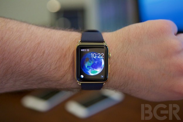
- Watch Faces. This is basically your main home screen on the watch, and as I hope I made clear, I love mechanical watches and complications so these really excite me constantly. The astrology view is just so beyond words, especially when thinking about moon phase complications on a mechanical, or even a planetarium-type complications — it's here, in software, and just feels so incredible. I love the chronograph face, the utility face, and the motion face. I hate the color face, appreciate the solar face and its infinite cool-factor, but borderline hate it, and the simple face isn't bad. The modern face hurts my brain too much to think about so I'm not going to go there.
- Remote app. I use a bunch of Apple TVs in my house, and when I'm in the Apple TV input on a TV, I practically only use my Apple Watch to navigate it. It's always on your wrist and works so great. No finding the remote, no finding your phone.
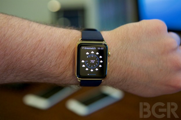
- Weather. Love how quick and easy it is to check the weather on the watch, one tap and I'm looking at the forecast, another tap and I'm looking at humidity of temperature levels throughout the day.
Siri
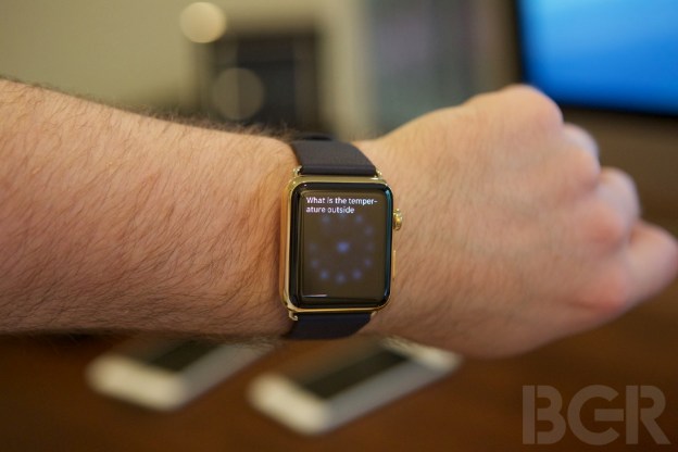
Siri is such an integral part of the Watch that it deserves its own section. Since there's no way to enter text traditionally with any sort of keyboard-type entry, Siri, in addition contextual replies based on your messages, or pre-loaded replies from yourself, are the only options.
One of the things I've loved about Siri on the watch is how it has reintroduced me to Siri, and this second time around, my impression is so much better. I loved using Siri when it first launched, but like other people, I stopped using it due to both the novelty wearing off and also because your request sometimes would time out. And if it didn't, it might be a little off, causing you to just type or do the request manually anyway. Over time, your brain just says, screw that, I'm going to do what I normally do because it's actually easier.
That's absolutely changed now. To use Siri on the watch, you either just hold the watch up and say, "hey Siri" followed by your request, or you can push in the digital crown and hold it there for about a second, bringing up the Siri interface.
Siri is insanely accurate on the watch — amazingly accurate, actually. I have practically no issues using it except in rare instances where I am in my house and start moving far enough away from my phone to break the Bluetooth connection, when the watch hasn't connected to Wi-Fi yet. Again, just a fringe case. Besides that, it's absolutely brilliant. You can practically use the watch just as you do on your phone or iPad.
Here are some of the ways I use Siri most frequently on the watch:
- Sending or replying to a message by saying, "tell [person's name] that I'm running late and should be there in 10 minutes," or "reply to [person's name] and say 'sure, see you there.' "
- Saying set the timer for three minutes in the morning so I'm alerted when my coffee is done.
- Asking for the weather forecast
- Launching specific apps
- Setting an alarm
Voice dictation also works brilliantly on the watch. If you don't want to use Siri for all requests and tasks, you also manually start a message, select the contact, and then tap the messages section to either get those preloaded phrases and emoji, or hit the voice dictation button and off you go. I wish there was a way to edit something on the watch, though, like there is on the phone.
Bands

When I was in a different life I had some Jacob & Co. watches, and my favorite thing about them was actually the bands. They were an insanely comfortable polyurethane rubber, but the watch came with four of them in different colors, and they were all user-changeable. I literally changed bands every single day. Here's a throwback for you guys, and I fully understand I'm going to get it in the comments.
Now, there aren't just comfortable sport bands for the Apple Watch, but classic leather buckle bands, a leather loop, modern loop, Milanese, and a link bracelet. They all work so incredibly with the watch that when you buy an Apple Watch with any band, that watch looks like it was made for that band, and that band looks like it was made for that watch.
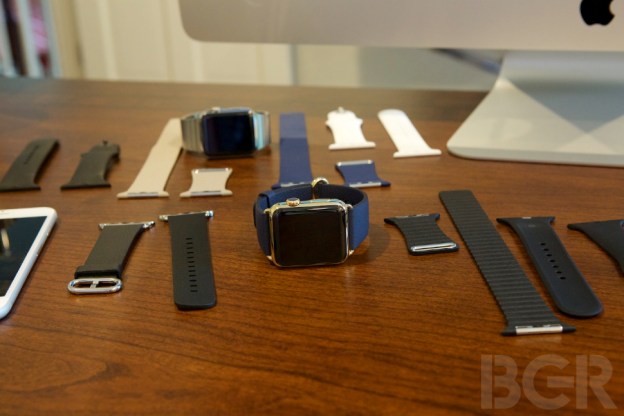
They are a perfectly matched, but even better, changing a band on your watch drastically changes the look of the entire watch. Add a classic buckle with those lugs and now you have something that looks so much more elegant. Swap it for a sport band, and you have a watch that really looks softer yet more durable and sturdy.
My favorite bands are, in this order, as hard as it is (based on the 42mm watch): stainless steel link bracelet, classic buckle, sport band, leather loop, Milanese.
Let's talk about the stainless steel link bracelet for a second — it's very light compared to other stainless bracelets, and I made the mistake of discounting that lightness as cheapness at first. You have to wear a band on the Apple Watch for at least a couple of days before you make a decision.
Once I got my own link bracelet, I was hooked. How is Apple the only company (out of all of these watch companies, ones that, you know, just make watches all day) to let you adjust the bracelet without any tools just by pressing a button? Why are they practically the only ones making a butterfly clasp that sits inside of the bracelet so it doesn't stick out into the underside of your wrist?
Some traditional watch-lovers have been negative on the band options in terms of quality and feel, especially with the classic leather buckle. Let me tell you that $150 for a leather band with this level of quality and precision and uniformity is practically a steal. It's expensive, but let's not forget how expensive traditional high-end bands are.
The same thing goes for the stainless steel link. $450 is more expensive than the Apple Watch Sport, yet $450 for a stainless bracelet of this quality and precision is an absolute steal.
The only band, and watch for that matter, I haven't seen in person is the space gray stainless link and I'm slightly jealous... though I'm not jealous enough to order one.
Edition
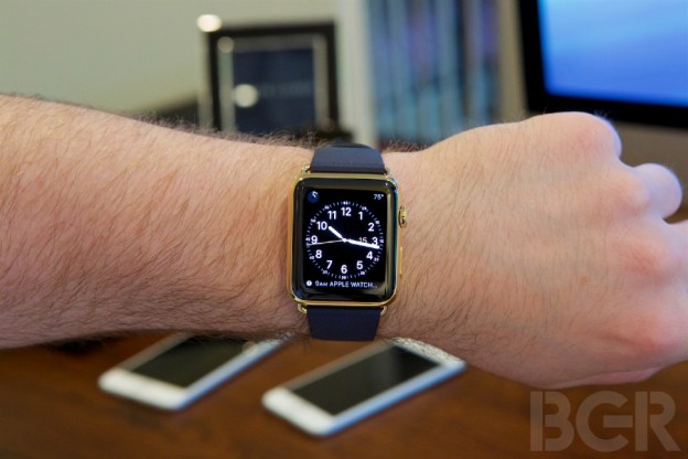
A lot has been said about the Edition, and even I wrongly predicted that the price would start around $5,000 instead of $10,000. The logic behind the Edition spans from making different versions of a product to appeal to different people, to having a hero product that helps put the other models in perspective.
The Apple Watch as a product gives more choice to the consumer than any product Apple has sold ever before, and the Edition is another option. Just as there's different models in a certain car class, there's a Sport, Watch, and Edition for the Apple Watch.
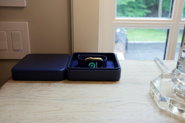
Apple has made all three collections identical as far as internals are concerned, but the case, bands, support, and purchasing experience with the Edition are unique. From a private try-on appointment to try various Edition models on your wrist, to a dedicated VIP support line to help with any Watch questions or support, to a courier delivering your watch, to higher-end Apple Watch bands, to a beautiful leather charging box, to, obviously, the gold casing, the Edition is just one level better in every way.
I have heard from someone that the gold Apple has introduced on the Edition actually is stronger than the stainless steel in terms of resisting scratches and dings.
There are so many arguments to be had here. It's one thing to spend $20,000 on an IWC, which has proven value and also can last for a hundred of years, and which takes months for one single person to manufacture and assemble. But what about spending $12,000 on a piece of electronics that could be outdated in a matter of years or months?
The counter to that is, the functionality here completely wipes the floor with your IWC. And with the Edition, you still get the high-end feel, the fact you know you're not wearing the same model as everyone else, and the comfort in knowing that you have the best model available.
To some people, that's worth the premium. And if not, guess what? You can buy a Sport or an Apple Watch and have the same basic experience that is offered on the Edition.
Apple hasn't lost touch with its customers because it made a higher-cost product. If the Edition offered better specifications than other models (which is the case with everything else in life, mind you), this argument would hold more water. Instead, Apple has said here are three collections, all are practically identical, and you can buy whatever fits your personal style and taste best.
If you're a woman dropping $11,000 on a Birkin bag or $7,500 on a Valentino or Cavalli dress, maybe you'd like an Edition. If you're a man spending $20,000 on first class tickets on your trip to Dubai, maybe you're going to want the Edition to complement your $4,000 Brunello Cucinelli brown leather jacket.
Maybe you'll think it's stupid and just buy a regular Apple Watch, I don't know or care, but it's great Apple gives you that option, and there are certainly people who appreciate it.
More importantly, it sets the tone for the Apple Watch as a luxury and fashion item. The $10,000 – $17,000 models instantly give the $399 and $599 models more credibility in both the consumer's eyes and in the luxury fashion world.
Let's see how Apple handles the Edition/higher-end models as the category progresses. New case materials and band options are a no-brainer, but is there a market for $2,500 – $5,000 Apple Watches? I say yes, absolutely, and it's going to be interesting to see if and when Apple addresses that.
Future
This is version 1 and I think we can expect future generations of the watch to incorporate more sensors for more kinds of fitness and health tracking. Blood oxygen levels and blood pressure come to mind instantly.
It could get a better screen, it could get thinner and faster, it could get a FaceTime camera, but the more interesting changes are going to involve how we can use the watch in the future to open up new kinds of interactions with our world. Especially when at some point, the phone will be untethered and artificial intelligence will be smarter and more useful. Context is going to be one of the most, if not the most important thing, and knowing what information you want, when and where, how and why, is going to be a game-changer.
And I believe the watch is going to be the place most of that happens.
Telling you the emails that are important that came in, the tweets you missed, reminding you to call your mother back who keeps bothering you to hook up her Sonos, letting you know you're running late to your meeting and you need gas so here's a modified route to the nearest gas station and updated directions to your destination from the gas station... those types of things are where future Apple Watch models will really shine.
This space is just so important, even if you don't quite understand it now.
Daily use
Here are some examples how I use the Apple Watch during a typical day:
- I wake up around 6:30AM, I weigh myself, and I instantly put my Apple Watch on after taking it off the charger. I check through my phone to respond or manage any new messages and notifications, and once those are dismissed, my phone usually stays in my bedroom, though if I take it to the kitchen when I'm making coffee, it ends up somewhere different each morning.
- As I'm making coffee and eating breakfast, I simply manage any new messages or notifications from my watch, quickly replying or deleting messages. This is where the entire dichotomy between "push" and "pull" starts to become clear in regards to the watch. I don't go looking for something to do or act upon, I'm simply acting when it happens.
- After coffee, it's up to my office to really begin my day, watch on my wrist, me at the computer, phone on my desk. Since I'm logged on to all my inboxes and iMessage and pretty much anything else I communicate or use on my computer, my watch barely notifies me of any message. I read and respond to iMessages as they come in for the most part, so the message is read and has no reason to go my watch. The same concept applies to email, Hangouts, Facebook, Twitter, and other services. The watch fades away when you don't need to use it, and comes back to life just when you want it to.
- Crap, my watch just tapped me on my wrist and notified me I have a meeting starting in an hour and half. I need to get ready and get on the road. Watch goes off, I shower, get ready, and head to the car.
- Once I'm at my meeting I'm getting another notification that there's motion at my back door. Awesome, my package was delivered.
- 10 minutes later another tap — time to head to the next meeting.
- I hit my stand goal, awesome. But I haven't hit my exercise goal. Moto! Time to go outside for a walk!

We're out of time
It is very important to understand that this is the first generation of Apple's entry into wearables. It is not a perfect product. But I don't believe there's a perfect product out there and I have chosen to overlook some of the initial hiccups: apps that can launch a bit slower than you'd like, or some software items that and are being improved on. I have got so much use out of my Apple Watch it is hard to understand how I wasn't tracking all my steps and heart rate, or that I wasn't able to separate myself from my phone whatsoever, just to name two.
That's one of the amazing parts about the Apple Watch. It can pretty much be whatever you want it to be. Just want to tell time but do it in a cool and digital way? Want something to discreetly notify you of important messages? Or you want to fully go in and use it as an extension of your phone, cutting down your phone usage by 25-50%.
That's truly incredible to have a device function like this and I noticed my phone habits change so much because of it.
I walk around my house or office without my phone anymore. If I get an important call, I can answer it quickly and if it's going to be longer than a minute or two, I go get my phone and transfer the call there. If I get an important message, I respond on the watch, and if I can't, I go to my phone. But by separating and freeing myself from the phone, I started being sucked into my phone less.
Instead of always checking it for every single notification and then getting lost in Twitter or reading another email, or something else, this lets me step away just a little bit. And it really is freeing.
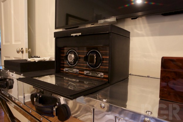
I have not worn a single mechanical watch since getting the Apple Watch on April 24th. I have tried a couple of mine on for a minute or two, admired them, and put them back into a watch winder box or a case. I then put my Apple Watch back on my wrist and laugh that in the future, younger generations are going to grow up and wonder why we ever put a piece of steel on our wrists that only told us the time and date.
It's early in this category, but it couldn't be more clear that Apple is the winner, and I haven't liked a product this much, ever, even months later.
Jonathan S. Geller can be reached via email at jonathan@bgr.com
