All The Ways iOS Has Gotten Worse In Recent Years
Even Apple's harshest critics can generally agree that there are a few areas where Apple shines brighter than most companies. The first is customer service, which is one area where Apple is without question unrivaled. No other consumer electronics company in the world has a customer support staff in stores, on the phone and online that is as courteous and helpful as Apple's, and no other company has policies that are as pro-consumer. In fact, as terrific as Apple's policies are in general, Apple store reps often still bend the rules and go out of their way to make customers happy.
Another area where critics and fans alike have generally given Apple the edge over rivals is user experience. iOS and macOS might not always pack all of the flexibility and functionality found in rival platforms, but the overall user experience and user-friendly features is unrivaled. At least, that used to be the case.
Is iOS becoming "user unfriendly"?
I've read chatter to this effect with increasing frequency in recent years, and I constantly find myself engaging in conversations with readers about this topic. Since it was first introduced back in 2007, Apple's iOS platform has always been the simple, streamlined alternative to more complex and overbearing smartphone operating systems like Symbian and Windows Mobile. Then Android came along and offered a number of nifty features that were absent in iOS, but Apple's platform was still far more user-friendly and reliable.
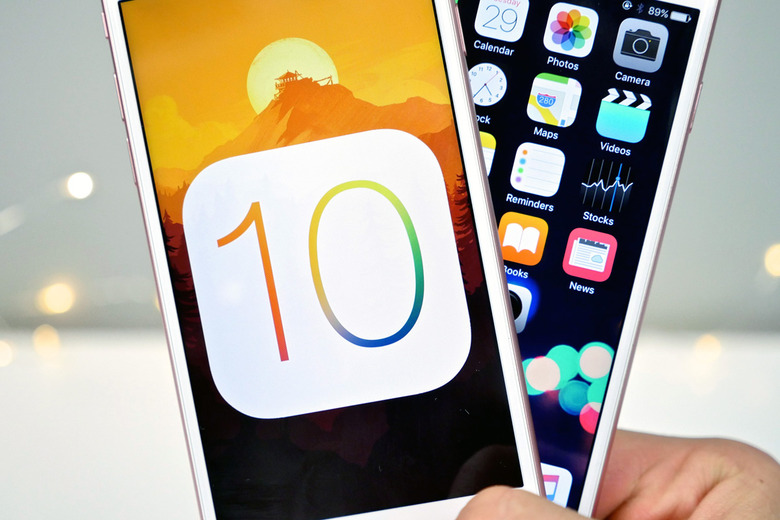
Fast forward to 2016, and iOS 10 was the latest in a number of steps backward for many fans. A recent thread posted by Reddit user "metroidpwner" finally pushed me to make this conversation more public, rather than continuing to have it over and over again with readers who email me.
With each new update, Apple adds new features. This is obviously important and everyone wants useful new features, but many longtime iPhone users are finding that these new features often come at the expense of the user experience. Here are just a handful of "user unfriendly" changes listed in that Reddit post:
- Control Panel has been expanded, but now it takes an extra swipe to reach the music controls.
- Pop-up notifications to update iOS have become increasingly aggressive — almost Windows 10esque.
- The new unlock mechanism that replaces swiping with home button presses.
- UI changes that make hanging up a phone call far more complex than it should be.
- Siri. Oh, Siri.
The Redditor's list goes on, and I could add plenty more to it myself. But I want to hear from you, longtime iPhone and iPad users. Is Apple adding new capabilities to iOS at the expense of the once-great user experience? Is ease of use taking a back seat to feature expansion? Let me know what you think on Twitter.
