Microsoft Windows Phone 7 Preview
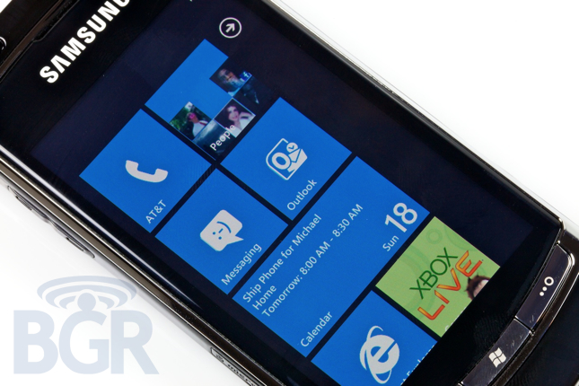
Once at the top of the smartphone pack, Microsoft's current mobile operating system, Windows Mobile, has quickly fallen from grace. Luckily the juggernaut in Redmond, WA decided finally to do something about that. You call it whatever you'd like — a restart, a do over — but Microsoft has entirely changed course with Windows Phone 7, and they have broke most everything in the process. That means old Windows Mobile applications won't work, the entire OS has been redone, and practically nothing from the user's perspective has been carried over. A good thing when you're now playing in a world of Androids and iPhones. We have been testing out a non-final, never ever going to be released to market Samsung prototype Windows Phone 7 device for a week, and we're excited to let you know what we think of the operating system.
Hardware
We're not going to review the actual hardware we received since it will never see the light of day, but we can talk about the hardware requirements and what that means for the platform. Microsoft has a reportedly over 200 page document that details what's required of the hardware powering Windows Phone 7. Some of that includes a minimum of a 3.7" 4-point capacitive multi touch display, 5 megapixel camera, 1GHz CPU, all memory must be built-in (it can be microSD, just not user accessible), dedicated graphics chip, and three hardware buttons on the front. That would be the back, Start, and search buttons.
That baseline is pretty high end, and other chassis specifications will be a little more relaxed. Chassis 2 will apparently support other hardware configurations like slide-out keyboards, and we assume chassis 3 might allow for lower-to-mid specs, but the last part is just our assumption. Having a baseline requirement is a great thing and it's nice to see Microsoft taking more a stance with this new platform. We all can remember the mess that Windows Mobile became (we're talking hardware).

User Interface
If you were to call Microsoft's Windows Phone 7 OS UI minimalistic, you'd be right. Even if our sentence wasn't. The thing is, sometimes when using Windows Phone, things are so minimalistic, that it actually feels a bit too lonely and open. Don't get us wrong, it's nice to feel like you're not constrained to a certain window or foreground app, but at the same time, we can't help but feel that there could have been so much more done.
At the bottom of every application are Microsoft's action buttons. These are contextual buttons that offer added actions in almost every application on the phone. The thing is, they're pretty standard, and not that user friendly. At least not for us. We're not sure why Microsoft decided to implement and design something that actually gets in the way instead of helping. For starters, we found them to be tiny and poorly placed. Unlike Android where you have a menu key and a nice big popup of additional actions, Microsoft's approach is to have a tiny, tiny area reserved for these buttons at all times, wasting screen real estate while also cluttering up the view with pointless circles that are almost laughably small. The one saving grace is the ability to expand this action button view, but we can't but feel like it would have been better all around to move all the action buttons over, and let the user expand / close it when necessary.
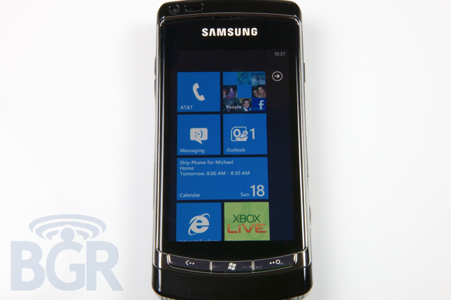
Let's take the homescreen for instance... Apple's homescreen is pretty straightforward. You have app icons and you have folders which contain apps and they are all the same size, and that's about it. Android has the same basic logic, except you can add widgets, add shortcuts to different menus or applications, and even add live moving wallpapers among other things. Microsoft basically reinvents the mobile phone homescreen, and we're not sure we're in love with it.
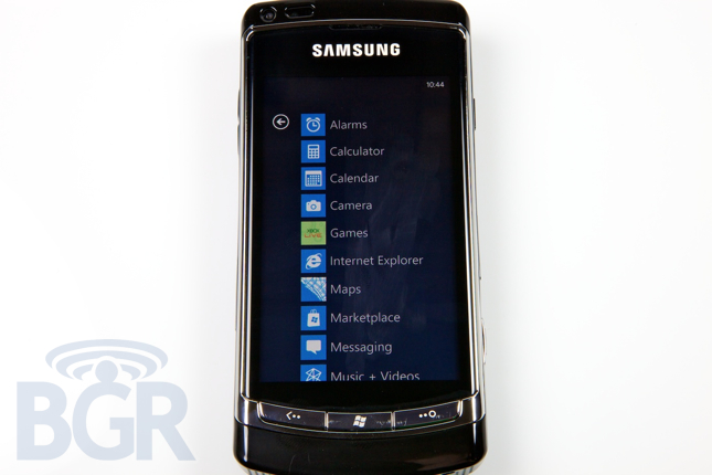
Other annoyances with the UI? The scrolling. There's a very slight rubber-banding effect, but what happens is, when you get to the bottom or top of a scrollable list, the scrolling stops short and the content then sort of mashes up slightly. It's not that elegant, and especially on this not-amazing prototype phone, it looks pretty bad and pixelated.
Something else would be the fact that threaded text message conversations are all the same color. So, your messages and the other party's messages are all the same color which makes things a bit difficult to tell apart. We also can't stand the fact that the top upper status bar which contains the time, battery level, signal strength and other status icons, is basically hidden from view for the most part. You can have these icons show at will by tapping the always-present time in the upper right corner, but it's not that reassuring having this stuff hidden by default for freaks like us.
One last thing that really bugs us with the UI is that there is no application switcher. At all. On a BlackBerry you can hold the BlackBerry key, on Android devices you can hold the Home key, and on the iPhone you can double tap the home button. Just simply navigating back, back, back, back and back doesn't really cut it, and during every day usage, it got tired quick.
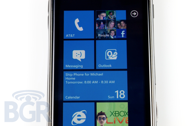
Home Screen / Hubs
Microsoft's new Hub interface is decent attempt to centralize different application data in a clean and pretty fluid manner. Apps will be able to create their own hubs, as will OEMs and carriers, but they'll have to follow some design guidelines that Microsoft has created. Yes, Microsoft will be limiting the scope of what third parties can do with hubs, and we think that's a great idea. Thing's like the navigation, and apparently even fonts will look uniform from hub to hub.
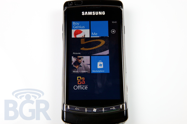
Hubs are a great idea in general, but the homescreen, filled with hubs, just comes off feeling unfinished and unpolished. Microsoft was sure to mention to us how they wanted the OS to just naturally speak for itself with clean, modern fonts and lines, and not be overloaded with fake 3D UI elements like drop shadows and the like. The thing is, it really comes off as feeling a little too plain for us, especially with the all black default color scheme. If you try and remedy that specific problem and you flip it the setting to use white instead of black, the phone is so bright that it's basically unusable.
You could argue the homescreen is the most important part of current smartphones, and in our view Microsoft really falls short here. It's definitely dynamic at times, but it's underwhelming for the most part and it sort of cheapens the other positive areas of Windows Phone 7.
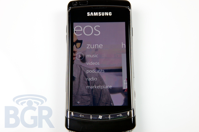
Zune / Music
If you're a fan of the Zune music player, you'll no doubt be enthralled with the Zune app on WP7. It's clean, functional, and very hip looking. In fact, Windows Phone 7 is basically modeled after the Zune UI (in our view at least, since we didn't see WP7 debut until after the Zune). It contains everything you'd want in a music player nowadays, like video / music video support, podcasts, a built-in radio, and the Zune Marketplace.
We've never been huge Zune fans over here, but we do have to say using the music player on WP7 was a really pleasant experience. We'd absolutely put it second to Apple's iPod on their iPhone. It is miles ahead of anything coming out of RIM or Android at this point, and it's great to see a phone that is just as focused on multimedia as it is on say, email.
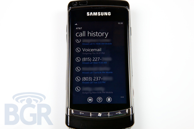
Phone
We're not going to lie, we really have no idea how people actually let the phone app get this far. When you first launch the application, you'd except to be at the keypad, so you can actually make a call, right? No. You're presented with the recent call history list. Just text splattered on the screen. No problem, you'll mosey on over to settings and change the default view so the keypad shows up. Ah, problem there. You can't make that change because it's not an option. So to make a phone call, you have to go into the phone and hit one of the poorly-sized action buttons below to bring up the keypad to make a phone call.
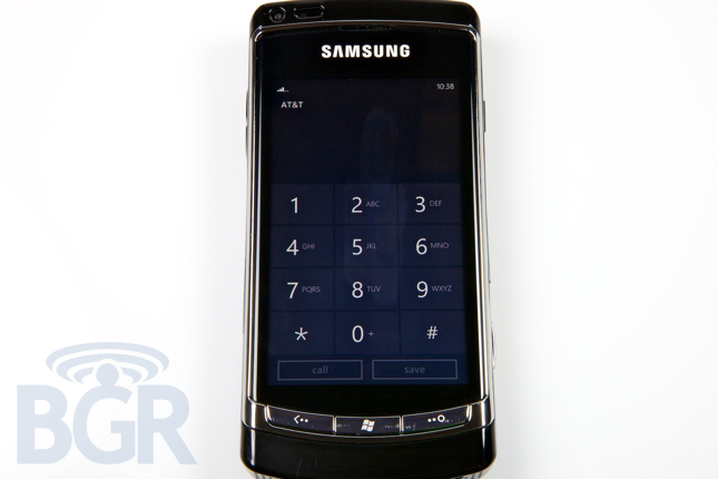
Another annoyance? Let's say you do for some reason want to actually call someone on your recently called list, so you don't have to bring up the keypad this time. Just tap the phone number in the list, and off you go. Not quite. Microsoft links the recent calls to "profiles" not numbers. It's the most insane thing we've ever seen. If you tap on the caller in the list, you don't dial the phone number, a profile view slides in and you then have to determine which number to call from there. Ok fine, but if you got a call from just a phone number, and not someone in contacts, it won't bring up the profile, it will just dial the phone number. Again, not quite. It will still bring up a profile view, but this time offer default options of calling or texting that number. A simple long press gesture could have solved these problems in our book. Long press to get options to text the number, save it to your contacts, or anything else. It's another little missed UI piece of the puzzle that gets really apparent when you use the OS a lot.
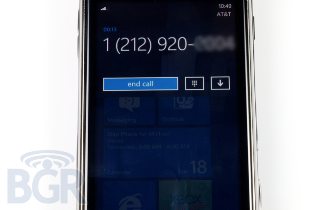
Actual phone calling works fine enough, though it can be a little confusing at times. Unfortunately Microsoft tries to be a little too hip by showing the background as transparent, and we just don't know what purpose this solves but a cheap UI effect. In our minds, you're either actively in the phone call (foreground), or the phone call is minimized (top status bar). But to have the phone application in the foreground not take up the whole screen and the view below it to be transparent doesn't really flow much. Maybe we're being picky, but with already frustrating calling experience, we'd have liked the phone application to just be a phone.
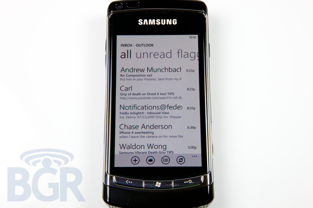
As huge Microsoft Office fans, using the email app on Windows Phone 7 is nothing short of fantastic. It's simple, easy to use, feature-packed (especially if you're on an Exchange 2007 or 2010 server), and really enjoyable. It's one of the only default apps to use a white color scheme instead of black, and it really looks great. Emails are organized in the hub very cleanly, with all, unread, flagged, and urgent sections that are flickable.
The transitions here work very well for the most part, but it's a little overblown at times and kind of wastes time if you're really hoping to and from emails in a hurry. Unfortunately, in this non-final version of the OS, PDF attachments were not supported. We've reached out to see if that will change in the first shipping Windows Phone 7 handset. There are little things we're not in love with on here, but they are pretty small... we don't like how there is no status bar for attachment downloads, it just says "Downloading" with no visualization of how much time or amount of data is left to download, we also don't like that by default, emails sent from the handset aren't immediately available in the sent folder. You have to manually sync the folder to view emails sent from the phone. Seems a little counter-intuitive. One last annoyance we stumbled across is that even with specific rules set up in Outlook 2010 on an Exchange server wit Outlook open, messages can slip through the cracks. It's not every message, and it's not the end of the world, but we haven't seen this happen on an iPhone, BlackBerry, or Android handset even once.
Something incredibly stupid with the email app, is the inability to remotely search for emails. With Microsoft launching this feature in Windows Mobile 6.1, and basically every other smartphone OS supporting it, it's pretty amazing how it isn't included. You're limited to whatever is locally stored on your device to search through. Microsoft did let us know they were open to revisiting this, so we'll have to see if it changes in the near future. For the meantime though, this really takes away from a great email application.
Keyboard
We absolutely love the keyboard on Windows Phone. It's so... clickable yet still virtual. It really flies, the predictions and corrections are awesome, and it's almost as good as the iPhone's keyboard. The iPhone has a more functional layout, and better access to symbols and corrections, but Windows Phone's keyboard is just about there, and easily our favorite second best software input device on a smartphone platform. Unfortunately, there's no multi-touch capability on it, but it's still very solid.
Browser
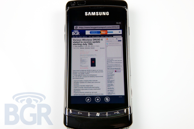
The mobile web browser is a tricky one. In our view, Apple still holds the crown, regardless of whether Android has taken over in raw Javascript performance. It's a whole package kind of thing, and with RIM currently out of the picture, the only two competitors are the aforementioned. Microsoft's browser is fine, but it's far from pleasurable to use. It's not the most elegant browser (there might just be some software bugs that will be fixed in the first shipping handset) and we at times had some pages that didn't render properly, and were a little janky after scrolling through them. The browser supports tabs, and has a simple thumbnail view to hop back to an open page, or close the open tab. There are favorites and a history view, and to be honest, that's about it. Bing search is built into the navigation bar, though search results don't populate in real-time like on Android and iPhone platforms. All in all, the browser was fine, but didn't have anything that was lust-worthy. We still prefer Google's and Apple's mobile browsers.
Productivity
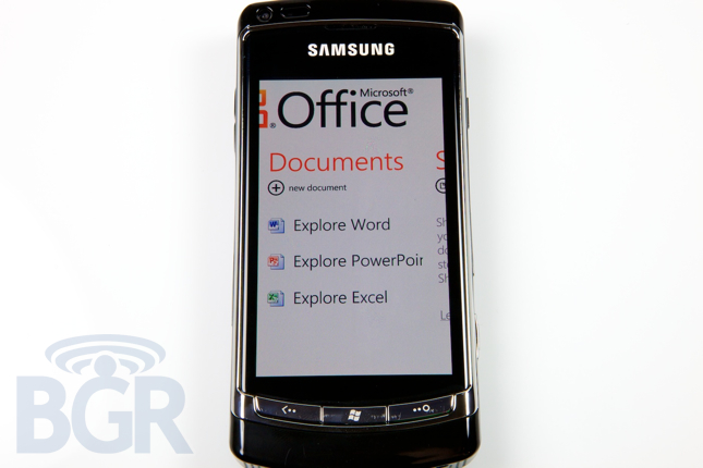
Microsoft's bread and butter is of course Windows and Office. So, what would a Microsoft mobile product be without a great implementation of Office? Windows phone 7 has its own Office 2010 hub complete with Microsoft Word, Excel, PowerPoint, OneNote, and SharePoint access. Combine that with the great email app (we can call it Outlook), and you've got a pretty powerful mobile productivity software suite. Easily the best mobile Office experience, and why shouldn't it be?
Social Communication
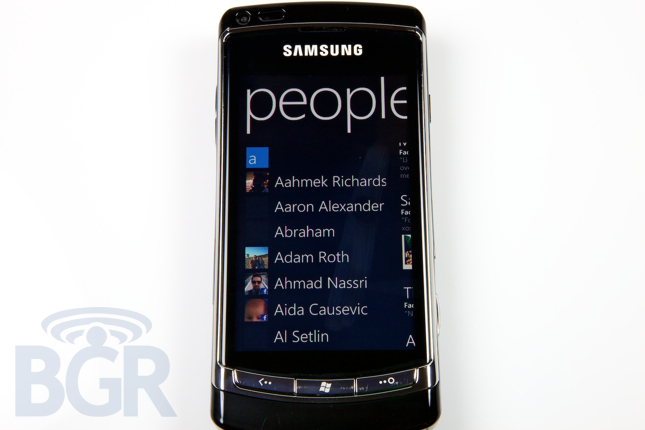
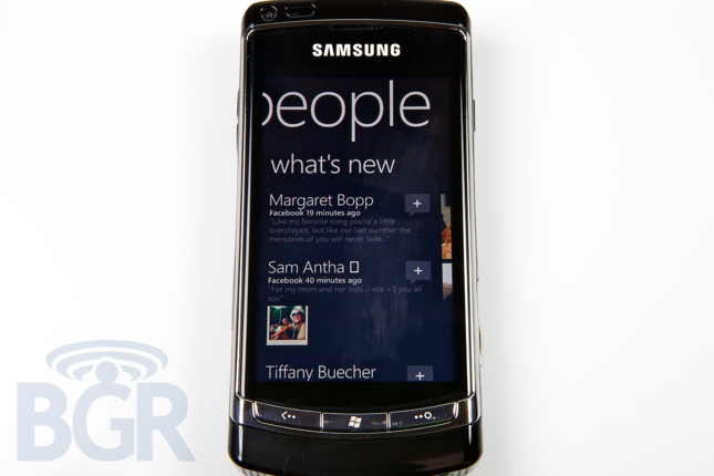
Windows Phone is pretty social right from the out of box experience. You can link your Windows Live, Facebook, and Exchange accounts as you glide through the first time set up process. Windows Live, Facebook, and Exchange contacts are all integrated together in the main people view. Unfortunately, there doesn't seem to be a way to control what shows up here, or limit it. For instance, we'd love Facebook to sync to our existing contacts in our address book and link up, but there is practically no interest in seeing every single Facebook friend listed in the people view. We have no found a way to filter out contacts by services or even groups and that's kind of frustrating.
Facebook status updating is built right into the device, but sadly your choices are only that and your Windows Live status. Twitter is nowhere to be found here.
The photos hub is interesting as it's an aggregated view of your local and remote photos, and sharing photos is a relatively easy task if you can figure out how. When tapping on an individual photo in a single view, nothing happens. You'd think there would be some overlay that pops over with action buttons, but you actually have to tap and hold the photo to accomplish this. Once there, however, you are greeted by a lot of sharing options. You can email the picture, upload it right to Facebook, send it in an MMS, or upload it to Windows Live SkyDrive.
Conclusion
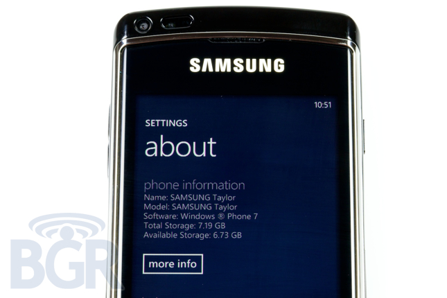
It should be clear to everyone that Windows Phone 7 as a platform is not finished yet. The first handsets aren't rumored until September, October, or November depending on what site you're reading on which day, and the handset we have been using for a week won't ever be released and is meant only for developers to test apps on actual hardware. However, we have been playing around with WP7 for enough time, and the OS is well-enough along that we have got a great feel for it, regardless of any minor improvements before the first handset launches. Microsoft has no doubt broken course and gone in an entirely new direction, something that many people wish RIM would do, and we applaud them for that. They have created a brand new mobile operating system packed full of clean, modern, and sometimes even beautiful design elements.
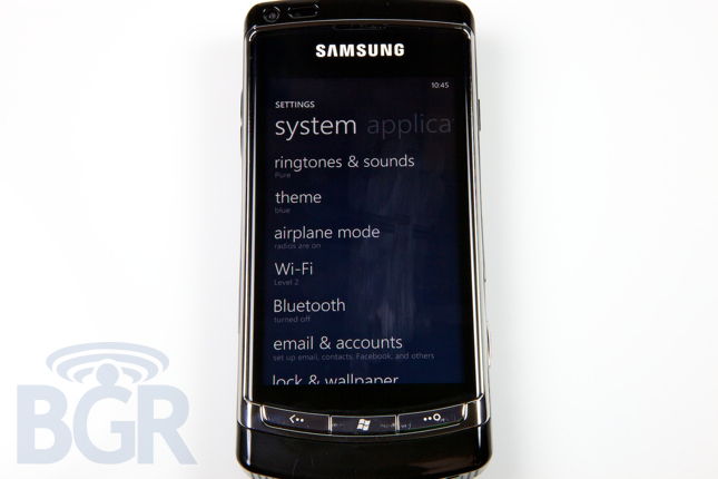
We liked using the OS in general, though the experience for us felt a little too much like our time using the Microsoft KIN 2. The tiled homescreen seems a little too constrained and boxed in for us, and the non-frills design approach actually left the handset menus and navigational elements feeling bare and unfinished, rather than pure and unaltered. Not having any sort of menu for hoping back and forth between applications hampers your every day usage, and the animated transitions also start to feel old pretty fast. For a phone that was made from scratch and started on after the first iPhone was introduced, and for a phone that's not even in market yet, it unfortunately in our view falls short. There's practically no real innovation we can see with Windows Phone 7. It's a decent mashup of some already pioneered features like aggregated status updates linked with your contacts, customizable homescreens, and a mobile apps and music marketplace, but we're not sure that's enough to push WP7 ahead of the three big juggernauts. It's a fantastic featurephone, but as a truly competitive smartphone platform, we're just not sure at this point in time.
There is no killer application on Windows Phone 7, and we can't see an overwhelming reason to use one instead of an iPhone, BlackBerry or Android handset. Whether Microsoft's OS updates to the platform will be enough to change our minds in the future is up to them, but for now, they've created a decent mobile operating system from scratch, but it unfortunately still has that Microsoft feel. And that's not the best thing sometimes.