Will The Tesla Model 3's Unique Dashboard Design Alienate Buyers?
In an effort to keep costs down, Tesla's highly anticipated Model 3 will not feature a futuristic dashboard or an advanced heads-up display (HUD). Despite rampant speculation regarding Tesla's plans to introduce a futuristic dashboard, Elon Musk this week confirmed that there will be nothing of the sort on the final Model 3 design. On the contrary, the Model 3's dashboard will be completely devoid of all the gauges drivers have been accustomed to seeing in front of their eyes for decades.
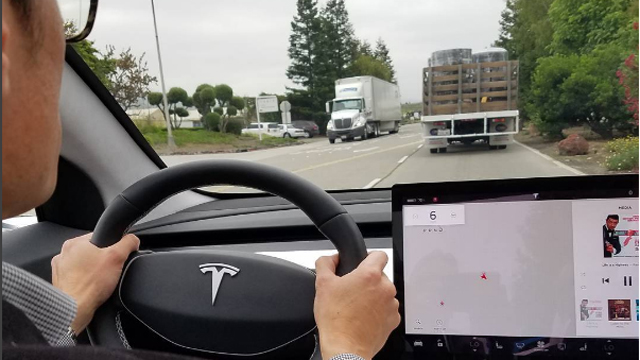
Instead, Model 3 drivers intent on ascertaining their current speed or checking out how many miles of range they have left will have to glance over at the car's 15-inch tablet located in the center console. In short, this is what the Model 3 driving experience is going to look like.

Though Elon Musk argues that traditional instrument cluster becomes less relevant when a car can drive itself, there's no getting around the fact that we're still a few years away from that reality taking shape. And with Tesla set to begin Model 3 deliveries later this year, it's not unreasonable to wonder if the bare bones dashboard design pictured above might alienate some prospective buyers.
As it stands now, there are presumably anywhere from 380,000 to 400,000 Model 3 reservations on the books. Those reservations, however, are non-binding and reservation holders can receive their deposit back at anytime. That said, it will be interesting to see what percentage of existing reservation holders actually end up purchasing a Model 3 and if the Model 3 design will adversely impact that figure.
A car is a very personal item and consumers can therefore be very fickle about what they are willing to fork over money for. While the fit and finish of the Model S has never been anything worth writing home about, the Model S is a luxury sedan that attracted early adopters who, by and large, are more willing to overlook design shortcomings.
The Model 3, in contrast, is a more budget-friendly car and, it stands to reason, will likely be a buyer's primary vehicle. That being the case, one has to wonder if Model 3 buyers will be less inclined to cut Tesla some slack for a dashboard design that is rather lacking relative to comparably priced cars.
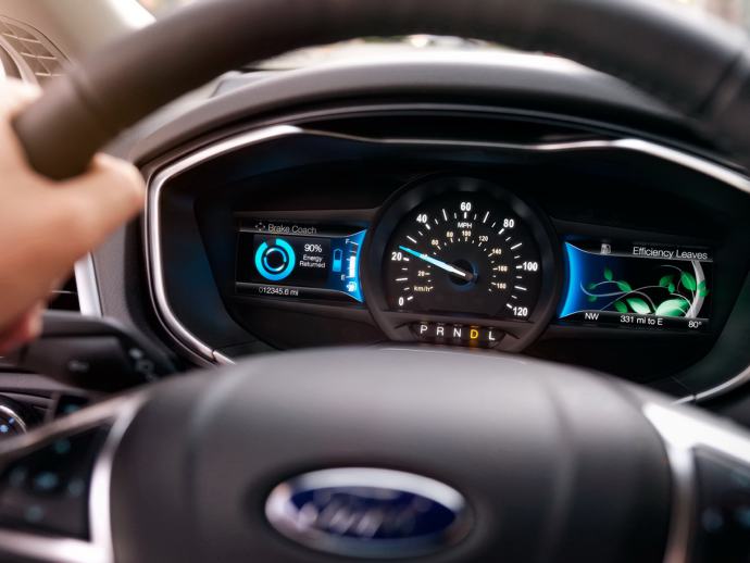
As a quick example, here's what the 2017 Ford Focus dashboard looks like.

Meanwhile, here's what the Model 3 dashboard looks like.
Will the allure of having an EV and being part of the Tesla brand be strong enough for buyers to ignore the meager design above? While Musk maintains that drivers won't care, I'm not entirely certain that's accurate given that Tesla is positioning the Model 3 as a car for the masses.