PayPal Sues Pandora For Ripping Off Its Logo Design
Last October, Pandora decided that the brand was in need of a revamp. So, as tech companies are prone to do, the music streaming company rolled out a brand new logo. And, as tech companies are also prone to do, the new logo design was accompanied with a healthy dose of marketing jargon.
"Music is a personal experience for everyone, from the artists creating it all the way to the fans listening to it," Pandora boasted in a blog post a few months ago. "And as Pandora continues to evolve the most personal music experience, our new look embraces the dynamic range of sound and color, visualizing the energy and emotion that artists pour into the creation of music, and that we feel as listeners. Our dynamic brand is composed of form, color and pattern, which we implemented into the new P icon and serves as your portal into the unique and diverse range of music you love."
Are you done rolling your eyes yet?
Okay, good.
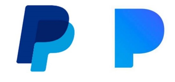
Now to be fair, Pandora's relatively new logo and app icon isn't that bad, but it was hard to ignore that it looked awfully similar to PayPal's existing branding. Here's a side by side comparison for context, with the PayPal logo on the left and Pandora's on the right.

Again, it's hard not to see the resemblance between the two and now PayPal is taking the matter to court. Late last week, PayPal filed suit against Pandora for stealing its logo and even included a few screenshots of Twitter users complaining about the confusion they've experienced on account of the similar logo designs.
PayPal's complaint reads in part:
Pandora has interfered dramatically with PayPal users' experience through the adoption of a new logo in October 2016, which not only resembles, but openly mimics the PayPal Logo. Element by element and in overall impression, the similarities between the logos are striking, obvious, and patently unlawful.
...
It therefore comes as no surprise that the Pandora Logo is confusing, frustrating, and delaying consumers in their efforts to locate and use the PayPal payments platform when they are met with two nearly identical logos. Just as importantly, the Pandora Logo is causing the status of the PayPal Logo as a unique identifier of the PayPal brand to be blurred.
In a statement on the suit made to Gizmodo, PayPal added the following:
We have invested significant time, money and energy into ensuring that our distinctive P logo easily identifies PayPal on mobile devices. In the face of this substantial investment and resulting goodwill, Pandora adopted a blatantly infringing logo. The striking similarities were immediately the topic of news articles and social media commentary by confused customers. Since Pandora would not agree to resolve this matter amicably, we had no choice but to file this lawsuit to protect both our brand and the PayPal experience for our over 200 million users.
Pandora, meanwhile, has yet to issue an official comment on the matter.
