Netflix Is Testing A Few New UI Changes - See Them Here First

Netflix is constantly testing new features to improve the user experience of its apps. Some of the tests that Netflix runs are only for the mobile apps, while others might only apply to desktop or TV apps. For example, Netflix tested and launched a tool for removing items from the Continue Watching row on mobile devices before the feature arrived on desktop. Not all Netflix subscribers will see these UI changes, as they're limited to those who have agreed to take part in tests. And not all of the features will graduate from these trials.
The latest tests can be found on the desktop app that many users might be familiar with, especially those who binge Netflix content on a laptop or desktop. Netflix is toying with two important changes: A new Settings menu that lets you customize the appearance of the title cards and a new Categories section.
The new Title Details settings menu appears to the right of your profile picture in the top right corner of the app. Press it, and you'll be able to toggle Title Details on and off.
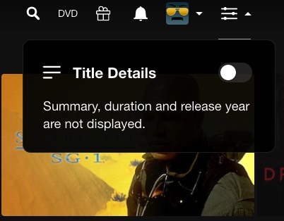
New Title Details settings menu appears next to the user profile.
Here's what the Netflix menu looks like when the text is removed:

Title Details setting disabled.
This is actually how all title cards are displayed right now. You'd have to hover over the title card and press the More info button (arrow down) to get to that information.
Here's what the Netflix menu looks like with title details enabled:

Title Details setting enabled.
Some might argue this is a better experience, giving you information at a glance to help you decide whether to start watching a show or movie or keep scrolling.
Speaking of scrolling, the new Categories section should make it easier to find the content you're looking for:

New Categories menu in Netflix's web app.
All streamers suffer from the scrolling problem. We keep scrolling vertically and horizontally in search of new things to watch. And we start from the top. The process can be frustrating and might involve performing actual searches in the hope that the gem that might inspire you is placed somewhere in Netflix's mysterious categories.
The categories menu lists 18 genres. Click the one you want, and you will be taken to a new page that looks a lot like the home page. The content is displayed in various categories and submenus, as seen below.
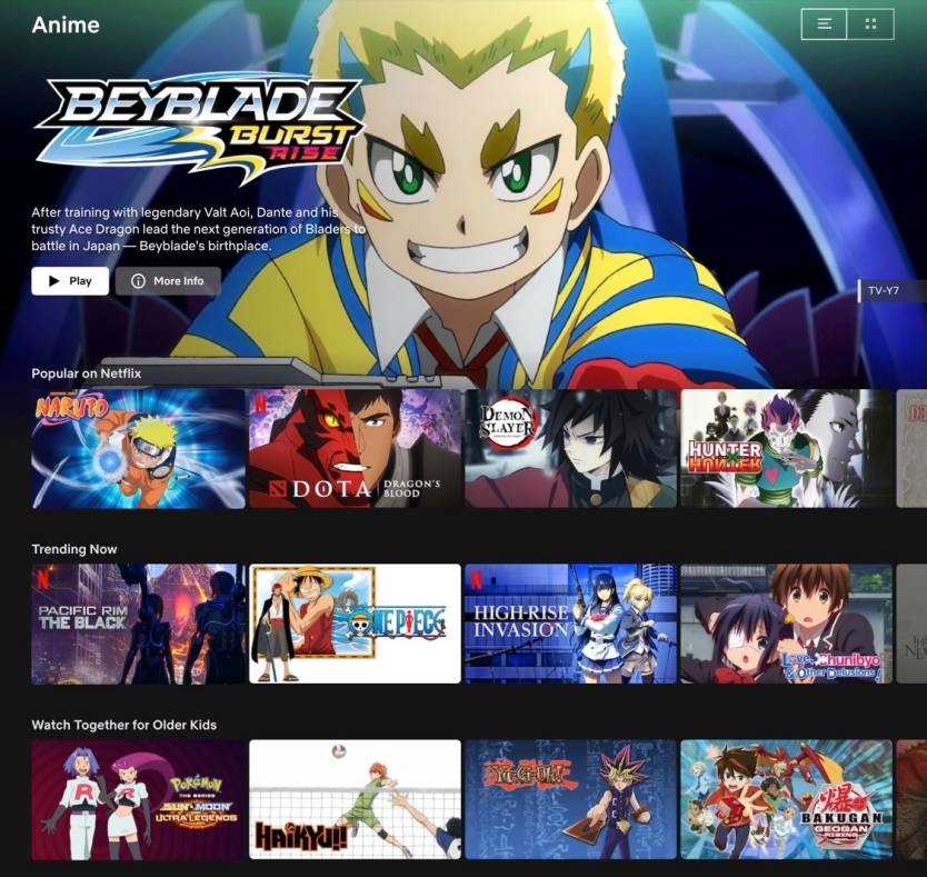
Netflix content shown under the Anime category.
In other words, you'll continue to scroll vertically and horizontally, but at least you might be closer to picking something you actually want to watch. Mobile users might be familiar with Categories, as the menu is already available to them. The mobile version lacks three items: Independent, International, and LGBTQ.
The new Netflix UI changes won't appear for every user. In our testing, we have seen either the Categories or the Title Details test, but we haven't seen both on any of our accounts. As with previous tests, there's no telling when or if Netflix will bring any of these changes to the rest of the Netflix user base.