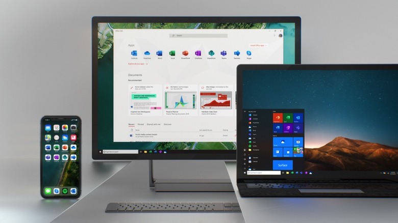
Microsoft Office Apps Are Getting New Icons
There's no denying that the Office suite of apps is Microsoft's most important product, even more critical for the success of the company than Windows. That's because many people already use alternatives to Windows, including Mac and Chrome OS. Even iOS and Android count as Windows 10 alternatives.
But regardless of your operating system preferences, Microsoft Office is still the best productivity suite out there. And Office works across platforms, as it's available on Windows, Mac, iOS, and Android. Microsoft is always looking to improve the Office apps, even if it means just minor visual alterations. To that end, for the first time in five years, the Office icons are changing, and we already have a preview of what they'll look like.
The Office apps icons are easily recognizable across platforms, especially if you've been a long-time user. The last time Microsoft updated them was five years ago, but a refresh is due. As you can see in the following presentation video, Microsoft is going for simplicity with its new icon designs, as well as a focus on collaboration:
The icons still maintain their personality, and you'll quickly be able to recognize Word, Excel, and PowerPoint apps in any list of computer or mobile applications. The letters that Microsoft uses for its Office apps are still there, but the background has been changed to something simpler — geometric shapes associated with the apps.
![]()
Microsoft's goal here is to focus on the content rather than a specific format and highlight the collaborative nature of Office apps. That's why the Word app loses the document outline in favor of shapes that suggest lines of text. Similar changes affect the Excel and PowerPoint icons.
"Our design solution was to de-couple the letter and the symbol from the icons, essentially creating two panels (one for the letter and one for the symbol) that we can pair or separate," Microsoft's Jon Friedman wrote on Medium. "This allows us to maintain familiarity while still emphasizing simplicity when inside the app."
![]()
Icon design updates are also coming to other apps, including OneDrive, Outlook Mobile, and Skype. The new icons will be rolled out to users in the coming months, starting with mobile and web apps.
