Microsoft Showcases The Fluent Design Changes Coming To Windows 10 In 2018
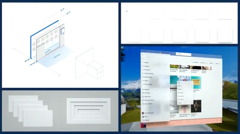
Google stole the show this week with a keynote catering to developers and end users alike, but on the second day of Build 2018, Microsoft gave Windows 10 users a great reason to tune back in. During a session called Fluent Design: Evolving our Design System, Microsoft showed off a series of significant design changes that will make their way to the platform throughout the year, making Windows 10 more cohesive and attractive.
Microsoft introduced the Fluent Design System last year at Build 2017 — a design language that would be based on five key components: Light, Depth, Motion, Material, and Scale. Our first taste of Fluent Design arrived alongside the Fall Creators Update last October, but that was just the beginning of what will be a long process.
In the hour-long session, Microsoft covered a wide variety of enhancements and adjustments that will appear in the coming months, but we'll focus on a few of the highlights. First, we have the command bar flyout, which is a separate command bar (similar to the one you see at the top of a Windows 10 application) that is contextualized for whatever you're working on at the time. The flyout will be highly customizable for third-party developers.
Shadow effects and a simpler color system will also play major roles in the future of Fluent Design, as apps will have more depth in the future, making it easier to distinguish between apps and interact with the device regardless of which method you choose, be it on a standard monitor or through a VR headset.
While many of the features are brand new, some are in response to changes that might not have been as successful as Microsoft expected them to be. For example, when Microsoft launched the Universal Windows Platform, the size of apps grew on the whole as developers designed with touchscreen devices in mind. This wasn't ideal for computer users who continued to rely on a mouse, which is why a new compact sizing is coming in 2018.
These are just a few of the countless Fluent Design refinements set to roll out before the end of the year, and while only a few of them will change the way you interact with your Windows 10 device, the culmination of the new design language should begin to take shape as third-party developers get on board with the changes.
