You Can't Even See The Most Brilliant Thing About The iPhone X's Design
It has now been nearly a week since Apple released the iPhone X, and the response from users has been overwhelmingly positive. In fact, I cannot recall any iPhone launch that has gone this smoothly for Apple. No "gates" like Antennagate, no widespread winging over minor problems, and no serious backlash over any of the features Apple introduced on the iPhone X. Honestly, the near-universal positive response has been pretty shocking.
It's not shocking because the iPhone X is a bad phone or because it has any serious issues, of course. Instead, it's shocking because the iPhone X marks the most dramatic change ever to Apple's iPhone lineup, and people are generally afraid of change. The Touch ID feature everyone relied on is gone, and the home button that had been at the center of the iOS user experience is gone as well. And yet people by and large are still head over heels in love with the new iPhone X thanks to its impressive power and stunning design.
What you might not know, however, is that the best thing about the iPhone X's design isn't something you can actually see when you hold the phone.
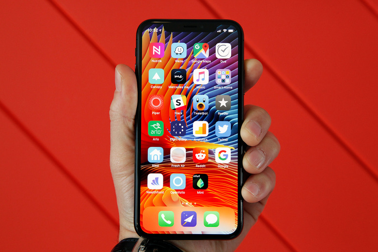
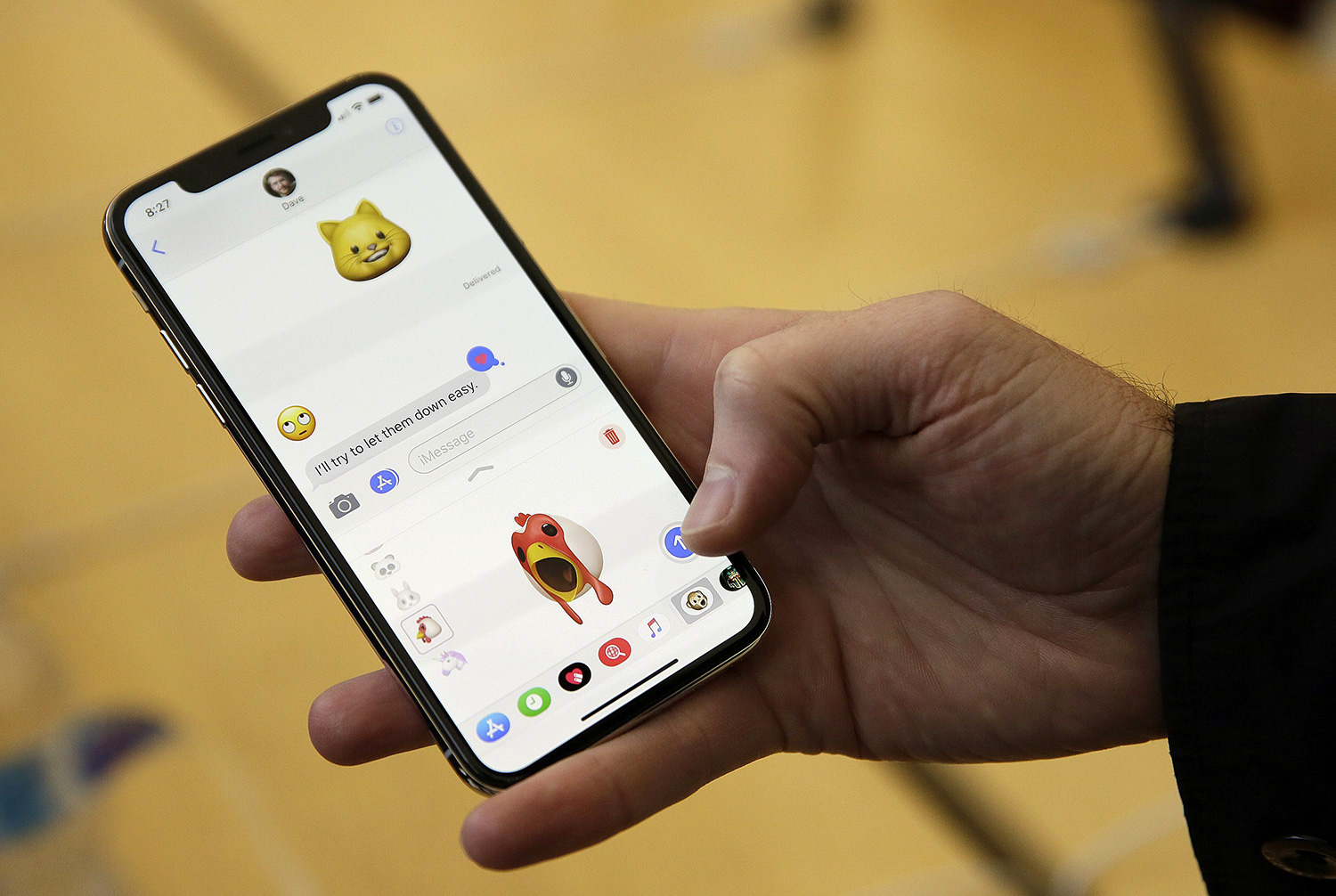
Here's a picture of the iPhone X and its (almost) all-screen design:
Now, let's look at some other phones that launched before the iPhone X and also feature (almost) all-screen designs.
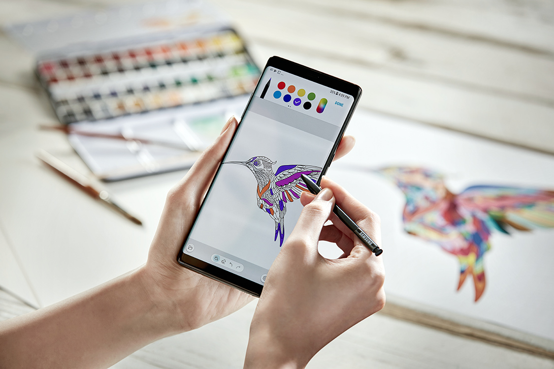
Samsung's Galaxy Note 8:
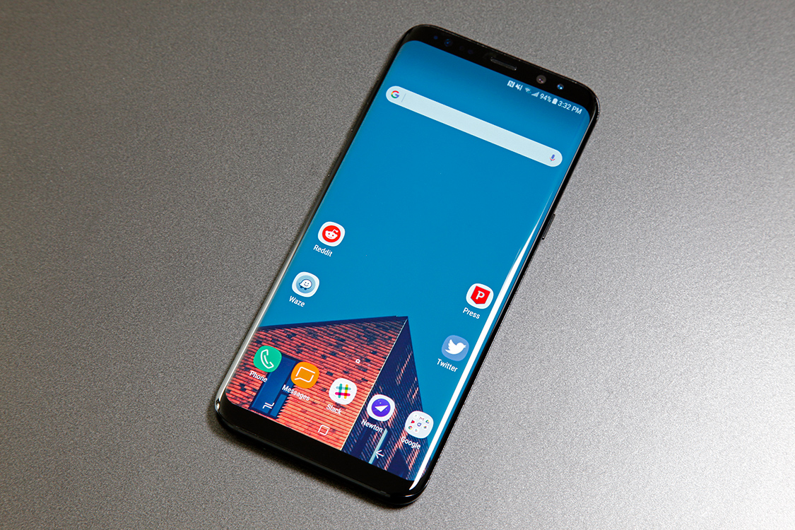
The Galaxy S8:
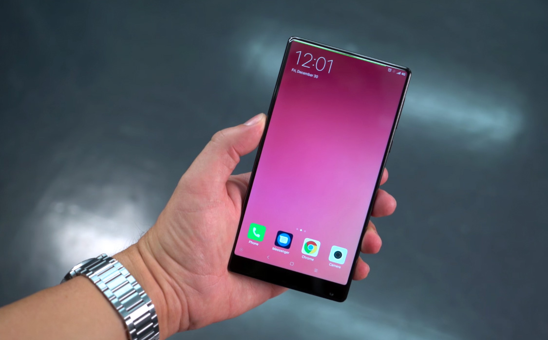
The Xiaomi Mi Mix:
The LG G6:

Now, all of those phones have beautiful designs with extremely small bezels around parts of the display. But if you look at Samsung's phones again, you'll notice that the bezels above and below the screens are quite large, and the same can be said of the LG G6. Xiaomi's phone has barely any bezel on the sides or above the screen, but the bezel below the display is enormous.
Now let's look at the iPhone X again:

Apart from the "notch" where Apple houses the iPhone X's ear speaker, TrueDepth camera array, and other sensors, the bezel is remarkably thin all the way around the screen which every other phone we've looked at has a huge bezel on the bottom. How did Apple manage to get the phone's display to stretch all the way to the bottom of the phone when no other company could?
The answer lies in the following image:
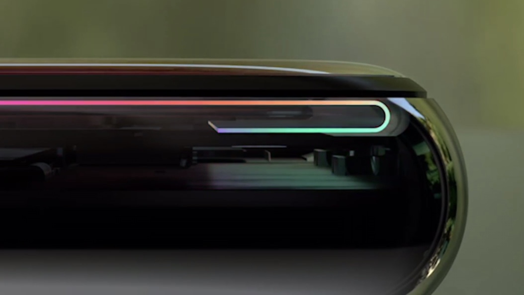
Rumors surfaced long before the iPhone X's launch suggesting that Apple was going to use flexible OLED display panels in the phone. And yet a few months later, designs leaked that showed a perfectly flat iPhone. What gives?
If you look closely at the image above, you can actually see that the iPhone X's display stretches past the bottom of the phone and then actually curves around behind itself. Apple did this so that the display controller — the chip that allows a screen to actually display images — could be hidden behind the actual display instead of underneath it, as is the case with every other all-screen smartphone on the market.
Apple's engineering here is nothing short of brilliant. It's a remarkably elegant solution that allowed Apple to release an iPhone with a display design that is vastly superior to everything else on the market. You can be sure that Apple's rivals are already hard at work copying this terrific design — surprising, we know — but for the time being, this is just one more way that the iPhone X is in a league of its own.
