Apple Already Has A Software 'Fix' For The iPhone 8's Worst Problem
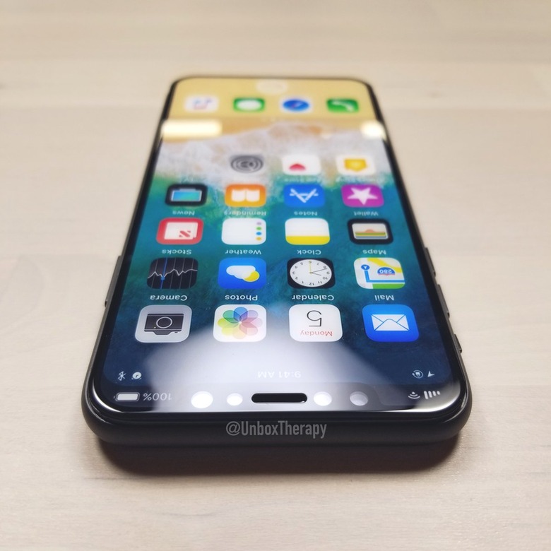
The iPhone 8 will look like no other iPhone, and it'll pack a bunch of features not available on any other smartphone made by Apple to date. But just like previous models, the iPhone 8 will not have a perfect design. The long-hated antenna lines are going away, but the camera bump on the back will still be there, and it'll be quite noticeable. However, the worst thing about the iPhone 8's design is that top bezel. It's not a full bezel, only a cutout that occupies the middle area, housing key components including the speaker, the camera, and the facial recognition system.
Apple accidentally confirmed that's the iPhone 8 design in a first firmware version for the HomePod, which was posted online a few days ago. The same leak also suggests that Apple has already fixed its top bezel problem.
The top bezel isn't only an unsightly presence that bothers the eye. It has a much deeper impact because it affects the way images are displayed on the screen. On the left and right side, we'll have UI elements part of the redesigned status bar in iOS 11.
A developer digging through the leaked HomePod code already discovered that the iPhone 8 will have a different type of status bar.
"The new status bar seems a lot more complex and powerful in design, maybe even interactive," developer Steve Troughton-Smith said on Twitter.
He then added more details about the code that covers the new status bar. "UIStatusBar has been redone with a new visual provider system, one of the options being 'split' (presumably for iPhone 8 camera notch)," he said.
Others found the same hints in code that Apple is changing the status bar in iOS 11, at least for the iPhone 8:
Some interesting related strings (I'm guessing you've come across these) pic.twitter.com/Go5ZVFlzea
— Jeff Grossman (@Jeffrey903) August 1, 2017
As you can see, the software will take into account the "top corners" of the status bar. The code doesn't say it, but it's safe to assume that the corners flanking the bezel may be used to display certain information like indicators for cellular and Wi-Fi connectivity (on the left) and battery status (on the right). And the corners may sit on top of the actual status bar that will be seen in apps.
That implies the camera cutout will not eat into the content shown in apps, which is certainly not something we'd have expected anyway.
Let's hope that screenshot-taking on the iPhone 8 will not include the top corners of the screen. We already saw how ugly such screenshots can be on a new phone that has an all-screen design and a top camera cutout like the iPhone 8. It's not pretty.
