Behold: This Is The iPhone 11, But Without That Massive Camera Bump
As sure as we are that Apple will release new iPhone models each September, we're also sure that a vocal minority of people will find something silly to complain about when those new iPhones are released. And thanks to all the leaks and rumors we're privy to each year, we actually don't even have to wait for those new iPhones to hit store shelves to see what people's complaints will focus on each year. We already know everything there is to know about the upcoming iPhone 11 series design, which will look quite similar to Apple's iPhone XS design from last year and its iPhone X design from the year before. That's right, just as it did with the iPhone 6 design that stuck around for three consecutive years, Apple plans to reuse the same design once again for three years in a row.
With the iPhone 7, Apple decided to make a few minor design changes in an effort to freshen things up a bit. After all, people had been accustomed to seeing the same iPhone design two years in a row, and then a fresh new design every other year. The iPhone 7 introduced two new color options, matte black and "Jet Black," and it also introduced a dual-lens camera that enabled Portrait Mode photos and 2x optical zoom. Fast forward to 2019 and Apple is using the same script yet again. A report from the world's top Apple insider several months ago said that the iPhone 11 and iPhone 11 Max will use new frosted glass backs to change the look a bit, and it might even come in a new finish. Then on the camera front, Apple is moving from the dual-lens setup we all know to a triple-lens configuration for the main camera. Therein lies the source of people's complaints this time around, and a new set of renders imagines what Apple's next-generation flagship phones would look like without the big camera bump everyone is talking about.
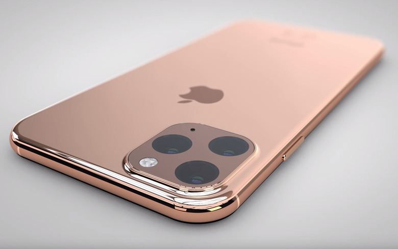
The image at the top of this post isn't an actual photo of the iPhone 11 or iPhone 11 Max. That said, it was created using schematics that were stolen from the Foxconn factory where iPhone 11 series phones will be assembled. As such, renders like the one above are believed to be very accurate representations of what Apple's upcoming new flagship iPhone models will look like. The finish on the back should look a bit different since the glass will be frosted, as reported by TF International Securities analyst Ming-Chi Kuo, but the rest is likely spot-on.
Naturally, one's eye is drawn directly to that massive camera bump in the top corner on the back of the iPhone 11. Since it occupies far more space than anything we've seen before on an iPhone, people have taken to Reddit and Twitter to complain about how ugly it is. As was the case with the first dual-lens camera on an iPhone... and the notch on the iPhone X... and the antenna lines on the iPhone 6... no one will care at all about the new, larger camera bump once the iPhone 11 has been out for a month or so. In the meantime, however, the internet was built for whining and that's exactly what people will do.
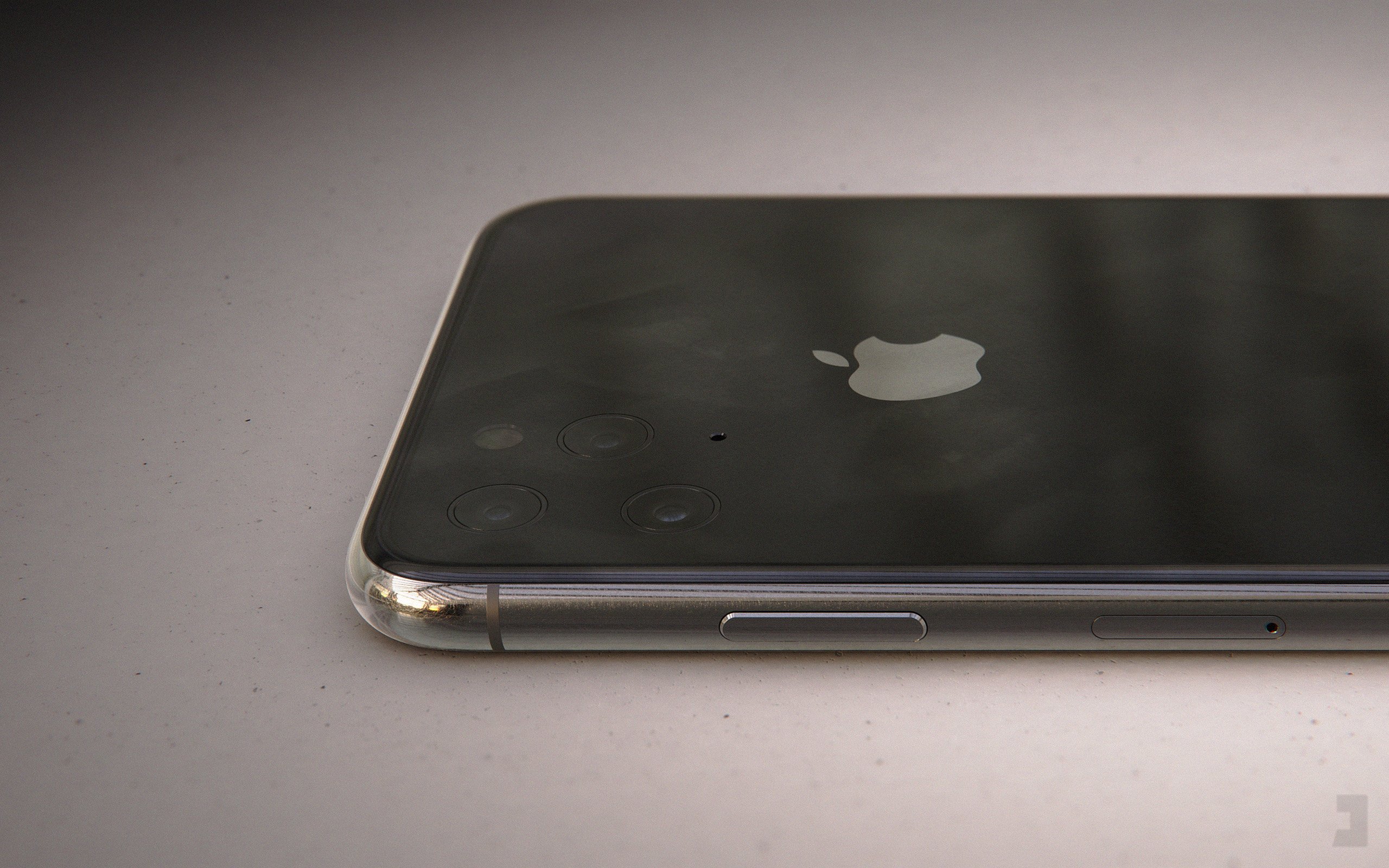
If you really hate the new camera bump on Apple's upcoming iPhone 11 series phones, you've likely wondered what the phone would look like without it. There's simply not enough room inside the iPhone 11 to pack in all those camera components without a bump, so Apple would have to make the phone uncomfortably thick to pull it off. Of course, the laws of physics don't apply to renders, so graphic designer Jonas Daehnert recently recreated the iPhone 11 with a triple-lens camera system that sits flush with the rest of the back.
Remember, it will not look like this. (maybe in 2020?)#teasing pic.twitter.com/yVjwMM8uKa
— Jonas Daehnert (@PhoneDesigner) May 6, 2019
Here's a closer look:

Here's another render of the bump-less iPhone 11, this time in silver with little chrome rings around each lens:
The #iPhoneXI without an hump and a subtle flash. Not that bad.
(game of make-believe) pic.twitter.com/TXiY2y4aqQ— Jonas Daehnert (@PhoneDesigner) March 31, 2019
And once again, a closer look:

We're not fans of those chrome rings, but the flush camera lenses on the Space Gray iPhone 11 render would definitely look sleek in real life. Of course, there's still no way to fit all of those components in the iPhone in real life without making it significantly thicker, so we're not going to see a design like that anytime soon.
