The Real Reason Why The iPhone 11 Pro's Camera Has Such An Unusual Design
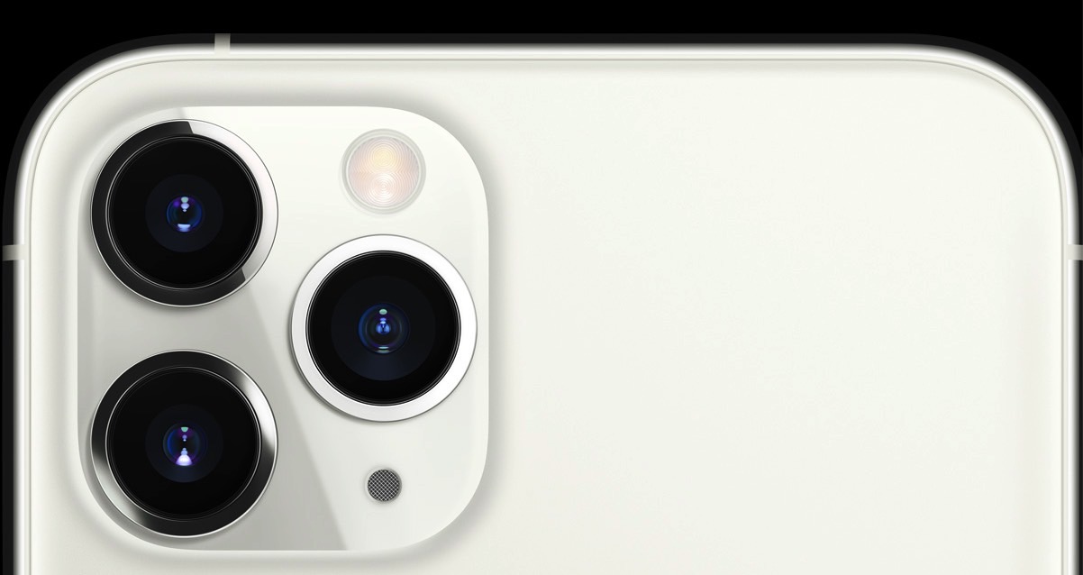
Ever since the iPhone 11 Pro design leaked, some people have expressed their hatred for the huge bump on the back that houses the phone's triple-lens camera, which was placed in a square module. But it turns out that is indeed the real design that Apple used for the rear camera on the Pro phones this year.
While it might not be pleasing to the eyes, the camera design, bump included, are necessary trade-offs that most people will get used to, just like they did with the notch two years ago when the iPhone X came out. It turns out that Apple has a real reason to place the triple-lens sensors as it did on the back of the iPhone 11 Pro and iPhone 11 Pro Max, though, and it has nothing to do with making the most of available space.
Other Android phones that have triple- or quad-lens setups have come up with a variety of arrangements. We're looking at horizontal, vertical, and square camera modules that can house up to four lenses. Phones including the P20 Pro, P30 Pro, Mate 20 Pro, Galaxy S10, and Galaxy Note 10 all feature triple-lens camera modules.
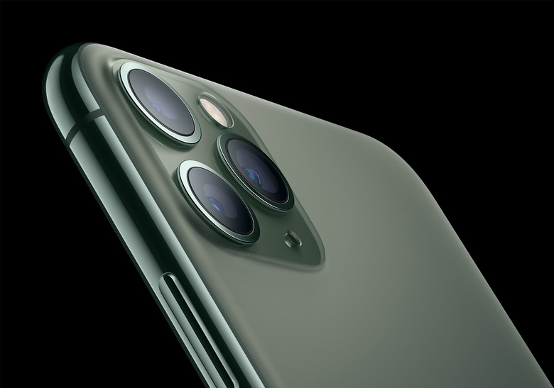
Apple, meanwhile, did things differently, arranging the three lenses on the back in a zig-zag pattern:

Several jokes and memes hit the web after Apple unveiled the iPhone 11 Pro, confirming the design above, while some reports mentioned that the new iPhone's camera bump actually triggered some people's trypophobia.
But Mashable explained exactly why Apple went for this design in its iPhone 11 Pro review:
Ignore the noise you hear online. The iPhone 11 Pro and 11 Pro Max are way better looking in person, after you've held one in your hands, and used its weirdly aligned triple cameras (there is a reason why they're like that, which I'll get into soon).[...]
Apple's deep software paired with the camera hardware is what sets the iPhone 11 Pro cameras apart and makes zooming between the three cameras feel so smooth; there's none of the stuttering you see on Android phones when you toggle from one camera to the other.
It's for this very reason that the three cameras on the back of the iPhone 11 Pros are aligned the way they are: for zooming straight out from the center. On Android phones, where the three cameras are usually aligned in a row, you have to physically shift the phone to the left or to right to recompose a shot, and doing so feels less like zooming in and out and more like switching to separate cameras. It's a small detail, but if you're serious about photography, it makes all the difference.
In addition to explaining this tiny but important iPhone 11 Pro design decision, the review also offers plenty of photos and comparisons with other iPhone and Android handsets, and reveals one other interesting tidbit about the new iPhones. Apparently, the rumored hardware that would make reverse wireless charging possible isn't there, and won't be enabled with a future software update:
A person familiar with the matter told me it's not something the company included and the inevitable teardowns of the phones won't reveal any special coil for it. This highly positioned person at Apple also reminded me not to take all rumors as truth. So take that for what you will.
The full review is available at this link.
