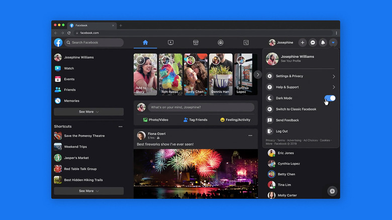
How To Enable Dark Mode On Facebook's Redesigned Website
- Facebook officially launched its redesigned desktop website on Friday, May 8th.
- The new Facebook design looks much more like the mobile app, loads faster than before, removes much of the clutter of the old design, and introduces dark mode.
- You can opt in to the new Facebook design at any time in your browser.
- Visit BGR's homepage for more stories.
Last year at its annual F8 developer conference (remember conferences?), Facebook revealed a new design for its desktop website. Over the past few months, Facebook has been letting some users opt into the new design in certain regions, but on Friday, the redesigned website launched globally, giving everyone with a Facebook account the ability to check out the new look and the additional features of the updated desktop experience.
If you want to see what the new Facebook looks like, all you have to do is head to Facebook.com on a browser, click on the down arrow at the right side menu bar at the top of the page, and look for the menu option that reads "Switch to New Facebook." You can swap back at any time from the same menu.
There are a few significant changes on New Facebook, some of which you'll notice right away, and some of which you might not. In the new version of the site, finding what you're looking for is easier than ever, with massive, easy-to-read buttons and shortcuts all over the page. Page transitions also load faster, which means you'll spend less time waiting. But the most noticeable change of all has to be the long-awaited addition of dark mode.
Once you've switched over to the New Facebook, find that same down arrow in the top-right corner of the screen (it should read "Account" when you hover over it) and click on it. There should be a toggle in the middle of the menu that reads "Dark Mode," which you can click to toggle the feature on or off.
I can probably tell you whether or not you'll like the redesign based on your opinion of the current design of the mobile Facebook app. It's a bit jarring at first, because my browser tab looks like a mobile website that has been reconfigured to fit a wider screen. But there's nowhere to go but up from the old, cluttered design.
"We've grown since Facebook.com launched 16 years ago," the team says. "We've built new features, optimized for new devices and operating systems, and expanded to hundreds of languages. Recently we'd focused on the mobile Facebook experience, and realized our desktop site had fallen behind. People need it to keep up. So we did on-the-ground research, spending months talking to people about how we could make the web experience better for them. Now we're excited to deliver the new site, a great new foundation for the next decades of Facebook.com."
