Google's Next Major Maps Redesign Is Rolling Out, But You Can't Have It Yet
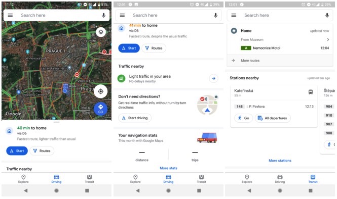
One of the most popular apps in the world is getting a fresh redesign on Android, although the update isn't available to everyone for the time being. The new Material Theme design will introduce a brand new user interface that should make navigation easier than ever on Google Maps.
However, the update isn't rolling out to all users yet, and iPhone user needn't get too excited. There's no telling when the iPhone version will receive the same treatment, providing it ever does.
The Google Maps redesign isn't a surprise, considering that Google announced the update back at Google I/O a few weeks ago. But that doesn't mean you can update your Android app right away.
An Android Police user received a server-side update for Google Maps, but not all beta users are on it. It's likely Google is testing out the new interface before releasing the update into the wild.

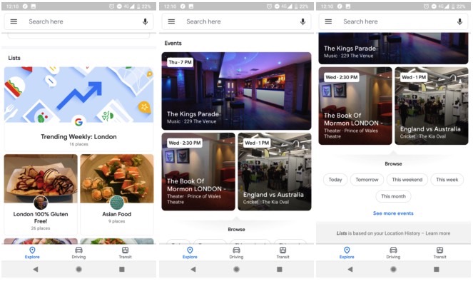
White dominates the new Google Maps UI, and users will notice several other changes, including rounded corners and pill-shaped buttons. The Explore screen gets most changes, including new colorful icons for each category and a scrolling carousel that brings up more information. Scrolling through it will get you lists shared by websites or Google, as well as a list for nearby events complete with different event times.

The number of categories has increased as well so you can search for more things to do around you other than food. What's not included in this update is the new For You tab at the bottom of the app that Google revealed at I/O. Check out more images while you wait for your Google Maps update over on Android Police.
