Google Has Already Updated Its Brand New Google Maps Redesign
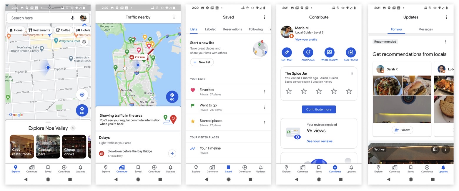
It was just days ago that Google unveiled a brand new Google Maps design in celebration of the app's 15th anniversary. The redesign is meant to offer a cleaner interface, with the most important change concerning the bottom menu. Google removed one of the previous items, replacing it with three tabs to better serve users.
It turns out, however, that Google's user interface makeover wasn't good enough, and the company is making one more important change to the bottom menu.
The Commute tab's name has been changed to a much simpler Go, which should better explain its purpose. That's the tab you should use to navigate the city, whether you're commuting to work or just visiting a new location. The new Go tab groups together the Commute tab and all the other transit-related shortcuts, 9to5Google reports. Here's a look at the redesigned UI after the recent update, but before the changes made to the Commute tab:

It's not just the name of the tab that was changed. The icon has also been redesigned to make it clear the menu isn't just for commuting. The home and office icon has been replaced with one that shows a car and rail, as seen in the screenshots below. Inside Go, the default view is Destinations, which includes shortcuts for Home, Work, and other shortcuts. There's also a Commute tab that now appears at the top. Some Google Maps users have also discovered additional menu items, including Line and Stations and Stop.

The difference between the two screenshots above shows that Google is still experimenting with the new menu. In fact, you might not get the new UI change just yet, but it'll probably roll out to all iPhone and Android users soon. To make sure you get it, you should update to the latest version of Maps, 10.35.2.
