A Significant Design Change Is In The Works For Google Maps
Google is testing a significant design change for Google Maps, with a limited number of users already seeing the change on their Android devices. Google wants to both simplify the user interface and make sure you get to where you're going as fast as possible. Detailed by Android Police, the new design is in testing and some Android users may already see the interface changes as long as they're using the latest version of Google Maps (9.85.2).
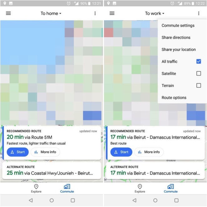
Google is testing out a simplified bottom menu that includes only two options. Explore remains unchanged, but the Driving and Transit tabs were merged into a single new one that reads Commute. That's the tab you'll want to use whether you're driving or using public transportation, and it sure seems like a good idea to combine the two options.
That's not the only change, however. Once you tap the Commute tab, you get to a new interface that displays selections including To home and To work on the title bar. Meanwhile on the bottom, you get cards with recommendations for alternative routes.

A hamburger menu lets you quickly access various settings for your commute, as seen in the screenshot above on the right above. But the new UI loses one thing you may have loved about the current Google Maps experience, and that's the sliding bottom menu that lets you access various settings and options. As Android Police points out, one problem with the new design is that it'll force you to do some "finger gymnastics" on phones that have increasingly taller displays.
There's no telling when this Google Maps design update will be released to everyone, but if you're lucky enough you might be able to check it out while Google is testing it.
