This Is The First Ever Video Of Fuchsia, Google's New Mobile OS That Will Replace Android
Google is working on a mysterious new operating system called Fuchsia that might one day replace both Android and Chrome. Apparently, Fuchsia is more than a hobby for Google, and the operating system represents a major endeavor for the company. There's no Linux involved, and Google is even working with its own programming language for the OS and the apps that will run on it. Fuchsia also comes with a reimagined user interface that looks nothing like Android, even though it still has Material Design at its core.
We already saw the first screenshots of Fuchsia's Armadillo UI, but now a short video shows us how it's actually supposed to work.
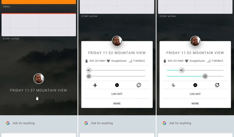
The home screen in Fuchsia an image of the user profile that's currently logged in at its center. There are no app shortcuts and no app drawer in sight. Instead, we're looking at a home area that can be scrolled up or down for different purposes. It looks sort of like Google Now cards in the Google app.
Scroll up and you see the apps or "stories" that you've accessed recently. You can get into each app that you need from there, expand it to full screen, or enable a multi-window mode by dragging an app into a second area. Scroll down and you get Google Now-like suggestions and a search field complete with a new keyboard app.
As for that profile image that dominates the home screen, you can tap on it to reach quick settings like volume, screen brightness, airplane model, orientation lock, and more. The profile section also offers additional information about the handset, including battery life and wireless network details.
The video below, via HotFix, highlights the main features of Armadillo in action.
