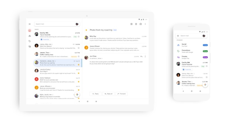
Google's Material Theme Redesign Is Rolling Out Now For The Gmail App
Google on Tuesday announced that its Material Theme redesign for Gmail — which arrived on the web last April — has begun to roll out for the mobile app as well. In addition to looking slicker and cleaner than it used to, the Gmail app has gained a few new features to improve the experience of checking emails on your phone.
The first new feature will be a welcome one for web users (or those of you migrating from Inbox, which will shut down soon): The ability to view attachments from the main screen without actually opening the email thread and scrolling to the bottom. It doesn't work exactly the same as it did on Inbox, but it's still an improvement.
Some of the other features that will migrate over from the web include easier switching between work and personal accounts, warnings to alert you when you receive a suspect email, and the ability to chance between three different views: Default, Comfortable, and Compact. Default is the view that includes attachments, Comfortable leaves you a bit of additional white space (without attachments), and Compact squishes everything close together.
"This update is part of a larger effort to make G Suite look and act like a family of products, designed in the Google Material Theme with ease-of-use in mind," says Google's Nikolus Ray. "We've already updated the web experiences for Gmail, Drive, Calendar, and most recently Google Docs and Sites. In the coming weeks, you'll see the new mobile design in Gmail on Android and iOS, with more G Suite mobile apps to follow later this year."
It's a small consolation for Inbox users who will be losing their email client of choice in the near future, but it's all that Google has to offer for now. The rollout began on Android today and will hit iOS in the coming weeks.
