Sorry, But A Hole-Punch Display Isn't Any Better Than A Notch Display
Like any other industry, trends come and go fairly quickly in the smartphone market. The same will be true in 2019, when a nifty new design trend makes its way to store shelves. Beginning in 2017, smartphone designs were all about the notch. Apple wasn't the first phone maker to cut a chunk out of a smartphone screen — LG has that honor courtesy of the V10 smartphone it released all the way back in 2015 — but no one would deny that Apple is responsible for the boom in smartphone notches that began in late 2017 with the iPhone X. Once Apple's tenth-anniversary iPhone design began to leak, nearly every smartphone maker on the planet rushed to copy it. The end result was a bit embarrassing since just about every Android phone maker on the planet released phones that were spitting images of the iPhone X, but seeing Android phone makers copy Apple's designs is obviously nothing new.
In 2019, something new is happening, though. For the first time in a long time, Apple is no longer responsible for starting a major smartphone design trend. Instead, it was Samsung's announcement last year that it was building smartphone displays with holes cut into them instead of notches. This way, rather than have a larger amount of space consumed by a notch, phone screens only need tiny little holes that allow the selfie cameras to peek through. It's a cool new design and it'll definitely be all the rage this year, but the truth is that it really isn't any better than Apple's old notch design.
Often referred to as a hole-punch display, the idea of this new smartphone design is to increase the screen-to-body ratio and reduce the amount of dead space around a smartphone's screen. In that regard, there's no question that it succeeds. Phones with notches place things like cameras, speakers, and various sensors in the notch, but there's still plenty of unused space between those components.
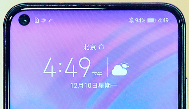
With a hole-punch screen like the one pictured in the featured image at the top of this post, all of the empty space from the notch is completely eliminated. The camera lens (or camera lenses in the case of phones with dual front-facing cameras) pokes through a tiny little hole cut into the screen, and other sensors are small enough to be placed in the barely-there bezel above. A thin cutout for the phone's speaker is typically also found in the top bezel, or some phones use newer tech that actually lets a smartphone's screen double as a speaker.
There's precious little question that hole-punch displays are new and cool. The Galaxy S10 series Samsung is set to unveil in less than a month will be the first globally available flagship phone series to ship with hole-punch screens, and this new design will definitely help set them apart from earlier flagships. Once the novelty of the hole-punch display wears off, however, people will begin to realize that this new design really isn't any better than a notch.
"Screen-to-body ratio" is a stat that hardcore gadget fans throw around all the time. It measures the amount of display on the face of a smartphone as compared to the amount of unused space around the display. So a smartphone with an old design that has big bezels above and below the screen will have a low screen-to-body ratio. Apple's old iPhone 8, for example, has a screen-to-body ratio of about 65%. Phones with notch displays and narrow bezels have much higher screen-to-body ratios. On the iPhone XS it climbs to about 83%, and it's even higher on smartphones with smaller notches.
Phones like the upcoming Galaxy S10 will have screen-to-body ratios that climb significantly higher. Early rumors suggested that the Galaxy S10's screen-to-body ratio will come in at around 93%. Not even phones with small notches like the OnePlus 6T break the 90% mark; the OnePlus 6T's screen-to-body ratio is about 86%.
Here's the thing: none of this really matters. If you're a phone nerd, these are fun numbers to toss around. If you're anyone else though, you're just happy that modern smartphones now have bigger screens than before without the overall size of the phones increasing. When the iPhone X and copycat phones first came out, the notch design was probably a draw for some people because it was cool and new. Now it's not because it's just the norm. When the Galaxy S10 first comes out, the hole-punch design will probably be a draw for some people because it'll be cool and new. By the end of the year, however, it'll just be the norm.
Moving beyond the novelty of screens like Samsung's Infinity-O display, there's something else that should be considered: is this new design really any better than a notch? There's no question that phones with holes in the screen have more display real estate than phones with notches. But the part of the screen affected by holes and notches is way up at the top edge.
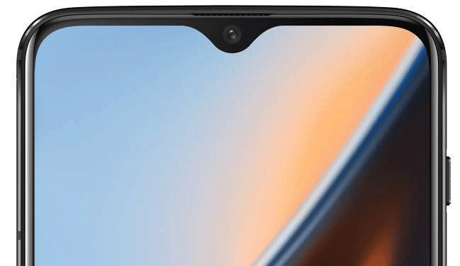
The only content of consequence that's ever displayed near the top edge are the menu bar and things like battery and reception icons. On a smartphone with a notch design, that content is spread out a bit on either side of the notch. On smartphones with a hole-punch design, that content is squeezed to one side or the other while the hole resides in a top corner.
So, I ask again. Is this design:

...better than this design:

...in any meaningful way?
No, it's not. In either case, the status area at the top of the screen is shifted a bit, and you lose a small amount of screen near an edge when watching videos or viewing photos. Even on phones with big notches like the iPhone XS and iPhone XR, any actual disadvantage compared to a hole is minimal. Apple's status area still shows all the info you need.
In the end, both of these designs are just pit stops on the way to smartphones with true all-screen designs. Technology is currently being developed by multiple companies including Samsung and Apple that will allow components like cameras and proximity sensors to be embedded beneath the screen without the need to actually cut a hole through it. Yes, displays can be made transparent — remember this awesome invisible TV demo from back in 2016? Within a few years, phones with no notches or holes (or stupid pop-up selfie cameras that are begging to break) will be the norm. Even then, the actual benefit from eliminating tiny notches and holes will be minimal. It'll be cool and novel at first, sure, but increasing the screen-to-body ratio by a few percentage points at the very outer edge doesn't actually offer any significant benefit.
