Facebook Just Announced Its Most Significant Site Redesign In Its History
Earlier today, Facebook announced plans to roll out a complete redesign of its ever-popular website. While website overhauls are not uncommon, Facebook redesigns are particularly intriguing given how widely used the site is and how iconic the overall look and feel — dominated by blue tones — has become over the years.
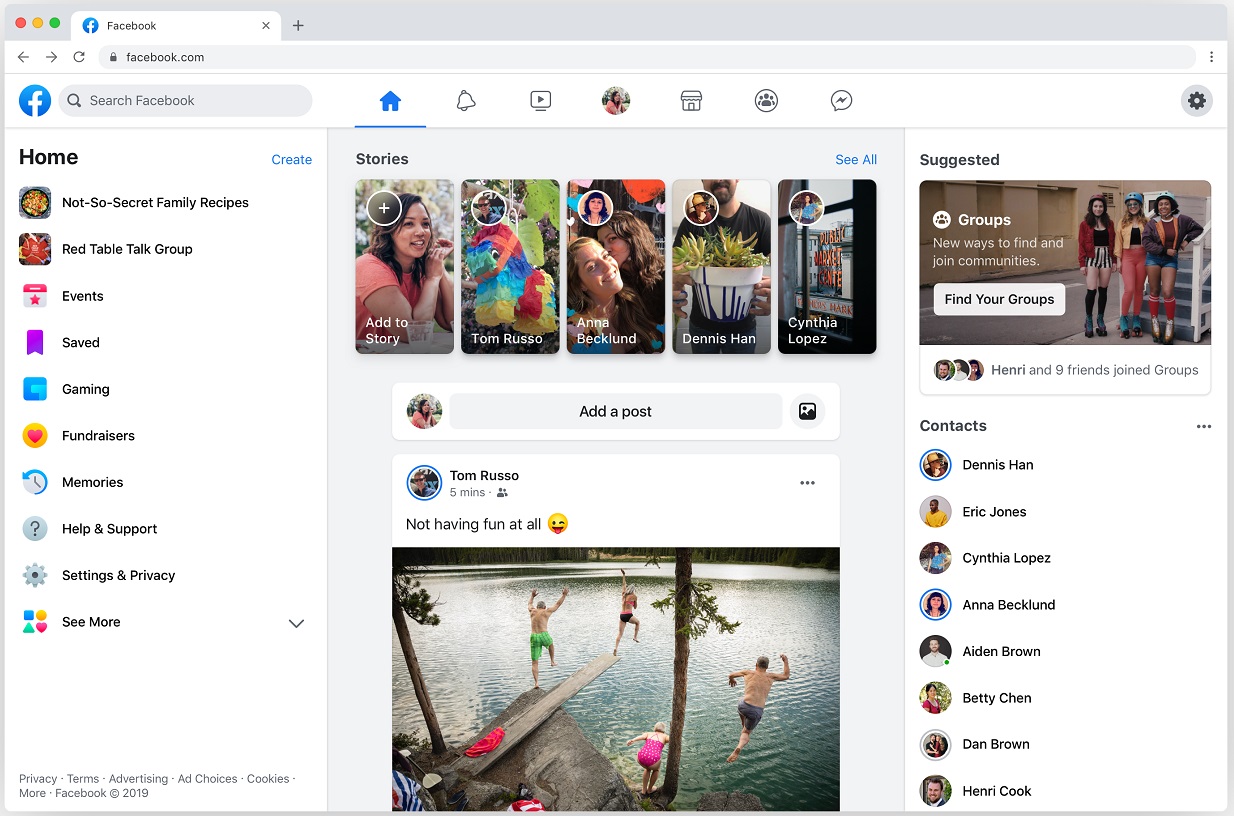
As to what's changing, Facebook said that the blue menu bar that has been part of the site since the very beginning will be replaced by a cleaner interface with a more minimalist sensibility.
Additionally, Facebook noted that the site will place a greater emphasis on groups. This shouldn't come as much of a surprise given that Facebook is still reeling from a seemingly endless number of controversies involving misuses of user data. To this point, Facebook notes:
This redesign makes it easy for people to go from public spaces to more private ones, like Groups. There are tens of millions of active groups on Facebook. When people find the right one, it often becomes the most meaningful part of how they use Facebook. Today, more than 400 million people on Facebook belong to a group that they find meaningful. That's why we're introducing new tools that will make it easier for you to discover and engage with groups of people who share your interests.
Facebook adds that the new design will be simpler and more immersive for users.
"Overall, we've made it easier to find what you're looking for and get to your most-used features," the company said.
Facebook added that the website overhaul will go into effect sometime in the next few months. As to what the new design is going to look like, well, it's quite a departure from what Facebook users have grown accustomed to, as evidenced by the photo below, which Facebook shared during its F8 keynote on Tuesday morning:

And here a few more from Twitter, courtesy of The Daily Show's digital production manager, Anthony De Rosa:
Notably, the Facebook app — which is used more widely than the website — will be graced with a design overhaul as well. Like the website, the blue menu bar on the app has been kicked to the curb and replaced with a blue Facebook logo and a row of icons. It will be interesting to see if there's a user backlash to the unfamiliar design. After all, if there's one thing users of popular websites have historically been resistant to, it's change.
