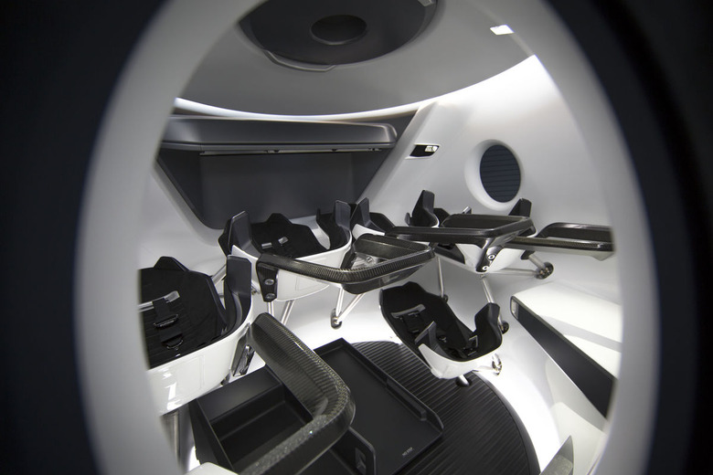
Here's What The Inside Of SpaceX's Dragon Crew Capsule Looks Like
SpaceX is just one of the companies currently racing to become the first to deliver a manned flight solution to NASA, and at its latest check-in it was just as far behind schedule as its competitors. Still, the company is indeed making progress, or at least it would seem so based on the new showcase of SpaceX's Dragon crew capsule.
Finally pulling the curtain back for the general public, SpaceX is now showing off what the inside of the high-tech passenger pod actually looks like. As you might imagine, it's pretty high-tech, but it's also very, very clean. No, I don't mean it looks like it was wiped with Clorox beforehand (though it might have been), I mean that it looks like a modern art exhibit.
In stark contrast to the cluttered confines of most spacecraft you're used to seeing — such as Russia's Soyuz capsule — the inside of the SpaceX Crew Dragon is incredibly minimalist. You wont' see a wall full of knobs and flashing lights, but what you will see is lots of glossy white paint, carbon fiber, and stainless steel.

A trio of displays are situated in front of the passengers, with the various buttons and knobs seamlessly blending into the frame. It all looks very fancy, and it's clear that a lot of thought was put into the aesthetics, but the most obvious question here is whether things will actually look like this once the Dragon is packed and ready for a manned flight.
Generally speaking, manned spacecraft are packed with all kinds of odds and ends that the astronauts need to do their jobs. Walls are lined with straps to hold various pieces of equipment related to the mission, and various checklists and tools are secured to just about any surface that will hold them. So, sure, the Dragon looks like a spacecraft out the year 3000 right now, but chances are it's going to look a bit more messy once NASA scientists get ahold of it.
