New Interactive Map Shows Which Coastal Regions Could End Up Underwater
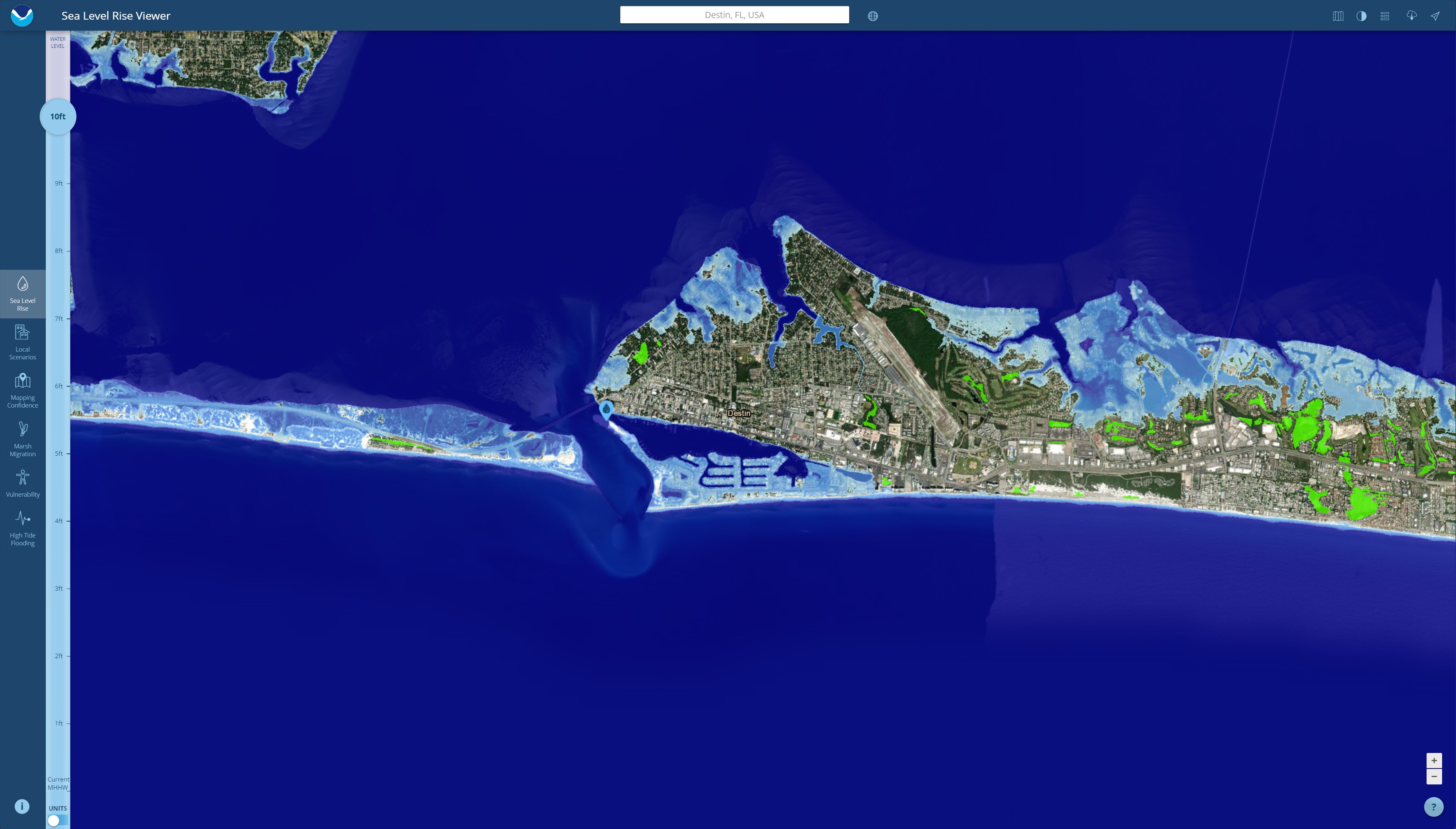
Life on the coast isn't always going to be as luxurious as it is right now. That's because rising global temperatures could eventually cause the sea levels to rise even more, burying much of the current coast underwater. Now, the National Oceanic and Atmospheric Administration (NOAA) has created a sea level rise map to let viewers see how it'll play out on American seashores.
You can see the new map by visiting NOAA's new website. From there, you can plug in your town or address, giving the map somewhere to focus. This gives you a more personalized look at how the rising sea levels will affect your own local infrastructure.

If you don't live near a coastline, then you can always input another city in the sea level rise map to get a simulation of what the escalating sea levels will do to the coastline. There are a total of six different tabs you can flip through right now, including Local Scenarios, Sea Level Rise, Mapping Confidence, Vulnerability, Marsh Migration, and High Tide Flooding.
Each tab provides its own wealth of information about rising sea levels, which could rise as much as 1.6 feet if certain ice shelves collapse. Each tab also contains a slider to let you see what the water levels would look like—aside from the High Tide Flooding tab. The maximum right now is a 10-foot increase, which would cause massive damage to the coastline.
The interactive sea level rise map is designed to pull from new data as it comes in, so NOAA plans to keep this up to date for a long while going forward. NOAA estimates that America's coasts will climb nearly two feet higher than where they currently sit and that those two feet of additional water could arrive within the next century.
