Walmart Is Changing Its Store Design, And Here's What It Looks Like
- Walmart is rolling out a dramatic redesign for its supercenters and other store locations that closely mimics the look of an airport.
- The new layout is supposed to be more efficient for shopping and emphasizes the use of a smartphone and the Walmart app to make the experience more streamlined.
- 200 stores will receive the redesign by the end of the fiscal year, and up to 1,000 by the following year.
As delivery services have ramped up in popularity in the wake of the coronavirus pandemic, some retailers have seen their bottoms lines suffer a great deal. Walmart has done a good job of avoiding a lot of that trauma by promoting its own online shopping options and pushing the message that its stores offer a safe and sanitary shopping experience.
Now, in a bid to reinvent its in-store shopping experience for the digital age, Walmart has revealed the all-new look of its stores. The redesign emphasizes using your smartphone and the Walmart app while in the store itself, and the company says it should offer a more streamlined and seamless shopping experience.
As you might imagine, the press release announcing the redesign is packed with buzzwords. It boasts an "omni-shopping experience," which I guess means that the customer is essentially running their own show as they pick up items and then check out with their smartphone rather than waiting for a cashier.
Here's how Walmart describes the new look:
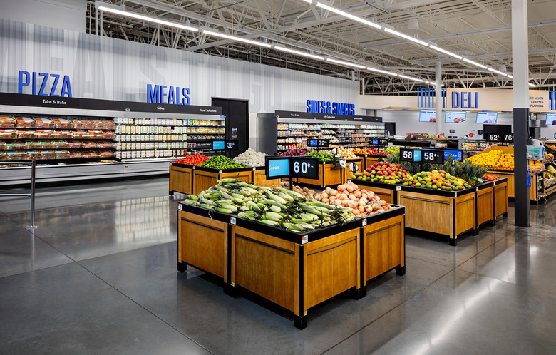
We've updated the Walmart signage on the exterior and interior of stores to reflect the Walmart app icon, creating an instant omni-shopping experience in the customer's mind. As customers enter the store, they are greeted with clean, colorful iconography and a store directory that encourages them to download and use the Walmart app while they shop.
Throughout the store, bold, dimensional typeface (e.g. SEAFOOD, BEEF and DAIRY) directs customers to the exact section they are looking for, while aisles are marked with letter and number combinations to guide customers from phone to product.
Images of an already-redesigned store interior were also released, and they do look quite a bit different than what you might be used to if you're a regular Walmart shopper.
Curiously, Walmart offers some insight into its inspiration for the new design, saying that airports (of all places) were what they were shooting for. "We were inspired by airport wayfinding systems as best-in-class examples of how to direct large groups of people," the company press release states. That's certainly an interesting direction to take, though I suppose it depends on what specific airports they're referencing because I've seen some that make me want to pull my hair out.
In any case, the new store looks will begin to roll out soon, with 200 redesigns being completed this fiscal year and up to 1,000 over the next year.
