You're Ridiculous If You Think This Is Better Than The iPhone 12's Design
- Apple's next-generation iPhone 12 release date is inching closer by the day, and the new phone series is set to feature the company's first big smartphone redesign in three years.
- While the iPhone 12's overall look is expected to be much different from the current iPhone 11 models, the phones will still feature a notch at the top of the display and many people seem to be upset.
- Newer Android phones like the just-announced Huawei P40 Pro feature a hole-punch design instead of a more traditional notch, but the reality is the design isn't any better than Apple's iPhone designs.
- Visit BGR's homepage for more stories.
With April right around the corner, we're now about five months away from seeing Apple unveil its new iPhone 12 series. Unless the novel coronavirus pandemic gets even worse than we're already expecting it to in the coming months, the iPhone 12 will certainly debut in early September regardless of when it's released. New reports that the iPhone 12 series release will be delayed pop up every other day at this point. Then on days in between, we see new reports that it's still on track to hit store shelves in September. The simple fact of the matter is that no one knows for certain when the iPhone 12 and iPhone 12 Pro phones will be released right now — not even Apple's top executives. The situation is fluid and changing on a daily basis, and there's no way to know what the landscape will look like next week, let alone next month and beyond.
Despite the uncertainty surrounding the release of the iPhone 12 series, there's no doubt that we already know what the new iPhones will look like. The world's top Apple insider Ming-Chi Kuo of TF International Securities started leaking details about the iPhone 12 lineup even before the iPhone 11 series was released. The phones will sport a new flat metal frame instead of rounded edges like Apple's current iPhone models, and it'll have an upgraded dual- or triple-lens camera system on the back, depending on which model you choose. It'll also have a notch in the display on the front, and people are already whining about it.
Yes, Apple's new iPhone 12 and iPhone 12 Pro models will have a notch just like Apple's iPhones have since the iPhone X debuted back in 2017. Back then, Android phone makers tripped over themselves trying to copy the iPhone X and 2018 brought with it dozens of embarrassing iPhone X copycats from Android vendors big and small. But that was a long time ago, and Android vendors have moved on... to a different smartphone display design that they can all copy.
All-screen phones with a hole-punch display design like Samsung's Galaxy S10 and Galaxy S20 series are great. There's no question. But here's the thing: a smartphone with a secure face unlock feature can't have just one tiny little front-facing camera poking out of a tiny little hole in the display. They can't even have two tiny little cameras in the display — not unless they want to be shamefully unsecure like Samsung's old phones.
No, phones with secure face unlock systems need more space on the front of the phone for additional sensors like Apple's infrared blaster or the cameras and ToF sensor on the front of the just-announced Huawei P40 Pro. That means they need to have either a great big notch at the top or a great big hole in the display. Is one solution really any better than the other?
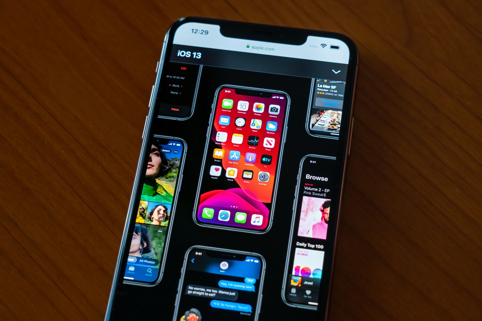
You tell me. Here's Apple's iPhone display design:

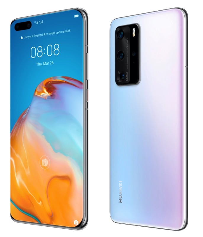
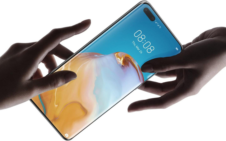
And here's Huawei's new P40 Pro display design:

Come on. Is a giant oblong hole at the very top of the screen really any better than a notch? Why, because there's a tiny little strip of screen at the top? What on Earth can possibly be displayed in that little strip of screen that's of any use at all? The status bar info and icons still need to be positioned to the side of the camera hole just like they have to be positioned to the side of the iPhone's notch. Is it better because it's on one side instead of in the middle? Give me a break.
I've seen many of the same people who complain about the notch in Apple's iPhone displays praising Huawei's new P40 Pro, and that's flat-out ridiculous. One design is no better than the other. They're both fine, and you won't notice the notch or the giant pill at the top of Huawei's display after a few minutes with the phone. Get over it, guys. Stop whining.
