Surprise: Apple Haters Couldn't Stop Whining About The Controversial iPhone 11 Design, But Now No One Cares
Back in 2017 before Apple's new iPhone X was released, people were losing their minds over one particular design feature that had been repeatedly pictured in leaks. That's right, we're talking about the notch. Apple wasn't the first smartphone maker to cut a chunk of out a smartphone screen; that honor goes to LG, which released a phone called the LG V10 back in 2015 that had a notch carved out of the top corner of its display. Then a small startup called Essential released a phone with a tiny notch in mid-2017, a few weeks before Apple's iPhone X was announced. Neither of those phones was very popular though, whereas Apple's iPhone X was the tenth-anniversary iPhone that featured Apple's most significant redesign ever. People went crazy complaining about how ugly the notch was, and how disruptive it would be to the iPhone's user experience. Heck, even I chimed in and wrote about how ugly the notch was before eating crow after the iPhone X was released. In fact, pretty much all the complaints about the iPhone X's notch quickly faded away after the phone hit store shelves.
What made me and all these other people change our tune? It was pretty simple: the notch doesn't matter. Once you start using a smartphone with a notch in the display, you stop noticing it almost instantly. It becomes just another feature of the phone's design. The area at the top edge of the screen is really only useful for elements of the status bar anyway, and Apple just pushed them to either side of the notch so nothing important was even lost. That's why all the whining and whingeing stopped so soon after people actually got the phone in their hands.
History repeated itself earlier this ahead of Apple's big iPhone 11 series launch, with people screaming across all corners of the internet about one particular design feature. Now there's nothing but silence, and no one is complaining that the upcoming iPhone 12, iPhone 12 Pro, and iPhone 12 Pro Max will have the same design feature. Why? Because just like the notch, it was a stupid thing to complain about in the first place.
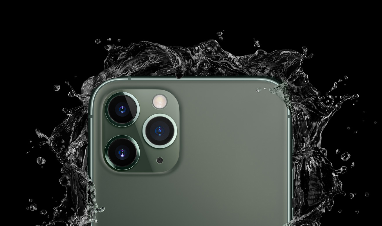
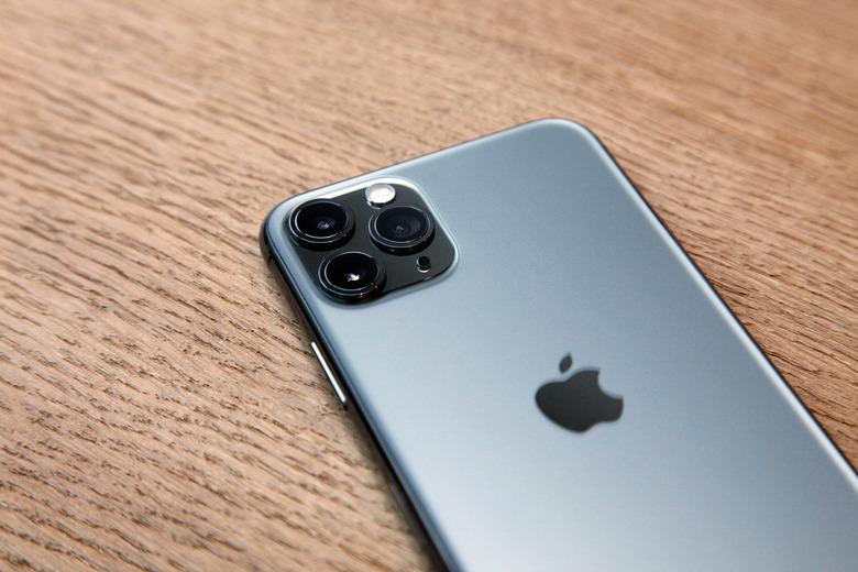
When renders of the iPhone 11 and iPhone 11 Pro models first started to hit the web, people couldn't get over Apple's new rear camera setup. The back of the iPhone 11 had a dual-lens rear camera while the 11 Pro and 11 Pro Max had a new triple-lens camera on the back. The incoming camera upgrade was obviously a big deal, but the bigger deal was that both of these new rear camera lens arrays were positioned in a huge square "camera bump." People hated how it looked, and they weren't shy in sharing their thoughts about the new design in the whiny complaints that rained down on social media sites.

Unlike all those people, I learned my lesson from the iPhone X and its notch. Did the iPhone 11 and iPhone 11 Pro's new square camera array look weird in all the renders that were flooding the web? Yes, of course it did. But as was the case with the iPhone X's notch, this "weird" new design element would inevitably be normalized soon after the iPhone 11 series was released and tens of millions of people were carrying the new phones.
A couple of months ahead of Apple's annual iPhone event this year, I issued a plea for people to stop whining about the new design. I explained that history was repeating itself, just like I did above, and that the new camera design that looked weird to everyone now would soon be completely normal because people would see it everywhere they looked. My email inbox always fills pretty quickly after I published a post like that, and this was no exception. While a few people emailed to agree with me, most of the messages were from people who hated Apple's new design and thought it would never be normalized — even though we had seen the exact same story play out before.
To them, I would now pose a simple question: When is the last time you heard anyone complain about the camera design on the iPhone 11, iPhone 11 Pro, or iPhone 11 Pro Max?
Apple's new iPhone 11 series has been out for just over a month now, and tens upon tens of millions of people around the world have bought them. And guess what... they're much more focused on the fact that Apple's new iPhones have the best smartphone cameras on the planet than they are about the square camera bump. And have you seen or heard anyone complain about rumors that the upcoming iPhone 12 series will have a similar design, potentially adding yet another sensor to the mix as Apple reportedly ponders the addition of a time of flight (ToF) sensor? No, you haven't — and in all likelihood, you won't.
New designs that stray from the norm always look funny at first. Sometimes, they're even ugly. But things are only strange and new until they're normalized, and nothing normalizes a new smartphone design like tens of millions of handsets flooding the streets that all share that same new design. Try to keep that in mind the next time you fire up Facebook or Twitter to whine about the latest smartphone leaks.
