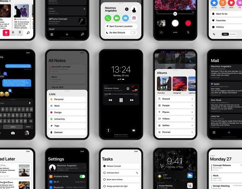
New iOS 13 Concept Fixes One Of The Worst Things About The iPhone
In just a few weeks, Apple will finally introduce the next major iPhone software upgrade, iOS 13, revealing its vision for the next year of mobile computing. iOS 13 is already a hotly anticipated update since some of its key features have leaked, including a system-wide dark mode similar to what's already available on the Mac. While we've been waiting for iOS 13 to arrive, a few designers have created some exciting iOS 13 concepts that look to guess what new software features Apple will bring to the iPhone and iPad next. In fact, we shared a collection of brilliant iOS 13 mockups with you just yesterday. We've got one more stunning iOS 13 concept for you now, and it's one that envisions a system-wide fix for what is possibly one of the worst things about the iPhone.
As much as I love the iPhone's all-screen design that came with the iPhone X in 2017, I don't appreciate the extra bulk of the iPhone X, especially once you add a protective case. One-handed operation is still very clunky, and Recheability is not helpful — I have it enabled, but I only use it by mistake since the gesture to enable it is so hard to perform with one hand.
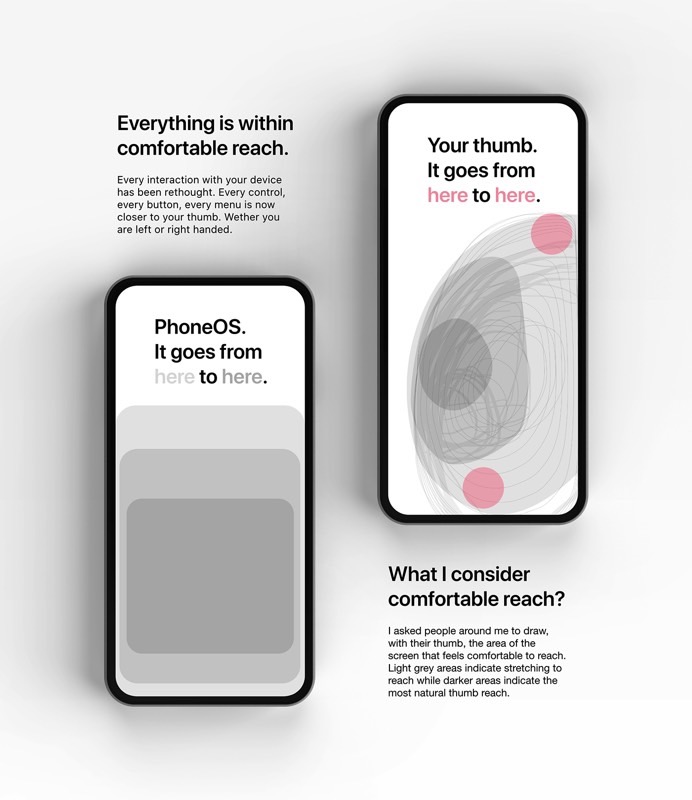
Designer Maximos Angelakis Maximos Angelakis has come up with an IOS 13 concept that aims to make iPhones a lot friendlier for one-handed operation. Rather than using Reachability, Angelakis imagines a new way to allow one-handed control over apps and menus: Shrinking down the user interface and bringing it closer to your thumb, which is usually how you control the phone that's in your hand.
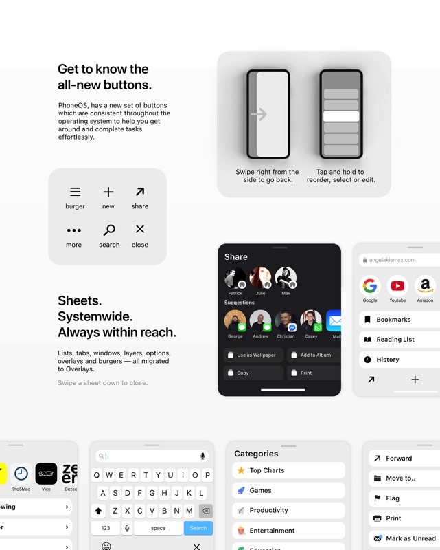
By using cards that occupy only the lower part of the screen and by bringing buttons and menus closer to the bottom of the screen, the designer created an IOS 13 concept that's a lot easier to navigate and control with just one hand. In essence, we're looking at a redesign of Reachability. But rather than swipe down to lower the screen contents, you get cards that cover the content only partially.
In addition to these cards, or sheets as Angelakis calls them, his concept also proposes new buttons and gestures that would be consistent throughout the OS.
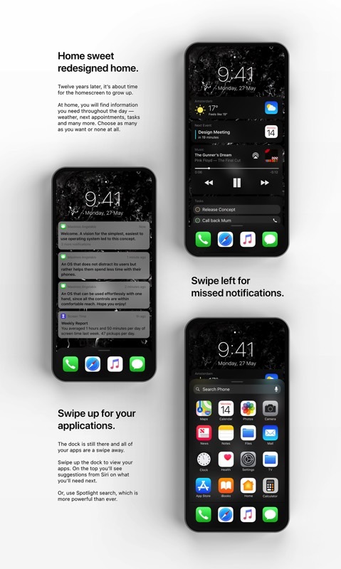
The designer has also reimagined the home screen to give it more functionality, replacing the apps with things you might actually want to have on the home screen, like weather details, the time, and widgets. In this regard, the home screen looks a lot more like Android than iOS, complete with an app tray the user would open by swiping up.
Similarly, the Control Center gets its own redesign and a new gesture. The Reachability gesture, which is no longer needed, lets you invoke the Control Center much more quickly. A swipe down on the home bar will do the trick, although I'll add that this will also cause unwanted Control Center interactions.
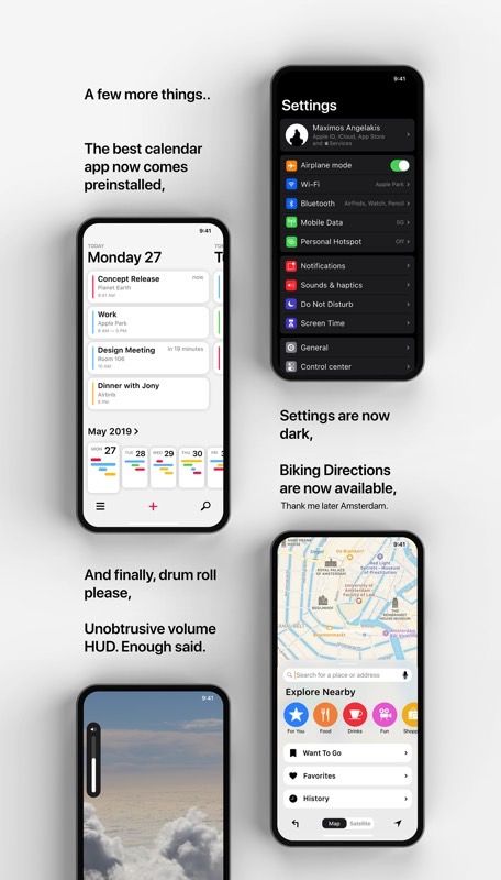
Angelakis reimagined several other core iOS features and apps, including multitasking, the Camera and Photos apps, the Safari browser, Siri, the App Store, and several other Apple apps. On top of that, the concept also delivers a dark mode and a brand new UI for volume control. That's one other feature we expect from iOS 13 this summer. You can check out more images at this link.
Apple will unveil the main iOS 13 features at WWDC 2019 on June 3rd, and launch a first beta version immediately after its keynote. The final iOS 13 version will be released just ahead of the iPhone 11 series launch in early or mid-September.
