Google Maps Looks A Little Better After Its Latest Material Design Tweak
In addition to rolling out new useful features for Google Maps, including some tricks that you've been clamoring for, like the speed limits, speed cameras, and incident reports that you're used from Waze, Google is also tweaking the design of the application. Not too long ago, Google tweaked the side menu of Maps to fit better with its Material design guidelines. The company is now doing the same thing to the search function.
Search happens to be the core of Google's business, but search is even more important in Maps than elsewhere. No matter what you do in Maps, it all starts with a search. And the search interface just got a server-side Material design tweak, as spotted by Android Police. That means you should get the updated design automatically, whenever it's ready to roll out in your market.
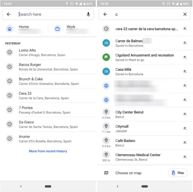
The new Material design tweaks bring over more colors to the search interface, as well as the original typography, Product Sans, that matches other areas in Maps, like the side menu that was updated not too long ago. White is, again, the dominant color, replacing the light grey backgrounds. While white will eat your battery faster than other colors, the new interface does look simpler and more elegant than before. Here's how search in Google Maps used to look before the update:

And how it looks after the search menu design tweak:

Yes, the updated Google Maps search interface looks a lot better. It should be rolling out to your devices soon if it hasn't already arrived.
