Here's Everything That's Wrong With The Android Notch In One Image
If you follow the firehose of tech news remotely closely, then you've probably noticed that most Android device makers have decided to copy the iPhone X this year. The notch is in fashion, so learn to love it. All sorts of smartphone makers are cloning the iPhone X design, including smaller companies from China, but also well-known players in the business, including Asus, Huawei, LG, and OnePlus.
Some of them are even trying to make it look like their notch approach is better than Apple. That list includes Asus and Huawei, who made such claims during their most recent product announcements events, but also OnePlus, who went out of its way to explain to the world why the unannounced OnePlus 6 will have a notch.
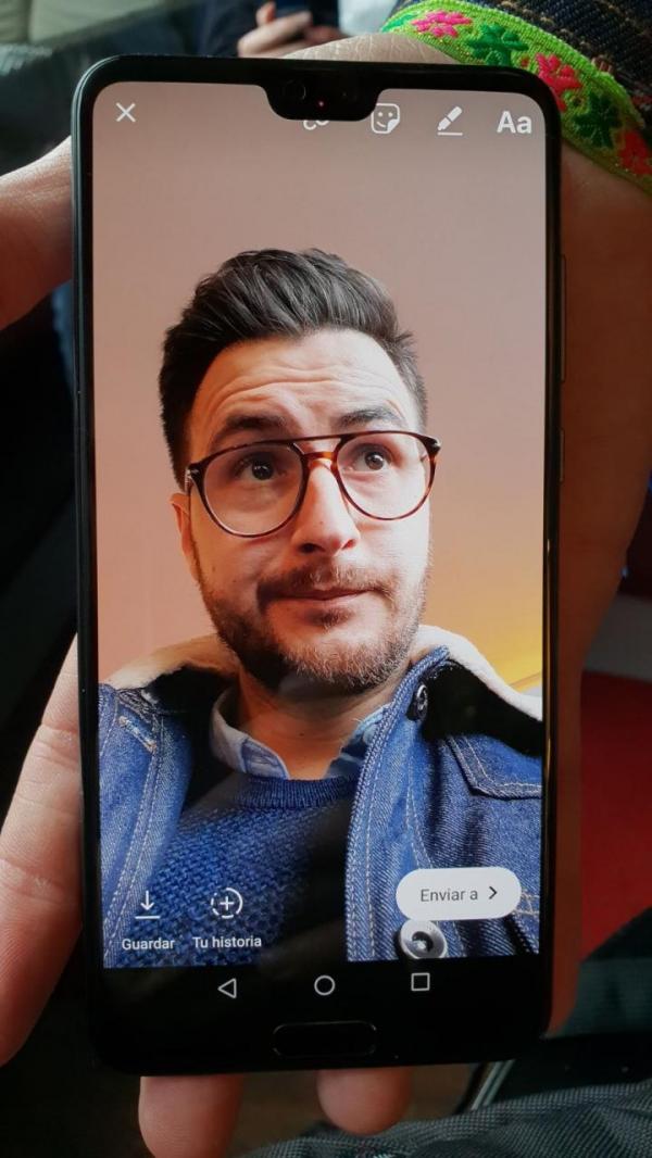
But most of these iPhone X clones are doing the notch wrong. And there's one picture that perfectly illustrates the main problem with notch bezels on Android.
The photo, taken by Spanish blog Topes De Gama, shows a Huawei P20 phone running Instagram:

I shouldn't even explain what's wrong with that, but I will, as we're looking at a couple of issues.
The Huawei P20 has a top notch like the iPhone, which can be hidden away via software. If you choose to embrace it instead, you'll discover that the notch cuts right into the in-app content. It's perfectly fine for the bezel to displace a portion of an image or video, as it is the case with the iPhone X. But Huawei's notch makes it harder to interact with the app's menu.
Not all Android device makers may have realized that, without total control over the software, they won't be able to avoid such user interface nightmares caused by the notch. Android P, when it arrives in August or September, will come with native support for notch interfaces. Ironically, however, Android P's notch-friendly UI will be first available on Pixel 2 phones that have huge bezels compared to all-screen smartphones. It'll take some time for the phones launching right now to get the Android P update. Until then, you may have to deal with similar experiences on Android-with-a-notch phones. On the other hand, it's likely that disabling the notch would prevent such issues in any app.
Apple, meanwhile, imposed strict design rules to prevent the iPhone X's notch to ruin app menus. That's because Apple has complete control over iOS.
Let's also take a minute and check the bottom side of the handset. Not only do we have a bottom chin that contains a fingerprint sensor, but we also have the navigation bar that takes up more screen retail estate. That doesn't look good at all, and one could argue that the back and multitask buttons could have been placed on the left and right side of the home button – yes, you can use gestures on that trackpad-like button, but the virtual buttons still show up.
While not all Android handsets with notch designs will feature physical buttons on the front, most of them will still have a bottom chin.
