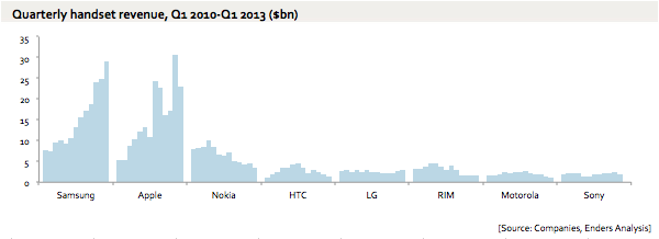
The mobile industry has painted a familiar picture of the past 12 quarters: the rich get richer and the poor get poorer. Benedict Evans of Enders Analysis on Thursday published what may be the best chart we have seen to date in terms of illustrating just how polarized the mobile phone industry is right now, where the top eight phone branded vendors are concerned. On one side we have Samsung and Apple, which have combined over the past three years to mop up an increasingly massive portion of mobile industry revenues. On the other side we have Nokia, HTC, LG, BlackBerry, Motorola and Sony — which all seem to be going nowhere fast. Evans’s eye-opening chart follows below.
Just how polarized is the mobile industry? This chart says it all
Updated Dec 19th, 2018 8:41PM EST

If you buy through a BGR link, we may earn an affiliate commission, helping support our expert product labs.
Zach Epstein has been the Executive Editor at BGR for more than 10 years. He manages BGR’s editorial team and ensures that best practices are adhered to. He also oversees the Ecommerce team and directs the daily flow of all content. Zach first joined BGR in 2007 as a Staff Writer covering business, technology, and entertainment.
His work has been quoted by countless top news organizations, and he was recently named one of the world's top 10 “power mobile influencers” by Forbes. Prior to BGR, Zach worked as an executive in marketing and business development with two private telcos.


